After 14 years of living with their 1960s kitchen, a Mill Valley, California, couple—she’s an archaeologist, he’s a fitness program manager, and they have two young daughters—turned to a team of collaborators to help them with their update.
The goal, in the archaeologist’s words: “a high-functioning, clean, timeless space that meshes with the look of my grandparents’ and mother-in-law’s midcentury furniture.” The solution: A newly opened-up space with custom solid-walnut cabinets (and retro circular cutouts) with a bean-shaped island/dinner table at the center. A new and improved version of the Brady Bunch eat-in kitchen? You tell us.
Photography by John Merkl.
Above: The just-under-200-square-foot kitchen began as an urge for a slightly bigger, brighter, more-up-to-date space that takes better advantage of the views of Mount Tamalpais right outside.
As often happens, the project snowballed along the way: “Interiors stylist Rachel Cleaveland Riedy [of Cleaveland & Kennedy Design], a friend, helped us come up with the look and materials,” says the archaeologist. “We planned to just hire her cabinet guy John Donovan and fill him in on our ideas, but he recommended having architect Jeff Gustafson help with space planning and drawing. And then, when we decided to take down a wall in the old pantry, we called in our terrific contractor Michael Gordon, who saved us from having to move out during the remodel. Our island was built by furniture maker Tripp Carpenter. And we had a skillful tile crew, London Tile. I managed the whole project, but Rachel was our sounding board and helped with the details and aesthetic decisions at every step.”
Above: The big new window over the sink offers mountain views and a glimpse all the way to the bay. To keep the space from feeling dark, Riedy encouraged painting the upper half of the room, the island base, and the adjacent living room white—it’s Benjamin Moore White Dove.
The undermount sink (with drainboard) is an Elkay Stainless Steel design paired with an Elkay Harmony Pull-Down Faucet. The new floor is wide-plank white oak, which the couple ended up extending throughout the house (“a big, logically challenging splurge, but a great impetus to clean out closets and get rid of a ton of stuff.”)
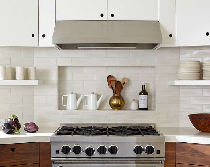
Above: Architect Jeff Gustafson situated the range, a Bluestar, in an angled section of the room that was created by stealing space from the pantry.
“Jeff made sure there was a good flow,” says the archaeologist. “It was a tough space—lots of angles and different ceiling heights. He was insistent on maintaining certain distances between the island and surrounding cabinets, communicating proportion, and inserting little details that I would really appreciate later, such as the utility closet. But he also tried to talk me out of the cabinet cutouts and built-in seating—and those are two of my favorite parts of the space.”
Above: “Everything takes place in our kitchen: homework, early morning work emails, family meals,” the archaeologist tells us, “A big, super-functional island was a must, but one of the challenges of the remodel was figuring out a design for it. Ultimately, my husband came up with the almost-kidney shape. And it really works—the curve lets people have more interaction.”
The island has a 2.5-inch solid walnut top—”Rachel and I went to Tripp’s studio and helped pick out and arrange the boards, so we had the right mix of colors”—and on the sink side, the base is kitted out with trash and recycling bins, and drawers for cutlery and bowls. Tripp Carpenter runs Espenet Furniture, a studio started by his father, celebrated woodworker Arthur Espenet. The bar-height Eames chairs, a Riedy recommendation, work well with the couple’s midcentury furniture throughout the house.
For more on islands, see Instant Kitchen Islands and A Hamptons Kitchen with a Custom Island, Sourced on Etsy.
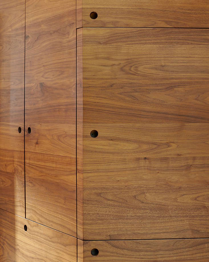
Above: The walnut has a horizontal grain and the circular cutouts are a sixties-inspired detail. “I always pitch cutouts as an option,” says Riedy, “but they take a certain client who understands the simplicity. To me, there’s something nautical about them.” As for the choice of solid wood instead of veneer: “It works better with the cutouts and really gives them a different quality and feel,” says the archaeologist.
Above: The archaeologist is an avid collector of Heath Ceramics, based in nearby Sausalito. The open upper shelves were added to give her a display space: “I love having them, but I didn’t want to manage the clutter of all open shelves, so we combined them with upper cabinets.” The tiles are Heath’s handmade Dimensional Crease design in Linen. (For another kitchen that makes use of the tiles, see A Budget Remodel with Heath Seconds.)
Above: The counters are cast concrete from Concreteworks of Oakland (“all the Heath stores have them,” notes the Heath collector).
Above: The kitchen faces a wall of built-in seating and storage and a new sliding glass door. “It’s always a challenge to get people to sit in the living room,” says the archaeologist, “so I figured we would just create a space like that right in the kitchen. Everyone hangs out here.”
Above: No need to go looking for a bottle opener.
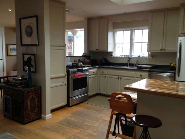
Before
Above: “The house was built in 1960,” says the archaeologist. “We had made some improvements—put in a skylight and updated the appliances several years ago—but nothing fancy, just utilitarian. The old cabinets were falling off the hinges, the counter was speckled gray-black Formica—it was starting to feel ratty and run down.” The old cabinets and replaced appliances, she adds, were donated and put to new use.
See more of Riedy’s work at Cleaveland & Kennedy.
Go to our Kitchens archive to tour more remodels, including:
- Before/After: A Cool and Confident Kitchen in LA by Project M+
- Rehab Diary: The $350 DIY Kitchen Overhaul in Two Weekends
- A Galley Kitchen Reinvented
And go to Remodeling 101 for advice on countertops, backsplashes, appliances.
N.B.: This post is an update; the original story ran on March 26, 2015.










Have a Question or Comment About This Post?
Join the conversation (18)