Natalie Myers’s clients bought their Los Angeles home after it had been renovated on the cheap by a pair of house flippers. The design lovers weren’t enthusiastic about the results, but the house was within their budget, they saw its potential, and they wanted to settle in quickly for the impending arrival of their twins.
According to Myers, an LA interior designer and principal of Veneer Designs, the flipped kitchen was big, “yet oddly there was a lot of wasted space.” A monolithic island encroached on the dining space, a vent hood blocked views into the rest of the house, and “decades-old cabinets with an illogical configuration were painted over and given new Euro-style pulls to look refreshed, without being user friendly.”
“I wanted my clients to have an airy, open kitchen that flowed into and out of the rest of the house,” said Myers. Here’s how she achieved the look.
Photography by Amy Bartlam, courtesy of Veneer Designs.
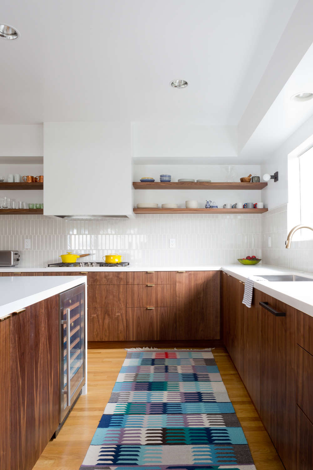
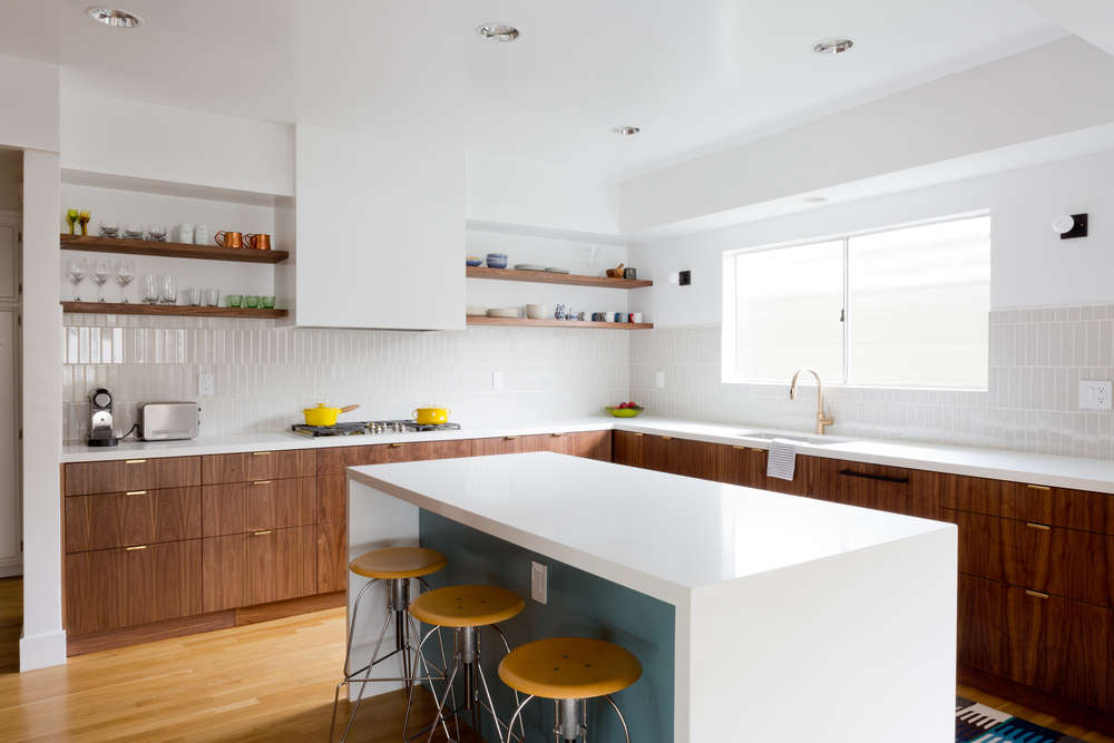
Above: Myers installed walnut veneer cabinets in a natural oil finish, configured to highlight an “attention-grabbing cooking zone” with generous countertop prep space. The clients wanted to avoid the heavy feel of overhead cabinets, so opted for open shelving instead. A vintage killim runner adds color to the wood-and-white space.
Above: The kitchen island and countertops are Qortstone, in Winter White. Inside the kitchen island, Myers installed a Masonite panel painted in Benjamin Moore’s Jamestown Blue (the same color as the house’s front door). On either side of the kitchen window, she installed a Fairfax Sconce from Park Studio in LA.
Above: The refrigerator is integrated into floor-to-ceiling walnut veneer cabinets. The black refrigerator hardware is from Top Knobs and Pulls.
Myers completed the kitchen remodel in only six weeks’ time. The impending arrival of the couple’s twins “put the project on a hyperdrive schedule, since we wanted the dust settled and cleaned before the babies arrived,” said Myers. Luckily, her clients had remodeled before, and were pros at communicating their ideas and “quickly deciding what they liked and didn’t like.”
Above: Myers used brass cabinet pulls from Deltana on the new drawers, and had the kitchen painted in Vanilla Milkshake by Benjamin Moore.
Above: A Faber range hood is built in, hidden behind drywall. The two-by-eight vertical field tiles that form the kitchen backsplash are Ashbury from Market Collection.
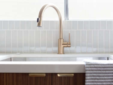
Above: For the kitchen faucet, Myers specified the Trinsic Single Handle Pull-Down Faucet from Delta, in Champagne Bronze.
Above: The Lucia-B dining table from Organic Modernism has a hand-forged bronze base and a black marble top. The chairs are Eames Molded Plywood Dining Chairs from DWR. The chandelier is by Stilnovo.
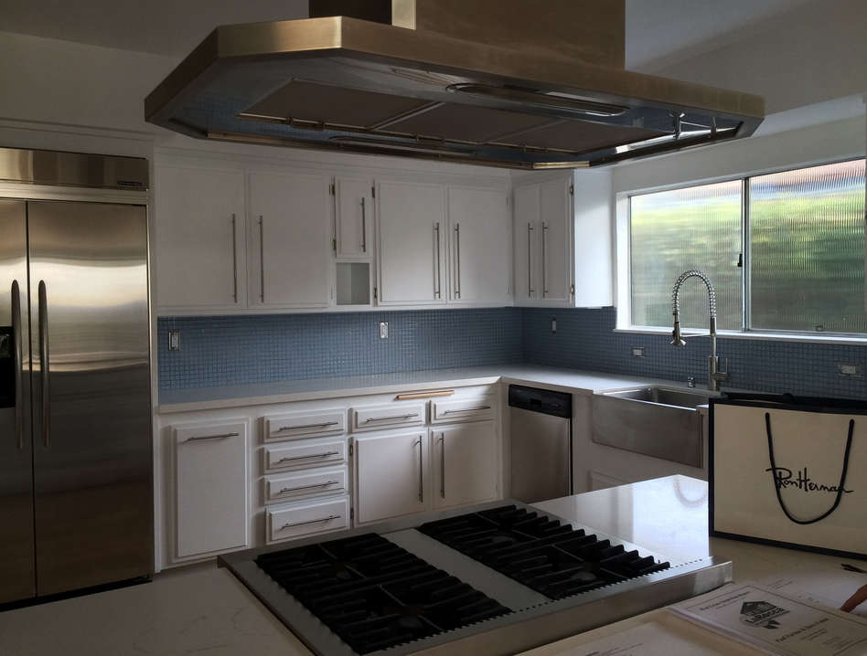
Before
Above: The flipped kitchen was “pretty basic,” said Myers. “Not bad, but not special. I knew we could do so much better.” She was able to keep the kitchen window, unchanged.
Above: Despite its many cabinets, the kitchen was not practical for the new owners of the house.
See Remodelista’s entire Kitchen of the Week series, including A Modular Setup from Sweden. View more from Veneer Designs on Gardenista in Outbuilding of the Week: Santa Monica Garden Lounge by Veneer Designs.







Have a Question or Comment About This Post?
Join the conversation (8)