LA architect Oonagh Ryan was given a tight budget to turn four dated penthouse apartments into short-term housing for creative types, available via 631 Wiltshire in Santa Monica, California.
The characterless two-bedroom units (1,900 square feet each) were built in the 1990s atop a 1950s Art Deco–style building. The kitchens in particular were in dire need of help and became the primary focus of the remodel. The firm’s trick for keeping costs down was to make the most of what was already there. “Instead of demolishing existing unsuccessful elements, we tried to work with them,” according to James Guillou, an architectural designer on the project.
Photography by Eric Staudenmaier courtesy of Oonagh Ryan Architects.

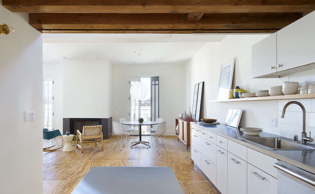
Above: Ryan had the drywall removed above the kitchen to expose the structural beams and add some character (as well as height) to the space. “We were hesitant at first because we weren’t sure what we would find, but it turned out that the the beams were in great condition,” said Guillou. “We just needed to sand and seal them.” To echo the rusticity, the architects added wood screens at the entryway and wood guardrails on the stairway—”the big move that ties everything together,” Guillou says.
A row of marigold wall sconces (Alabax Small from Schoolhouse Electric) lines the wall opposite the kitchen.
Above: For the backsplash, the team used affordable six-inch-square matte tiles in Biscuit from Daltile. The stainless steel sink is from Elkay, the faucet is Ikea’s Ringskar, and the dishwasher is from Bosch.
Ryan had the entire loft painted in Benjamin Moore’s White Dove, one of the colors included on our list of Paint Colors with Cult Followings.
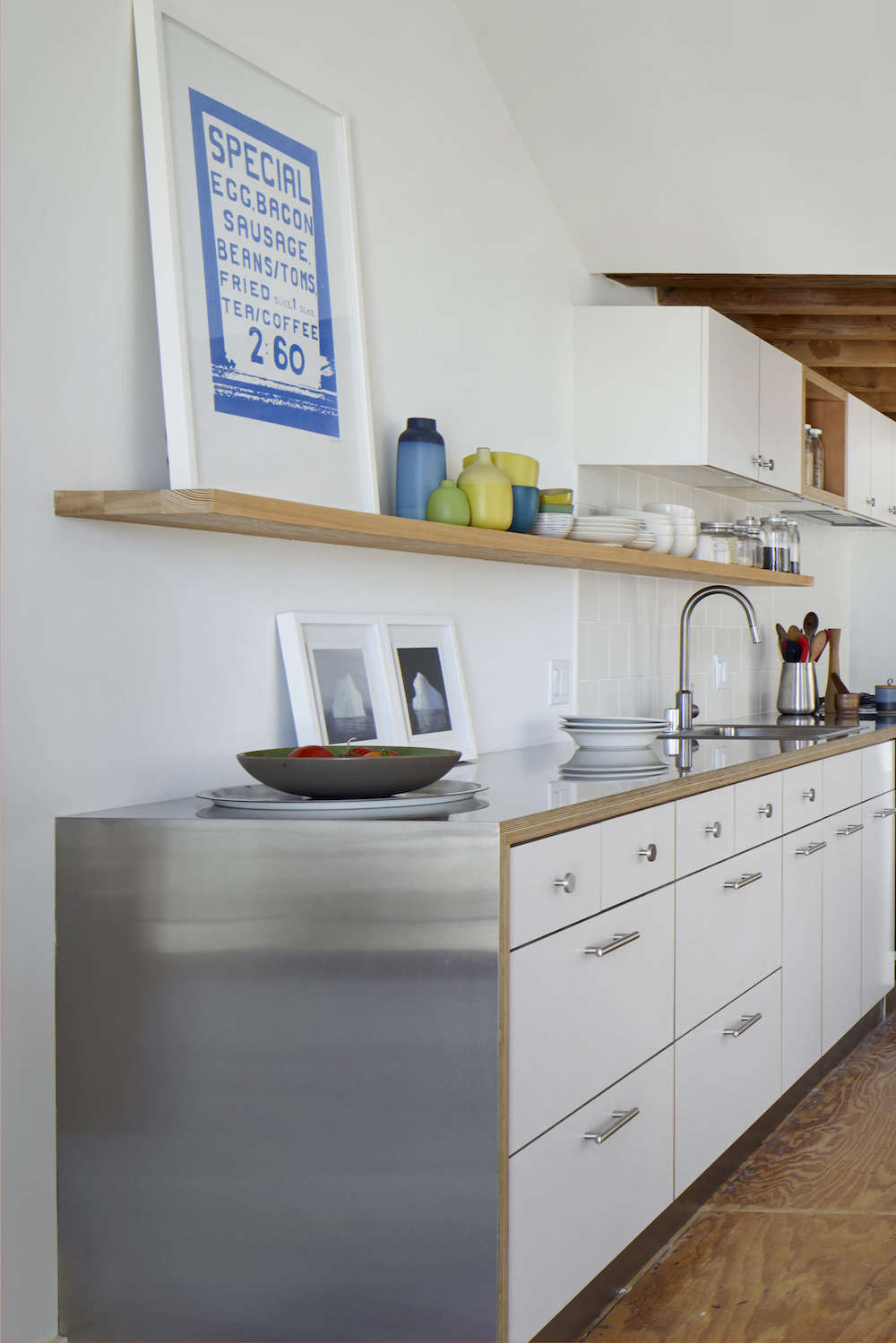
Above: “Our favorite budget countertop is a sheet of brushed stainless steel with an exposed, clear-sealed multi-ply plywood edge,” says Ryan (see more ideas in 10 Favorites: Architects’ Budget Kitchen Countertop Picks). “It’s a really terrific countertop from a cost, durability, and maintenance perspective. And it only looks better with age and use.”
The cabinets and drawer fronts are Douglas fir multi-ply plywood, faced with affordable matte Formica in Neutral Weft. The single shelf above the counter is made of clear-sealed Douglas fir. The toe kick beneath the cabinets is stainless steel.
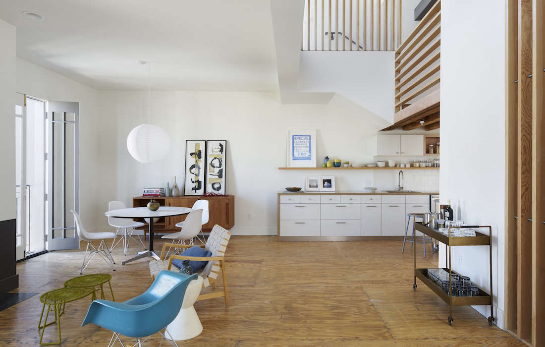
Above: When the construction crew removed the existing flooring, they discovered a plywood subfloor in unusually good shape. “We looked at other flooring options and were unsatisfied with what we could afford in our budget,” said Guillou, “so we ended up clear-sealing the plywood and forgoing a more traditional floor.” The design team was pleased with the result: “The visual movement was particularly nice and reflected the casual aesthetic we were going for.”
Above: To keep the project within budget, Ryan thought carefully about where to spend and where to save. “By keeping the cabinetry, appliance, and plumbing fixture budgets low,” says Guillou, “we were able to splurge on the Douglas fir screens and guardrails.”
Above: Another budget design trick, courtesy of Guillou: “Using large and affordable statement pieces like the large Noguchi-like paper lanterns over the dining table add great design impact,” he says.
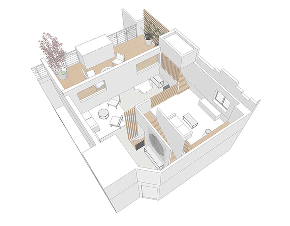
Above: A 3-D drawing shows the bedroom space lofted above the kitchen.
Browse Remodelista’s Kitchen of the Week series, including Frama Copenhagen’s Studio Kitchen and Jasper Morrison’s First Modular Kitchen.








Have a Question or Comment About This Post?
Join the conversation (5)