Katie Hackworth, one half of H2 Design + Build in Seattle, worked from a home office for five years and had grown accustomed to its perks—kitchen included. But as her business grew, she needed a space to meet with clients and knew a dedicated workplace would help her focus. Plus, she saw an opportunity to show potential clients what she could do.
Hackworth and her business partner and husband Paul dug into a much-neglected rental studio in Seattle’s Madison Park neighborhood and turned it into a home away from home. Now, Hackworth can prep lunch in the kitchen and meet with clients at the dining table; the rest of the time the same table holds drawings, samples, and concept boards. In the overhaul, the duo added a powder room, desk space, and materials library, but we’ll focus on the kitchen and dining here; visit H2 Design + Build for the rest of the project.
Photography by Belathée Photography, courtesy of H2 Design + Build.
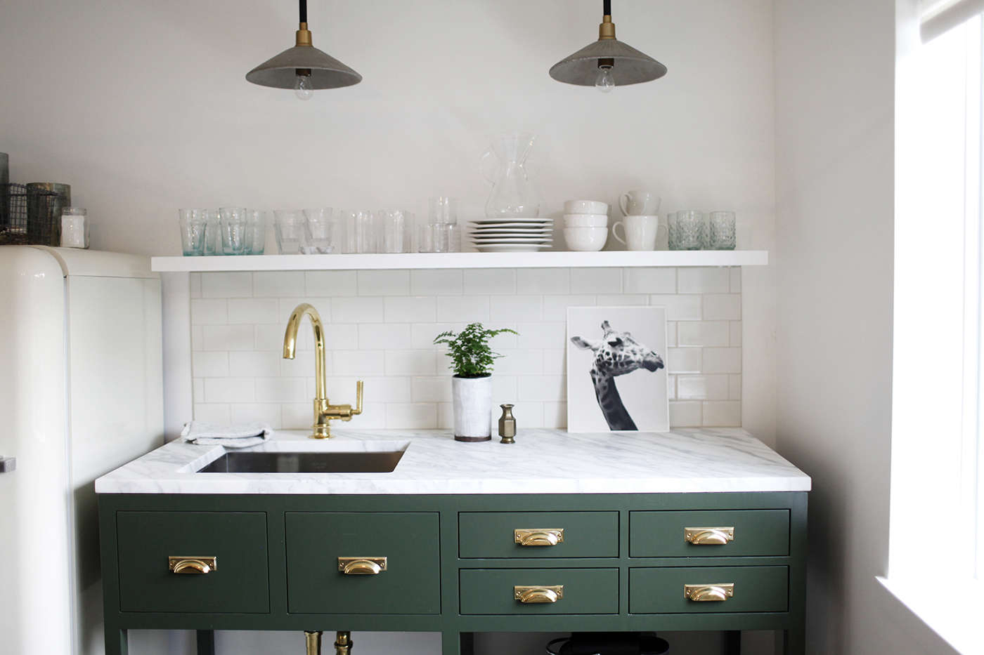
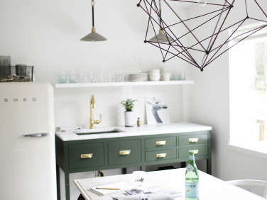
Above: The H2 office kitchen in the front room of the design studio. The office gets ample natural light from a large window facing a quiet street in the neighborhood’s tiny downtown. The white Smeg fridge at left was one of the first things Hackworth purchased for the new kitchen.
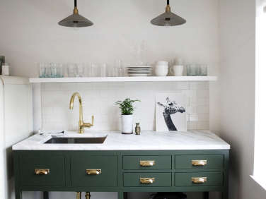
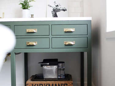
Above: For the kitchenette unit, Hackworth fell for Waterworks’ Iverness Worktable but needed something that could accommodate a sink and would fit in a particular dimension. She commissioned a local cabinetmaker to build a kitchenette version she redesigned with room for an undermount stainless steel sink and a single-hole faucet. She topped the unit with a Calacatta marble slab left over from a previous job.
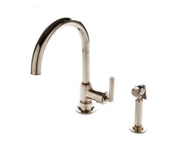
Above: Hackworth used the Henry One-Hole Gooseneck Kitchen Faucet in brass from Waterworks (featured in 10 Easy Pieces: Architects’ Go-To Traditional Kitchen Faucets). She installed a basic wood shelf and white crackle-glaze tile as a backsplash.
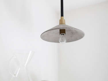
Above: Two saucer-shaped concrete Milan Pendants from Jayson Home hang above the counter.
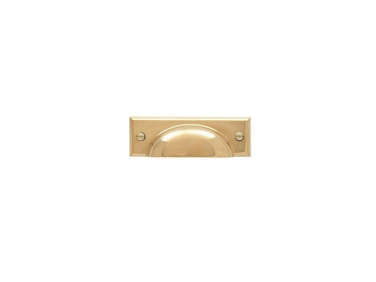
Above: The kitchenette is painted in Chimichurri from Benjamin Moore with Rejuvenation’s Bevel Edge Bin Pulls in unlaquered brass.
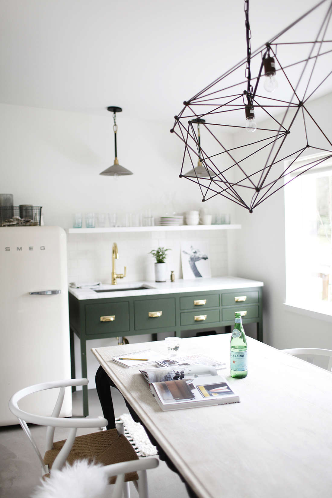
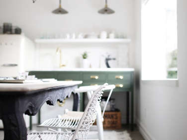
Above: For the dining/meeting table, Hackworth decided first on Wegner Wishbone Chairs from DWR, then on a table to flatter them. She liked the price and contrast that Anthropologie’s Cabriole Dining Table offered: “The black-stained table base with its vintage inspired legs are what got me.”
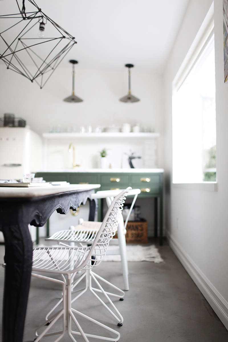
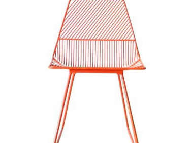
Above: The Wishbone chairs are paired with a trio of wire chairs from ABC Home (these were the last three, Hackworth says, but she pointed us to the Ethel Chair from Bend as a good alternative). Over the dining table, Hackworth used the Sussex Chandelier from Jayson Home.
Though it’s always a hard decision to invest much in a rental, Hackworth thought wisely: “I don’t mind splurging on timeless pieces I can take with me,” she said. “Almost everything in the space will be easy to move to our next location when the time comes, kitchenette included.”

Above: “The desk to the left of the Smeg is where you’ll find me the majority of the day,” said Hackworth.

Above: At the other end of the dining table is the front door of the office. The white linen curtain at right divides the kitchen and worktable from the office desks and materials library.

Above: At the entrance to the office, a coat rack with potted fiddle-leaf fig, mirrors, and artwork.

Above: Katie and Paul Hackworth in front of their Seattle studio. The building was originally a detached garage and had been previously used as a floral shop, antiques store, and travel agency.
Before

Above: H2 had some major work to do on the rented studio. “All of the rotting beams were exposed, any existing insulation had been ripped out, the concrete floor was cracked and uneven, and the single-paned windows and doors weren’t doing much in terms of keeping the cold out,” said Hackworth.
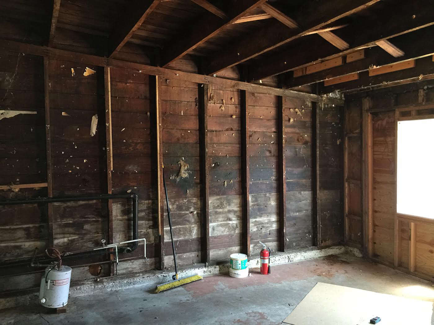
Above: The pair leveled the floor with new concrete, added new sheetrock walls, created an enclosed space for a small powder room, and updated all plumbing and electricity. Why put all that energy into a rental? Because, said Hackworth, “We were able to agree on a great rental price with our landlord, knowing renovations would be on our dime.”
See all of Remodelista’s Kitchen of the Week posts, including Blackened Steel, Bohemian Style, and Oakland Family Kitchen by Medium Plenty.



Have a Question or Comment About This Post?
Join the conversation (1)