Icon - Arrow LeftAn icon we use to indicate a rightwards action. Icon - Arrow RightAn icon we use to indicate a leftwards action. Icon - External LinkAn icon we use to indicate a button link is external. Icon - MessageThe icon we use to represent an email action. Icon - Down ChevronUsed to indicate a dropdown. Icon - CloseUsed to indicate a close action. Icon - Dropdown ArrowUsed to indicate a dropdown. Icon - Location PinUsed to showcase a location on a map. Icon - Zoom OutUsed to indicate a zoom out action on a map. Icon - Zoom InUsed to indicate a zoom in action on a map. Icon - SearchUsed to indicate a search action. Icon - EmailUsed to indicate an emai action. Icon - FacebookFacebooks brand mark for use in social sharing icons. flipboard Icon - InstagramInstagrams brand mark for use in social sharing icons. Icon - PinterestPinterests brand mark for use in social sharing icons. Icon - TwitterTwitters brand mark for use in social sharing icons. Icon - Check MarkA check mark for checkbox buttons.
You are reading

Kitchen of the Week: A Dog-Friendly Kitchen from Studio AC Design, Ikea Cabinets Included

Search

Kitchen of the Week: A Dog-Friendly Kitchen from Studio AC Design, Ikea Cabinets Included

January 2, 2020

Here’s proof that a single detail can elevate a design from nice to newsworthy. The transformative feature came from a line in the clients’ brief asking architects Studio AC of Toronto to see if they could find a place for a dog bed in their new kitchen. Given that space was at a premium, “it wasn’t an insignificant request,” note the architects (AC stands for Architecture and Collaboration).

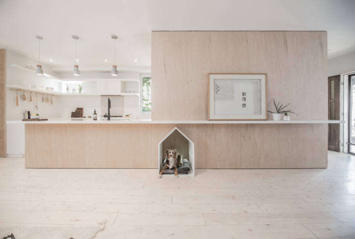
The solution they came up with makes use of a central, multipurpose geometric volume and Ikea cabinets customized with CaesarStone and open shelving. A long counter divides the kitchen from the living area and Rusty’s dog house masterfully fits underneath—out of the way but positioned front and center.

Photography by Sarjoun Faour, courtesy of Studio AC.

the kitchen is integrated into a floor to ceiling birch plywood structure that  17
Above: The kitchen is integrated into a floor-to-ceiling birch plywood structure that also contains a foyer, closet, and stairs. The wide-plank floor is lightened plywood sealed with a matte polyurethane.
&#8\2\20;rather than imagine a home comprised of rooms within an open plan, 18
Above: “Rather than imagine a home comprised of rooms within an open plan, we conceived a room revolving around a singular mass,” write the architects. “The mass provides the aesthetic grounding for the project while also containing all of its support functions in a clean plywood wrapper.”
the kitchen is fitted with simple white ikea cabinets paired with custom overhe 19
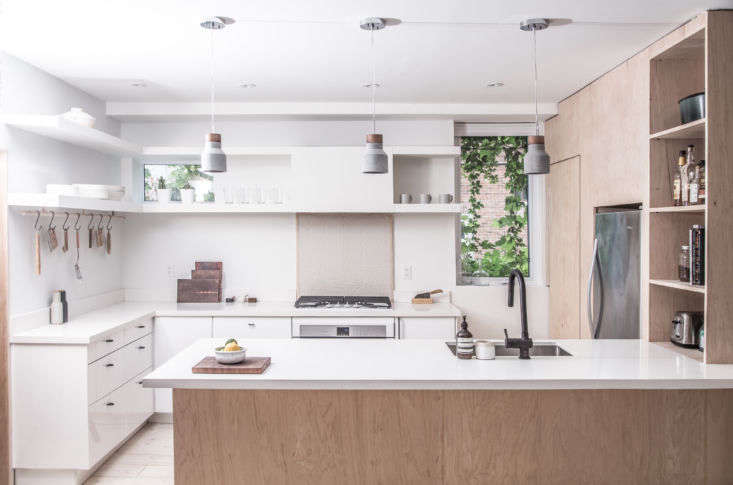
Above: The kitchen is fitted with simple white Ikea cabinets paired with custom overhead open shelving of painted wood. The counters are white CaesarStone (read about it in Remodeling 101: 7 Things to Know about Engineered Quartz Countertops).

“The plywood volume is used to lengthen the relatively modest floor plan,” explain the architects. “By stretching itself across the programs and extending the kitchen surface, the plywood volume creates a functional graphic that leads the eye across the space.”
the refrigerator is fitted into the plywood volume but left undisguised. the ra 20
Above: The refrigerator is fitted into the plywood volume but left undisguised. The range has a tiled backsplash and the two-tiered overhead shelves conceal the exhaust fan.
the matte black faucet is vigo&#8\2\17;s gramercy pull down design; \$\184. 21
Above: The matte black faucet is Vigo’s Gramercy pull-down design; $184.90 from Build.com. The hanging ceramic lights were supplied by the clients; for something similar see 10 Easy Pieces: Terracotta Pendant Lights.
a custom wood rod and s  hooks provide hanging storage. 22
Above: A custom wood rod and S  hooks provide hanging storage.
rusty&#8\2\17;s house is composed of plywood &#8\2\20;painted so it can 23
Above: Rusty’s house is composed of plywood “painted so it can pop against the plywood mass it lives in.”

Floor Plan

studio ac was tasked with remodeling a \1,500 square foot two story house. the  24
Above: Studio AC was tasked with remodeling a 1,500 square foot two-story house. The ground floor, shown here, has a dining and living area that surround the central kitchen/stair volume.

Working on your own kitchen? Find more inspiration and intel in our Kitchen of the Week archive. Also take a look at:

(Visited 1,005 times, 1 visits today)
You need to login or register to view and manage your bookmarks.

Have a Question or Comment About This Post?

Join the conversation

v5.0