Icon - Arrow LeftAn icon we use to indicate a rightwards action. Icon - Arrow RightAn icon we use to indicate a leftwards action. Icon - External LinkAn icon we use to indicate a button link is external. Icon - MessageThe icon we use to represent an email action. Icon - Down ChevronUsed to indicate a dropdown. Icon - CloseUsed to indicate a close action. Icon - Dropdown ArrowUsed to indicate a dropdown. Icon - Location PinUsed to showcase a location on a map. Icon - Zoom OutUsed to indicate a zoom out action on a map. Icon - Zoom InUsed to indicate a zoom in action on a map. Icon - SearchUsed to indicate a search action. Icon - EmailUsed to indicate an emai action. Icon - FacebookFacebooks brand mark for use in social sharing icons. flipboard Icon - InstagramInstagrams brand mark for use in social sharing icons. Icon - PinterestPinterests brand mark for use in social sharing icons. Icon - TwitterTwitters brand mark for use in social sharing icons. Icon - Check MarkA check mark for checkbox buttons.
You are reading

Kitchen of the Week: An Architect’s Light-Filled, DIY Copenhagen Kitchen, Ikea Hack Included

Search

Kitchen of the Week: An Architect’s Light-Filled, DIY Copenhagen Kitchen, Ikea Hack Included

May 14, 2020

My first introduction to Copenhagen-based architect Stine Marie Rosenborg was a shot of a simple grey, wall-mounted cabinet in her dining room that looked suspiciously like Ikea’s Ivar model. On the outside, the cabinet was soft and subtle, but another shot with the double doors open revealed surprising salmon-y red interiors. I quickly hit “follow” on Rosenborg’s Instagram account and have admired her apartment—in the Vesterbro neighborhood of Copenhagen—ever since.

And particularly her simple, light-filled kitchen which—like that smart Ikea cabinet upgrade—is a DIY, little-bit-at-a-time affair. “I was apartment hunting for about six months before I found this apartment,” Rosenborg, who works primarily in interior design for the firm Rønnow Architects, wrote to me in an email. ‘The kitchen was crowded with cupboards and tall cabinets when I moved in in 2014. On top of that, the cabinets were very 1990s, with a cheap lacquered wooden surface. I was still studying architecture and didn’t have the finances to completely re-do the space, but I tore down several cabinets, which made room for a small breakfast nook.

“Everything was painted, including the kitchen cabinets, and my brother, who is a craftsman, helped me with the plastered walls in the dining room,” she adds. “Last year a balcony was installed in extension of the kitchen, and we re-did the breakfast nook with a bench.”

Earlier this winter, Rosenborg and her partner were planning another kitchen upgrade—but the surprise early arrival of their baby boy put those plans on hold for now, at least until summer. “The plan is to paint the cabinets beige to give the room a warmer feeling,” Rosenborg says, and to add new lights and a new table. “With a baby in the house, everything takes a little longer than originally planned.”

Still, the kitchen is a sunny, bright place for the small family to spend more time in these days, between self-isolating and the first weeks and months with an infant. “We spend a lot of our time in the kitchen,” Rosenborg says. “The light is amazing, and with the direct view to our little green balcony it has become even better.”

Take a look at the kitchen and dining room—including that excellent Ikea hack.

Photography courtesy of Stine Marie Rosenborg, except where noted.

the small and sunny kitchen, with plain wood floors, butcher block countertops, 17
Above: The small and sunny kitchen, with plain wood floors, butcher-block countertops, a newly installed balcony, and plenty of houseplants. “I saw several apartments and made a few offers, but I am glad they didn’t go through because this apartment was a perfect fit for me at the time—and now my little family,” Rosenborg says.
&#8\2\20;the new color in the kitchen will be a lime paint from jotun in th 18
Above: “The new color in the kitchen will be a lime paint from Jotun in the color Tidløs, and the cabinets will get the color Space,” says Rosenborg, but for the moment it’s a serene palette of charcoal and cream (plus a Vipp trashcan).
the couple&#8\2\17;s breakfast nook got an upgrade with a hand built storag 19
Above: The couple’s breakfast nook got an upgrade with a hand-built storage bench, which makes efficient use of an empty stretch of wall (and offers a landing place for watering cans and potted plants just beside the balcony).
a light filled place for breakfast. 20
Above: A light-filled place for breakfast.
ikea&#8\2\17;s ivar cabinets, wall mounted, in the dining room. &#8\2\2 21
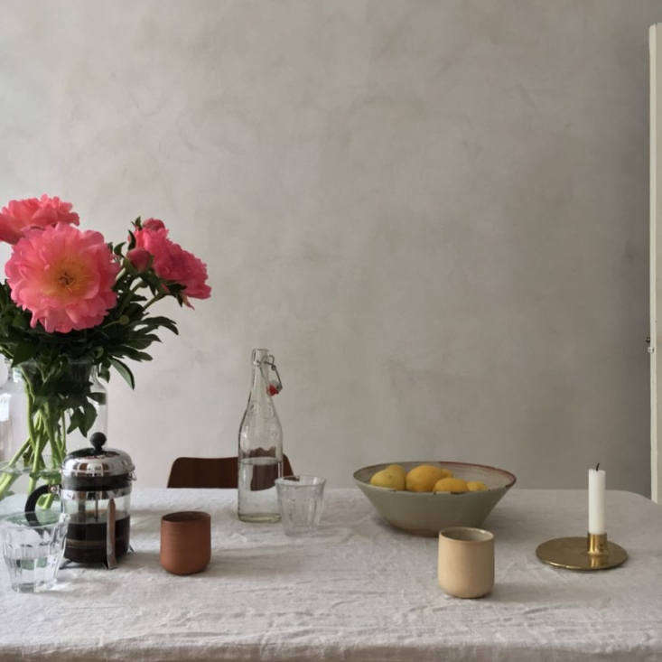
Above: Ikea’s Ivar cabinets, wall-mounted, in the dining room. “The grey plaster is actually a plaster for outdoor use from Weber in the color light grey,” says Rosenborg. (For more of our favorite twists on the Ivar, see Archive Dive: 10 Times Ikea Storage Furniture Looked Expensive.)
open, the cabinet becomes a wall mounted bar with a surprising backdrop. the in 22
Above: Open, the cabinet becomes a wall-mounted bar with a surprising backdrop. The interiors are painted in Etruscan Red by Danish paint company Flügger. Photograph by @_designtales_.
&#8\2\20;since spending so much time at home the last couple of months, i h 23
Above: “Since spending so much time at home the last couple of months, I have been so much more appreciative of our home, decor, and color scheme and how important it is for me to live in our calm surroundings,” says Rosenborg. “And, on top of that, the spring light is making it even better.”

For more thoughtful Copenhagen interiors, take a look at:

(Visited 1,682 times, 1 visits today)
You need to login or register to view and manage your bookmarks.

Have a Question or Comment About This Post?

Join the conversation

v5.0