Icon - Arrow LeftAn icon we use to indicate a rightwards action. Icon - Arrow RightAn icon we use to indicate a leftwards action. Icon - External LinkAn icon we use to indicate a button link is external. Icon - MessageThe icon we use to represent an email action. Icon - Down ChevronUsed to indicate a dropdown. Icon - CloseUsed to indicate a close action. Icon - Dropdown ArrowUsed to indicate a dropdown. Icon - Location PinUsed to showcase a location on a map. Icon - Zoom OutUsed to indicate a zoom out action on a map. Icon - Zoom InUsed to indicate a zoom in action on a map. Icon - SearchUsed to indicate a search action. Icon - EmailUsed to indicate an emai action. Icon - FacebookFacebooks brand mark for use in social sharing icons. flipboard Icon - InstagramInstagrams brand mark for use in social sharing icons. Icon - PinterestPinterests brand mark for use in social sharing icons. Icon - TwitterTwitters brand mark for use in social sharing icons. Icon - Check MarkA check mark for checkbox buttons.
You are reading

Prospect & Refuge: A Spectacular Coastal Home Both Wild and Cozy

Search

Prospect & Refuge: A Spectacular Coastal Home Both Wild and Cozy

March 31, 2023

The most compelling architectural projects have a palpable sense of place. This can mean honoring a building’s original design, prioritizing integration into (as opposed to conquering of) the natural landscape, or, perhaps, acknowledging the history of the area. This new build, in a coastal town in Victoria, Australia, does it all.

Melbourne-based architectural firm Kennedy Nolan is behind the incredibly thoughtful project, dubbed the “Always House.” They were brought on to restore the dramatically sited cliffside home designed by Australian midcentury stalwarts Chancellor and Patrick, but when it became clear that it was structurally unsound—in danger of sliding to the beach below—they pivoted to building anew.

They tore down the original building, constructed a foundation of 14-meter piles, then rebuilt the home “to ‘remember’ the [former] house by largely reconstructing its form and arrangement,” says founding partner Patrick Kennedy.

The team also made sure that the new build would continue to take full advantage of the views offered by the spectacular oceanfront location, which he called “both a gift and a problem,” one that often results in single-orientation glass boxes. Their solution: orient the home both out toward the ocean and in toward a new courtyard. In addition, they would follow the “prospect and refuge” theory of design, which posits that ideal living spaces should offer opportunities to both explore (prospect) and nest (refuge). “Views are amplified by the way they are revealed; rounding a bend, passing through a gate, moving from darkness into light,” says Kennedy.

A dim, hushed interior dominated by wood and stone is a cozy counterpoint to the wild coastal landscape—not to mention an apt backdrop for the client’s collection of Indigenous art, much of it by Yolngu female artists in north-east Arnhem Land. The home is on land originally inhabited by the Bonurong people, and its name is inspired by Aboriginal land rights advocate Uncle Williams Bates’ motto: “Always Was, Always Will Be Aboriginal Land.”

Below, a tour of the Always House, a home with a profound sense of place.

Photography by Derek Swalwell, courtesy of Kennedy Nolan.

from the road, the home seems to disappear thanks to a street level green roof. 17
Above: From the road, the home seems to disappear thanks to a street-level green roof. It’s planted with native poa grasses and pigface (an Australian succulent), and reduces stormwater runoff, cools the rooms below it, and provides natural habitat for thornbills.
&#8\2\20;the sequence of arrival is a narrative contrived to decelerate. th 18
Above: “The sequence of arrival is a narrative contrived to decelerate. There are distinct paths for different occasions and users but they all provide pause points, an opportunity to take in the location, to sense the terrain, to enclose and release,” says Kennedy.
the front gate opens to stairs that lead to the courtyard and entrance. inside  19
Above: The front gate opens to stairs that lead to the courtyard and entrance. Inside the foyer are Larrakitj memorial poles, made from hollow stringybark trunks.
an open kitchen, dining, and living space. two large hotaru marker pendant ligh 20
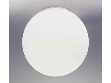
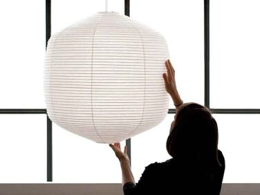
Above: An open kitchen, dining, and living space. Two large Hotaru Marker Pendant Lights by Barber Osgerby for Twentytwentyone help to delineate the dining area and lighten the wood-heavy interior.
pale green slate floors, and walls and ceiling clad in western red cedar lend t 21
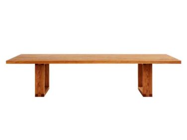
Above: Pale green slate floors, and walls and ceiling clad in Western red cedar lend the space an earthy, timeless appeal. The Sleigh Loop Dining Table is by Mark Tuckey; the Huma Dining Chairs by Expormim.
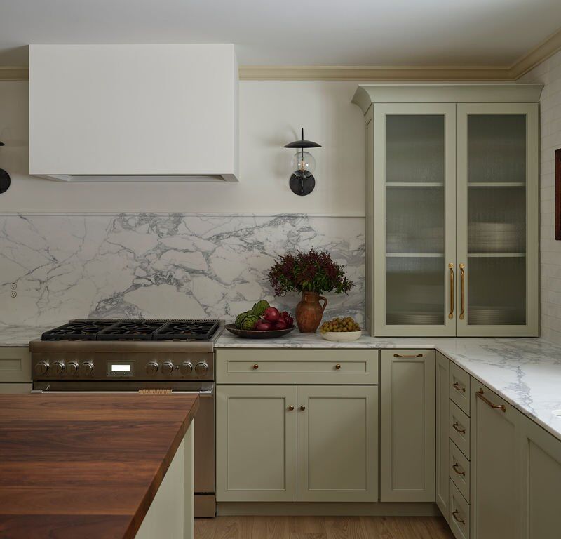
the kitchen, with its clean lined blackbutt island, epitomizes warm minimalism. 22
Above: The kitchen, with its clean-lined blackbutt island, epitomizes warm minimalism.
the large public space has multiple ways to access both the courtyard (to the l 23
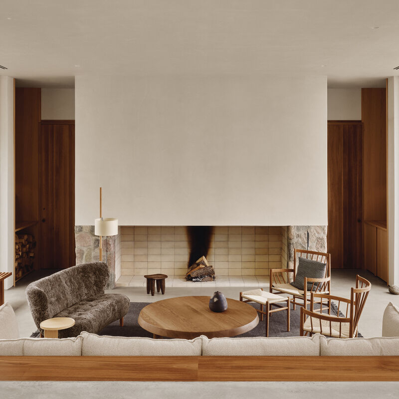
Above: The large public space has multiple ways to access both the courtyard (to the left) and the beachside terrace (to the right). The Belt Sofa is by Patricia Urquiola for Moroso.
hanging over the fireplace is artwork by nonggirrnga marawili from buku larrngg 24
Above: Hanging over the fireplace is artwork by Nonggirrnga Marawili from Buku-Larrnggay Mulka Centre. The French cane chairs are vintage. Just beyond is a den.
the main bedroom features floor to ceiling curtains in nya nordiska&#8\2\17 25
Above: The main bedroom features floor-to-ceiling curtains in Nya Nordiska’s Ubundu fabric and a 9602 Floor Lamp by Paavo Tynell for Gubi.
a cedar clad wall of closets in the bedroom. to the left is the ensuite bathroo 26
Above: A cedar-clad wall of closets in the bedroom. To the left is the ensuite bathroom.
in the main bathroom, penny wall tiles from academy tiles; floor tiles from sig 27
Above: In the main bathroom, penny wall tiles from Academy Tiles; floor tiles from Signorino.
the sink setup combines a brass faucet from vola, a basin from astra walker, an 28
Above: The sink setup combines a brass faucet from Vola, a basin from Astra Walker, and a Laufen basin frame, painted in Dulux ‘Manor Red’, from Reece.
a symphony of pattern and texture. the dioscuri wall lamp is by artemide. 29
Above: A symphony of pattern and texture. The Dioscuri Wall Lamp is by Artemide.
a guest bedroom overlooks the courtyard. while the ground level followed the fo 30
Above: A guest bedroom overlooks the courtyard. While the ground level followed the footprint of the original structure, a newly designed vertical portion added a second floor.
a laundry room in the same design language as the rest of the home, thanks to p 31
Above: A laundry room in the same design language as the rest of the home, thanks to penny tiles, globe sconce lights, brass fixtures, and cedar cladding.
a standalone guest studio sits at the property&#8\2\17;s highest point and  32
Above: A standalone guest studio sits at the property’s highest point and enjoys a view of the green roof. The brass clothing rack is from House of Orange.

For similar homes, see:

(Visited 6,673 times, 1 visits today)
You need to login or register to view and manage your bookmarks.

Product summary  Item 6 159Item 7 160

mobilia moroso belt sofa website
Patricia Urquiola

Belt Sofa

$22,702.00 USD from Mobilia

Have a Question or Comment About This Post?

Join the conversation

v5.0