Icon - Arrow LeftAn icon we use to indicate a rightwards action. Icon - Arrow RightAn icon we use to indicate a leftwards action. Icon - External LinkAn icon we use to indicate a button link is external. Icon - MessageThe icon we use to represent an email action. Icon - Down ChevronUsed to indicate a dropdown. Icon - CloseUsed to indicate a close action. Icon - Dropdown ArrowUsed to indicate a dropdown. Icon - Location PinUsed to showcase a location on a map. Icon - Zoom OutUsed to indicate a zoom out action on a map. Icon - Zoom InUsed to indicate a zoom in action on a map. Icon - SearchUsed to indicate a search action. Icon - EmailUsed to indicate an emai action. Icon - FacebookFacebooks brand mark for use in social sharing icons. flipboard Icon - InstagramInstagrams brand mark for use in social sharing icons. Icon - PinterestPinterests brand mark for use in social sharing icons. Icon - TwitterTwitters brand mark for use in social sharing icons. Icon - Check MarkA check mark for checkbox buttons.
You are reading

Jolene in London: 7 Simple, Budget Ideas to Steal from the Year’s Most Rustic Bakery

Search

Jolene in London: 7 Simple, Budget Ideas to Steal from the Year’s Most Rustic Bakery

Patricia Niven August 22, 2023

This week we’re revisiting some of the most popular DIY stories from our archives. Read on for end-of-summer project inspiration:

The oldest surviving terraced houses in England were built in 1658, and they stand at 52-55 Newington Green, in a neighborhood that borders Hackney and Islington. Across the historic green, at number 22, is Jolene, a bakery, restaurant, and wine bar opened in September by David Gingell and Jeremie Cometto-Lingenheim—the pair behind two of north London’s favorite neighborhood restaurants, Primeur and Westerns Laundry.

Both of the previous sites are in unexpected locations: Primeur is in a converted 1920s car garage on a smart residential street, whilst Westerns Laundry occupies a former wholesale laundry business. Despite the historic surrounding, the founders of Jolene have taken on something less architecturally interesting: the bakery is on the ground floor of an unremarkable, three-story block of flats, with retail space on the ground floor. “This is a fairly ugly building,” admits Jeremie. “Of course it helps to have a building that has a dramatic look from the outside, but I think we’d already done that twice. For me it was a challenge to see whether having an ugly outside could actually enhance the inside.”

Jolene in London 7 Simple Budget Ideas to Steal from the Years Most Rustic Bakery portrait 7
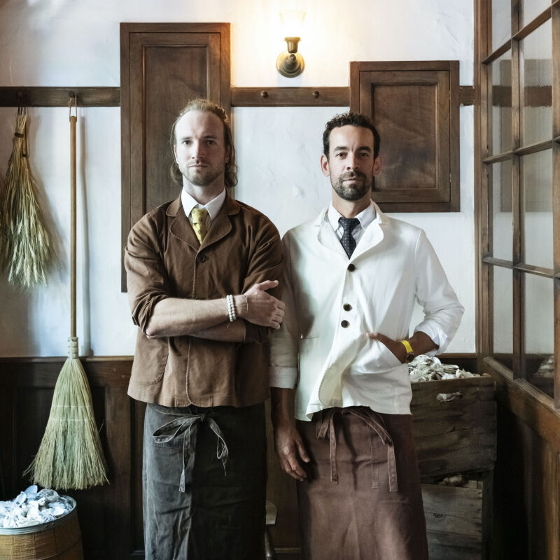
Above: David Gingell (left) oversees the menu, Jeremie Cometto-Lingenheim is responsible for the interiors.

When we met, Jolene had just been awarded “Design of the Year” by Eater London. “What’s interesting, is that the other contenders spent a huge amount of money on their design,” explains Jeremie. “For us, only a third of our budget is spent on design. We want people to remember us for the food we cook—the rest is really secondary.” The duo have teamed up with farmer Andy Cato (formerly of Groove Armada), who supplies the bakery with sustainably-farmed grains from Gascony. These are milled on site each day and turned into the breads and French bakes that fill the counter. “Of course I think then you need to put money in the details,” continues Jeremie. “I think that’s what makes a big difference, but the details don’t necessarily have to be expensive.”

Here are eight design ideas to take away, all on a budget.

Photography courtesy of Jolene.

1. Under-promise, over-deliver.

Jolene in London 7 Simple Budget Ideas to Steal from the Years Most Rustic Bakery portrait 7
Above: The exterior of Jolene doesn’t have the architectural drama of previous sites.

“Under-promising and over-delivering is quite important,” explains Jeremie. “There are a lot of ugly places that become beautiful once you’re inside, and I like that contrast.” Jeremie compares this approach to their daily-changing menu. As in Primeur and Westerns Laundry, the day’s dishes are chalked up on the wall, the ingredients laid bare: “spelt, pumpkin, sage, and walnut” or “chicken, gem, anchovy, and croutons.” What comes out of the kitchen is invariably more than the sum of its parts.

2. Start very simply.

front door jolene
Above: “David said something that has always stuck with me,” Jeremie confides. “’You can’t put the toothpaste back into the tube.’ It’s a wonderful saying which can be applied to so many things. It’s much easier to start very simply and add as you go along. That’s what we’ve always done and it seems to work for us.”

Jeremie cites the utilitarianism of the Shakers as “a massive inspiration,” as well as the writing of Belgian designer Axel Vervoordt. (Read more on these design inspirations in 16 Design Ideas to Steal from the Shakers and Best of the Belgians: 10 Favorite Architects and Designers.)

3. Create texture.

the uneven nude wall behind the counter is created using hydrolime (a combinati 20
Above: The uneven nude wall behind the counter is created using hydrolime (a combination of lime and plaster). Beneath the zinc counter, Jeremie has created a “mud wall” by incorporating the sawdust from on-site joinery into the hydrolime and applying it with a cloth.
madeleines, financiers, palmiers and naroques bread made from french grain 21
Above: Madeleines, financiers, palmiers and Naroques bread made from French grains on the wooden counter.

(Want to apply limewash at home? Consult DIY Project: Limewashed Walls for Modern Times and Remodeling 101: Everything You Need to Know About Limewash Paint.)

4. Strip away the extraneous.

the approach to the interior is much like the duo&#8\2\17;s approach to foo 22
Above: The approach to the interior is much like the duo’s approach to food: there is no extraneous clutter. “We don’t like to have anything here that isn’t useful,” says Jeremie. Staff aprons and branded totes hang on the Shaker pegs and the tables are simply dressed with seasonal foliage.

5. Economize, customize.

exterior curtain jolene
Above: The window dressing at Jolene was created by Jeremie and one of his chefs, who is also an embroiderer.

“I wanted to do curtains, then we didn’t have the money, so I bought some sticks instead,” he says. Vintage linen (a market find) is hung from a eucalyptus branch, which slots into a U-shaped wooden bracket beside the aluminum window frame.

“my happiness depends on you” is a line from the dolly parton son 24
Above: “My happiness depends on you” is a line from the Dolly Parton song, “Jolene.” The naive logotype was created by the six-year-old son of Frith Kerr, the founder of the design consultancy, Studio Kerr.

6. Juxtapose rustic and industrial.

“incandescent strip lights have become our signature,” explains j 25
Above: “Incandescent strip lights have become our signature,” explains Jeremie. They have been phased out of production across Europe so it took nine months to source these from Atlanta (Jeremie has 300 spares in storage). Here, they are positioned under a high shelf that displays a rustic Hungarian meat trough for corralling produce.

7. Don’t be afraid to mix materials.

Jolene in London 7 Simple Budget Ideas to Steal from the Years Most Rustic Bakery portrait 7
Above: A neutral color scheme accommodates pairings of seemingly disparate materials: wooden Thonet-style chairs (found on eBay) are tucked under zinc tabletops; Duralex glassware and ceramic jugs by Carmel Eskell congregate on the tabletops; white-washed cinderblocks disappear behind banquettes upholstered in recycled wool felt from Kirkby Design.

For more wabi-sabi inspiration, read about Japanese restaurant Bessou in New York, and this minimalist kitchen in Tokyo.

Taking on a food tour of London? Don’t miss a few of our favorites:

N.B.: This story originally ran on March 2, 2020 and has been updated.
(Visited 13,557 times, 9 visits today)
You need to login or register to view and manage your bookmarks.

Frequently asked questions

What is the name of the bakery featured in the article?

The bakery featured in the article is called Jolene Bakery.

Where is Jolene Bakery located?

Jolene Bakery is located in London.

What design ideas are highlighted in the article?

The article highlights various design ideas implemented in Jolene Bakery to create a budget-friendly space.

What is the main focus of the design in Jolene Bakery?

The main focus of the design in Jolene Bakery is to create a cozy and comfortable atmosphere for customers.

How does Jolene Bakery achieve a budget-friendly design?

Jolene Bakery achieves a budget-friendly design by incorporating reclaimed materials, using second-hand furniture, and DIY projects.

What role does lighting play in the design of Jolene Bakery?

Lighting is an important aspect of the design in Jolene Bakery, as it enhances the ambiance and creates a warm and inviting feel.

Are there any specific tips or recommendations mentioned in the article for achieving a budget-friendly design?

Yes, the article provides tips such as utilizing local resources, embracing imperfections, and repurposing existing materials to achieve a budget-friendly design.

Is Jolene Bakery known for its food as well, or is the focus primarily on design?

Jolene Bakery is known for both its food and design. The article focuses on the design aspect, but it mentions that Jolene Bakery offers a range of delicious food options as well.

Where can I find more information about Jolene Bakery?

For more information about Jolene Bakery, you can visit their official website or social media pages.

Have a Question or Comment About This Post?

Join the conversation

v5.0