Icon - Arrow LeftAn icon we use to indicate a rightwards action. Icon - Arrow RightAn icon we use to indicate a leftwards action. Icon - External LinkAn icon we use to indicate a button link is external. Icon - MessageThe icon we use to represent an email action. Icon - Down ChevronUsed to indicate a dropdown. Icon - CloseUsed to indicate a close action. Icon - Dropdown ArrowUsed to indicate a dropdown. Icon - Location PinUsed to showcase a location on a map. Icon - Zoom OutUsed to indicate a zoom out action on a map. Icon - Zoom InUsed to indicate a zoom in action on a map. Icon - SearchUsed to indicate a search action. Icon - EmailUsed to indicate an emai action. Icon - FacebookFacebooks brand mark for use in social sharing icons. flipboard Icon - InstagramInstagrams brand mark for use in social sharing icons. Icon - PinterestPinterests brand mark for use in social sharing icons. Icon - TwitterTwitters brand mark for use in social sharing icons. Icon - Check MarkA check mark for checkbox buttons.
You are reading

A Modern Garden Kitchen in a Historic Row House in Melbourne

Search

A Modern Garden Kitchen in a Historic Row House in Melbourne

December 31, 2020

When we last checked in on Anna Pipkorn Skermer and Jane Kilpatrick of Pipkorn Kilpatrick, the Melbourne-based interior designers had just tackled their first big commission: an extraordinarily refined houseboat: see Lake Luxe, Scandi-Style.  Today, we’re spotlighting another nature-centric project of theirs: Kilpatrick’s own indoor-outdoor kitchen in a charmingly tiny Edwardian brick row house in Melbourne’s Fitzroy.

To remake the quarters for Kilpatrick and her husband, the duo created a new “flow-through floor plan from front door to backyard,” ending in a clean-lined kitchen that’s fully open to the backyard. The front of the house was largely preserved. What had to be fully reconfigured was an existing north-facing addition out back: a clutch of small spaces ending in an awkward bath/laundry that was the sunniest room in the house. The laundry duo is now tucked out of sight, and a brick terrace and plantings have taken center stage off the large open kitchen. The remodel was completed 10 years ago and recently photographed to prepare the house for sale—Kilpatrick and her husband now have three young sons and need bigger quarters. We think this one looks hard to equal.

Photography courtesy of Pipkorn Kilpatrick.
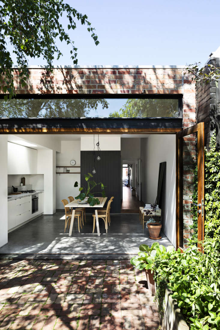
pipkorn klipatrick westgarth kitchen melbourne 4
Above: The center of the house is a bright kitchen and dining area with custom bifold doors and a transom window that fully connects indoors to out. The shotgun hallway was created by flipping the position of the original hall. The charcoal paneled partition hides the fridge and laundry.

The house dates to the 1890s and brick salvaged from the remodel was reused to pave the new terrace. The plantings include an herbs garden in an old wooden crate.

pipkorn klipatrick westgarth kitchen melbourne 2a
Above: A polished concrete floor adds to the indoor-outdoor vibe. The kitchen cabinets are a flat-pack design that Kilpatrick and her husband painted and assembled themselves—”we were on a tight budget”—and had their builder install. They’re finished with Carrara marble counters and Bosch appliances.

The small sink, Kilpatrick says, is scaled to the room: “it’s big enough to wash big pots and deep enough to hide dishes when doing a quick clean.”

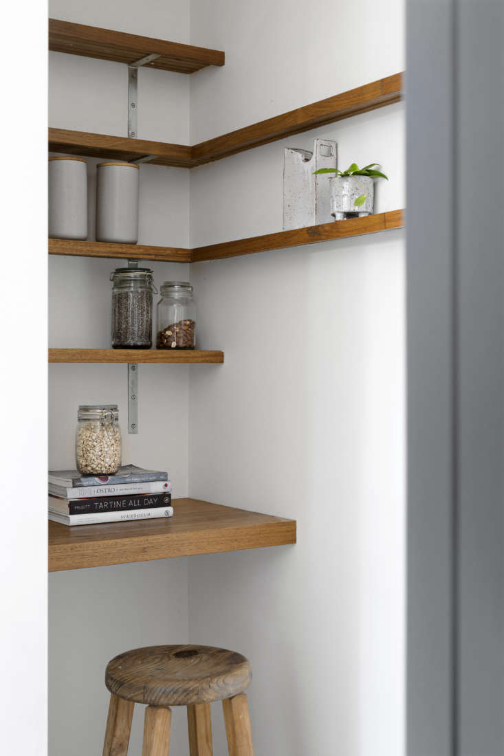
pipkorn klipatrick westgarth kitchen melbourne 1
Above: Kilpatrick carefully stuck to a palette of whites and grays offset by warm wood tones. A frameless skylight over the kitchen further brightens the space.” Note the pantry/work area tucked off the kitchen—the fridge stands out of view opposite the desk.
pipkorn klipatrick westgarth kitchen melbourne 7
Above: The nook is used as a place to study and to charge phones.
pipkorn klipatrick westgarth kitchen melbourne 6
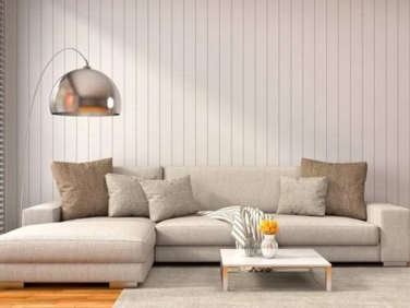
Above: The partition is composed of readymade V-groove paneling. (See others example in A DIY Kitchen Overhaul for Under $500 and DIY Beadboard Ceilings, Before and After.)
Easycraft EasyVJ Primed MDF Interior Wall Linings
pipkorn klipatrick westgarth kitchen melbourne 3
Above: The ash dining table is Hay’s Ypperlig design from Ikea surrounded by Thonet’s classic Hoffman Side Chairs. The hanging lights are Nud Classic Black Lamp Holders.
pipkorn klipatrick westgarth kitchen melbourne 5
Above: A tall mirror enhances the sense of space and brings the garden into the room. The purple potted plant is a smoke bush.
pipkorn klipatrick westgarth kitchen melbourne 8
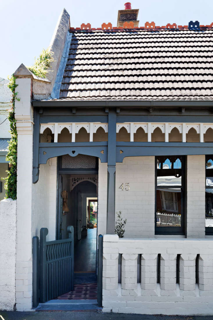
Above: The little brick house retains its Edwardian crenellations and other period detailing—and now has a front-door view out to the garden.
pipkorn kilpatrick westgarth kitchen after layout
Above: The floor plan shows the new kitchen-dining setup and artfully relocated laundry and full bath (which had formerly occupied the back). “We flipped the hall through to the kitchen so you could see the rear garden from the front of the house—and avoid walking diagonally through the living room,” says Kilpatrick.

Craving outdoor access? Here are three more remodels that connect kitchen to garden:

(Visited 1,854 times, 1 visits today)
You need to login or register to view and manage your bookmarks.

Product summary  

Have a Question or Comment About This Post?

Join the conversation

v5.0