Icon - Arrow LeftAn icon we use to indicate a rightwards action. Icon - Arrow RightAn icon we use to indicate a leftwards action. Icon - External LinkAn icon we use to indicate a button link is external. Icon - MessageThe icon we use to represent an email action. Icon - Down ChevronUsed to indicate a dropdown. Icon - CloseUsed to indicate a close action. Icon - Dropdown ArrowUsed to indicate a dropdown. Icon - Location PinUsed to showcase a location on a map. Icon - Zoom OutUsed to indicate a zoom out action on a map. Icon - Zoom InUsed to indicate a zoom in action on a map. Icon - SearchUsed to indicate a search action. Icon - EmailUsed to indicate an emai action. Icon - FacebookFacebooks brand mark for use in social sharing icons. flipboard Icon - InstagramInstagrams brand mark for use in social sharing icons. Icon - PinterestPinterests brand mark for use in social sharing icons. Icon - TwitterTwitters brand mark for use in social sharing icons. Icon - Check MarkA check mark for checkbox buttons.
You are reading

Kitchen of the Week: A Designer’s Own Ikea Hack Kitchen in Provence, Before and After

Search

Kitchen of the Week: A Designer’s Own Ikea Hack Kitchen in Provence, Before and After

March 21, 2019

Ilaria Fatone is an interior stylist and blogger who grew up in Milan, lives in Provence, and has a fondness for the sun-suffused Scandinavian look. Those influences all came into play when she was performing a total redo of her family’s galley kitchen in a ground-floor apartment that had been unchanged since it was built in 1969.

“The renovation keywords were fluidity and coherence,” she says. “But my main intention was to bring in the maximum amount of natural light, and that was quite a challenge since the kitchen faces north.” Her solution? A high/low mix of clean-lined pale wood cabinetry—Ikea on the inside, custom on the out—Corian counters, a polished white concrete floor, and an ingenious sliding glass door. “It’s an open kitchen you can close—and it still looks open.” Join us for a guided tour, plus a look at Ilaria’s Before and In Progress shots.

Photography by Ilaria Fatone.

After

a wood  and glass paneled sliding door creates a clever division between the ki 17
Above: A wood- and glass-paneled sliding door creates a clever division between the kitchen—approximately 117 square feet—and the living-dining area.

Ilaria softens the look of both spaces with plants and baskets, here in artful combination.
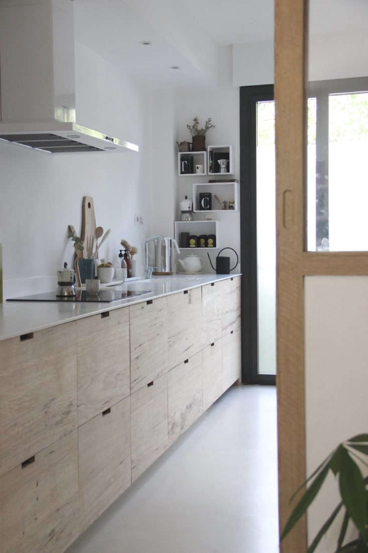
 &#8\2\20;it&#8\2\17;s an ikea kitchen structure that i dressed up 18
Above: “It’s an Ikea kitchen structure that I dressed up with tailor-made wooden drawer fronts,” says Ilaria of the under-counter storage.

Her carpenter first made the room’s sliding door partition, and she liked the look of it so much that she had him use the same hardwood, Western African fraké, on the drawers. “We kept them raw and minimal with no handles, just a gap to slip your hand in.” (Go to Cutout Cabinet Pulls to see a range of options.) The wall-hung shelves are painted plywood shipping boxes: They come with Ilaria’s subscription to Designer Box (a design surprise a month delivered to your door).

indestructible, bright white corian counters were ilaria&#8\2\17;s biggest& 19
Above: Indestructible, bright white Corian counters were Ilaria’s biggest expense: “They reflect the light.” In Remodeling 101, read up on Corian (and Corian Look-Alikes).

The Corian sink is notably European scaled: “We didn’t need a bigger one; we didn’t want it taking up too much space.” The faucet is a Brive from French brand Jacob Delafon.

evidence that a stylist is in residence: a wooden tray anchors a tidy ense 20
Above: Evidence that a stylist is in residence: A wooden tray anchors a tidy ensemble of kitchen accessories. The cutting board is the Slice by Heerenhuis of Antwerp.
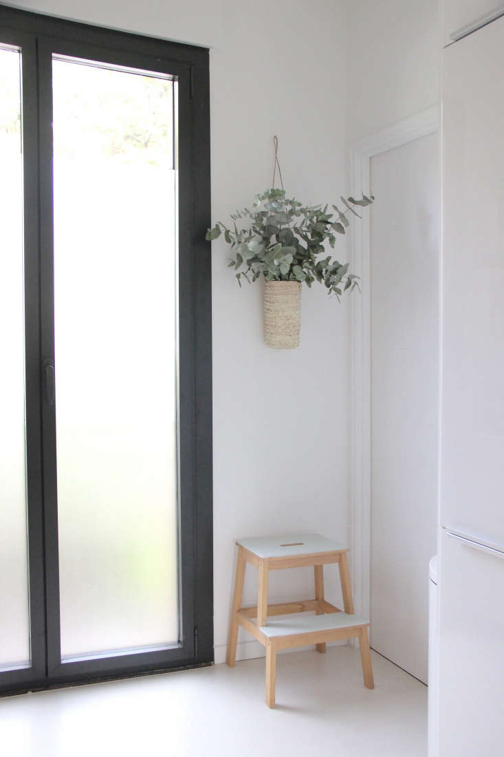
newly installed aluminum framed glass doors replaced the old side entrance and  21
Above: Newly installed aluminum-framed glass doors replaced the old side entrance and bring more light into the room.

The doors overlook the street, so for privacy, Ilaria applied an inexpensive, removable matte plastic Window Film to the glass. It mimics frosted glass and “keeps the look minimal.” The hanging basket and market basket below are from Jamini Design, a Paris importer of Indian designs.

on the opposite side of the room, ikea ringhult cabinets in glossy white create 22
Above: On the opposite side of the room, Ikea Ringhult cabinets in glossy white create a workhorse storage system.
In addition to hiding the fridge and freezer, the setup has pantry and storage shelves and incorporates a stacked microwave (top) and wall oven by German brand De Dietrich, which also made the induction cooktop and minimalist white hood.

the fridge (from ikea) is on the left and the freezer is below the wall oven.th 23
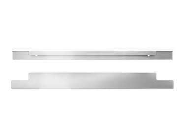
Above: The fridge (from Ikea) is on the left and the freezer is below the wall oven.The aluminum cabinet pulls are Ikea Blankett handles.
when the sliding door is closed, it &#8\2\20;makes one with the glass wall, 24
Above: When the sliding door is closed, it “makes one with the glass wall,” says Ilaria.

A Corian shelf tucked between the storage unit and wall serves as a breakfast nook and hangout spot. The stool is Hay’s About a Stool.

southern italian baskets that belonged to ilaria&#8\2\17;s grandmother  25
Above: Southern Italian baskets that belonged to Ilaria’s grandmother hang over the table. “They’re for drying fresh pasta, but I use them as trays when we eat outside, and the rest of the time, they give the kitchen a bohemian touch.”

Before

the kitchen was an unharmonious mix of homey elements when ilaria and fami 26
Above: The kitchen was an unharmonious mix of homey elements when Ilaria and family bought the apartment.
 a door closed off the space from the living room. 27
Above: A door closed off the space from the living room.

In Progress

ilaria wanted to begin fresh and put every inch to use. 28
Above: Ilaria wanted to begin fresh and put every inch to use.
the existing terracotta tiles were removed mostly intact. 29
Above: The existing terracotta tiles were removed mostly intact.
how to open up a galley kitchen: step one of the sliding glass door panel. 30
Above: How to open up a galley kitchen: Step one of the sliding glass door panel.

Go to Ilaria Fatone to see more of the project.

For more small kitchen inspiration, take a look at:

N.B.: This post is an update; the original story ran on May 11, 2017.
(Visited 8,030 times, 1 visits today)
You need to login or register to view and manage your bookmarks.

Frequently asked questions

What is the article about?

The article is about how to remodel a galley kitchen using IKEA hack ideas.

What is a galley kitchen?

A galley kitchen is a long, narrow kitchen that usually has counters and appliances on either side.

What is an IKEA hack?

An IKEA hack is a creative way to customize and repurpose IKEA furniture or accessories to suit your needs.

What are some examples of IKEA hacks used in the article?

Some examples include turning a bookshelf into a pantry, using an IKEA rail system as a spice rack, and repurposing IKEA dining chairs as bar stools.

What is the budget for this kitchen remodel?

The budget for this kitchen remodel is around $4,000.

What are some tips for designing a galley kitchen?

Some tips include maximizing storage space, using light colors to create an illusion of more space, and focusing on functionality over decor.

What is the overall design aesthetic of this kitchen remodel?

The overall design aesthetic of this kitchen remodel is modern and minimalist, with a Scandinavian influence.

What is the takeaway from this article?

The takeaway is that with some creativity and DIY skills, it's possible to transform a small galley kitchen into a functional and stylish space without breaking the bank.

Product summary  

Have a Question or Comment About This Post?

Join the conversation

v5.0