Icon - Arrow LeftAn icon we use to indicate a rightwards action. Icon - Arrow RightAn icon we use to indicate a leftwards action. Icon - External LinkAn icon we use to indicate a button link is external. Icon - MessageThe icon we use to represent an email action. Icon - Down ChevronUsed to indicate a dropdown. Icon - CloseUsed to indicate a close action. Icon - Dropdown ArrowUsed to indicate a dropdown. Icon - Location PinUsed to showcase a location on a map. Icon - Zoom OutUsed to indicate a zoom out action on a map. Icon - Zoom InUsed to indicate a zoom in action on a map. Icon - SearchUsed to indicate a search action. Icon - EmailUsed to indicate an emai action. Icon - FacebookFacebooks brand mark for use in social sharing icons. flipboard Icon - InstagramInstagrams brand mark for use in social sharing icons. Icon - PinterestPinterests brand mark for use in social sharing icons. Icon - TwitterTwitters brand mark for use in social sharing icons. Icon - Check MarkA check mark for checkbox buttons.
You are reading

The Ferry Boat Inn: 15 Ideas to Steal from a Seaside Pub in Cornwall

Search

The Ferry Boat Inn: 15 Ideas to Steal from a Seaside Pub in Cornwall

January 16, 2018

Everything about The Ferry Boat Inn in Cornwall, England, is charmingly faded, as if it has seen many summers on the salty coast. And it has: The pub is housed in a 300-year-old building on a cove in the fairytale coastal village of Helford Passage, near Falmouth, and within the Cornwall Area of Outstanding Natural Beauty.

The pub, as it’s now known (it was formerly an inn, hence the name), was recently transformed and reopened by two couples, Kate and Ben Towill of Charleston-based Basic Projects (co-owners of Remodelista favorite The Fat Radish) along with Ben’s brother, Alex, and his wife, Sarah. “When Alex, a well-known chef in Cornwall, told us this pub was available, Ben said to me, ‘This is the one,'” according to Kate. The family had a personal history with the place: “Alex, Sarah, and Ben all knew this pub from their childhood; it was where they went for special occasions,” she adds. They set about transforming the interiors, using old photos from the late 1800s as a guide and taking new inspiration from red-sailed boats, the moss and palm trees that grow on the cove, and a favorite 1970s film. The hitch? They had six short weeks to transform it. Here’s how they did it—plus 15 ideas to steal.

Photography by Mae Pate, except where noted.

1. Find inspiration in unlikely places.

the cove. the team took inspiration from a surprising source: swallows & am 17
Above: The cove. The team took inspiration from a surprising source: Swallows & Amazons, a favorite childhood film from 1974. “Its sense of adventure, vintage seaside style, and faded colors was absolutely a guide,” says Kate. “I wanted the banquettes to look like a faded red sail cloth, like the sail of the children’s boat.”

2. Add a jaunty greeting.

when choosing house numbers or a mailbox, consider personality. sarah towill, t 18
Above: When choosing house numbers or a mailbox, consider personality. Sarah Towill, the illustrator and designer behind Ink & Honey, painted the pub’s sign in characteristic red. Photograph by Alex Towill.
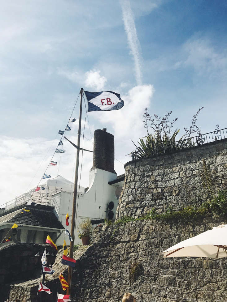
jaunty nautical flags hang outside. photograph by alex towill. 20
Above: Jaunty nautical flags hang outside. Photograph by Alex Towill.

3. Stick to a strict palette.

to add color to the interior, which has slate floors and rehabbed plaster walls 21
Above: To add color to the interior, which has slate floors and rehabbed plaster walls and fireplace, the team had custom cushions made in a palette of faded reds and blues: striped stool covers, faded red banquette cushions inspired by red sails, and plaid throw pillows.

4. Be subtly nautical.

the team wanted to take inspiration from the cornwall coast &#8\2\20;withou 22
Above: The team wanted to take inspiration from the Cornwall coast “without being too obviously nautical,” Kate says. The solution: red-and-white-striped curtains, old milk glass light fixtures, and, above, vintage sailing guides and flags that look like they’ve been there forever. With authenticity in mind, the team restored the paneling to look like it did when the building was an inn.
another playful nautical detail: wicker boat fenders from the \1970s. &#8\2 23
Above: Another playful nautical detail: wicker boat fenders from the 1970s. “We found those at a fantastic antique shop in Penzance called Steckfensters,” Kate says. “We weren’t sure exactly where they were going when we saw them, but we had to have them!” Hung from rope, they’re a nautical curio.

5. Opt for patina, not shine.

although authentic tarnish is a plus, substitute or supplement with new finds m 24
Above: Although authentic tarnish is a plus, substitute or supplement with new finds made to look well-worn: Behind the dining room banquette is a long, tarnished mirror that Kate and the team commissioned from a local glass manufacturer. (For a similar style, see Bespoke Vintage-Style Mirrors from a Small London Workshop.)

6. Evoke portholes with round windows.

small hatch windows, painted in a robin&#8\2\17;s egg blue, is another subt 25
Above: Small hatch windows, painted in a robin’s egg blue, is another subtle nautical nod, as are the shell wall lights. (For more, see Beach House Chic: 9 Inspired Nautical Notes.)

7. One coat of plaster goes a long way.

for a new take on plaster, think thin, not layered. to restore the original loo 26
Above: For a new take on plaster, think thin, not layered. To restore the original look to the plaster archways and walls, the team added a “skim coat” using a traditional product called One Coat. “It’s common in English country homes and we don’t have it in the States,” says Kate. “I was trying to work out how I could take the massive bags back in my suitcase.”

8. Place vignettes in unexpected places.

shelves aren&#8\2\17;t just for arm&#8\2\17;s reach: a quirky high perc 27
Above: Shelves aren’t just for arm’s reach: A quirky high perch holds vintage books and finds, illuminated by a Hector Wall Light by Original BTC.

9. Repurpose vintage church furniture.

salvaged church pews and chairs are mixed with custom furniture by james adcock 28
Above: Salvaged church pews and chairs are mixed with custom furniture by James Adcock of Four Corners.

Many of the dining room chairs and benches are repurposed church finds. “The high back benches are pews from a church in Yorkshire from 1300; I found them on eBay,” Kate says. “We had planned to chop them up and use them as pew seating in the bar room. In the 11th hour, we decided to have one long bench along the wall, so we used pieces of these pews all over the pub. One was kept whole and used in the pub room [above], one pew was used as a vanity in the men’s washroom, and we even used a piece as the door for the electrical panel. The wood was so beautiful and old, we couldn’t waste it.” The dining room chairs are vintage chapel chairs with rush seating. (Another restaurant we love with chapel chairs: Via Carota in NYC; see Design Sleuth: Church Chairs in the Dining Room.)

10. Use local wood wherever possible.

when new materials are necessary, keep a connection to the area. &#8\2\20;t 29
Above: When new materials are necessary, keep a connection to the area. “The biggest change we made was removing the existing bar completely,” Kate says. They rebuilt it with “a gorgeous massive plank of white oak” from a local supplier (“We even got to watch it sewn down by big Joe, the owner,” she adds.) “The best comment we got on opening night was from a local who had owned the pub in the 1970s who came up to us and said, ‘Cheers for bringing my bar back.’”

11. Mix and match throw rugs under tables.
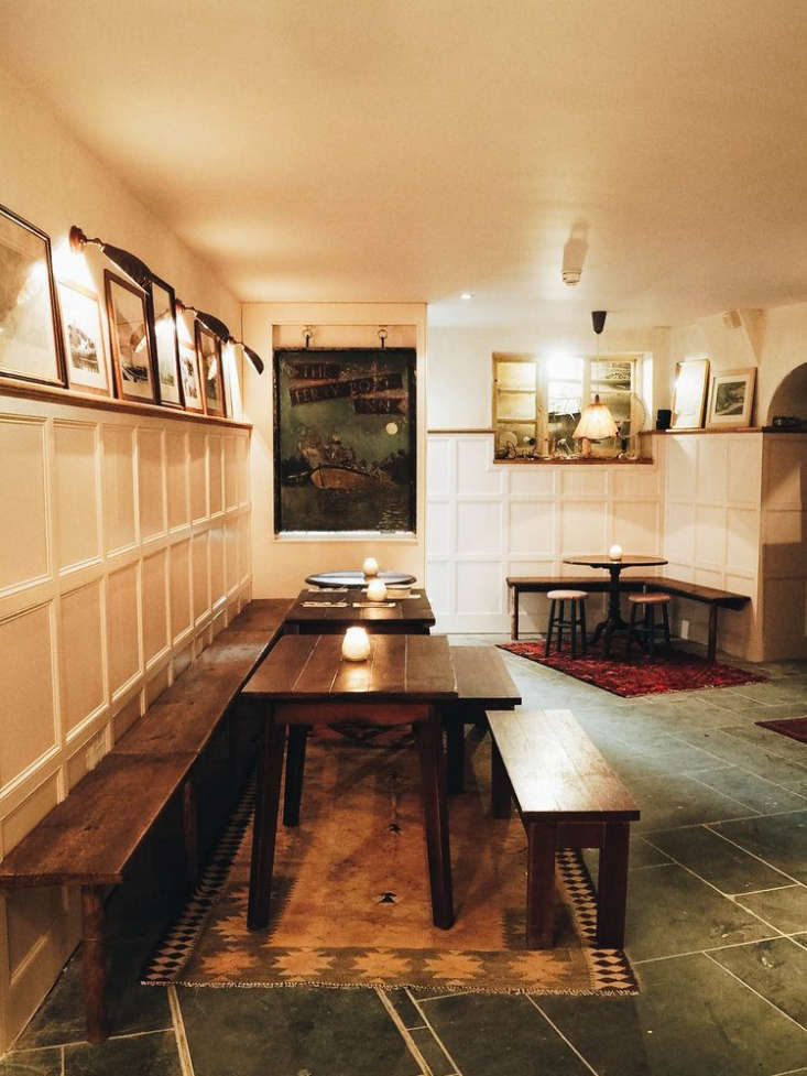
in the bar room, vintage rugs add color and divide the dining spaces. to get th 30
Above: In the bar room, vintage rugs add color and divide the dining spaces. To get the look at home, layer or mix and match smaller rugs, rather than opting for one large one. (Beyond the tables: the original Ferry Boat Inn sign.)

12. Practice communal design.

as the renovation went on, locals with an attachment to the storied pub wanted  31
Above: As the renovation went on, locals with an attachment to the storied pub wanted to contribute their memorabilia: “People would bring in photos of themselves in the 1970s as a teenage dishwasher at the pub, or as a baby on the beach with old cars in the background,” Kate says. The team framed the villagers’ photos alongside vintage maps and postcards and hung them in the bar. “Each photo has a personal story behind it,” Kate says.

13. Embrace kitsch.

one place where the maritime theme is not subtle: vintage hand painted lampshad 32
Above: One place where the maritime theme is not subtle: vintage hand-painted lampshades. Pick one campy detail to embrace: “I became slightly obsessed with vintage nautical wall lights and lampshades,” Kate says. “I had to have these shipped from the US, and Dave, our sparky, rewired them for English sockets.”

14. Keep raincoats at the ready.

by the door, a no frills wood plank fitted with hooks holds guests&#8\2\17; 33
Above: By the door, a no-frills wood plank fitted with hooks holds guests’ coats—a friendly touch at the pub or at home.

15. For beachside homes, a no-frills spigot cleans sandy feet.

outside, a simple spigot cleans beach pails and more, red lettering included. p 34
Above: Outside, a simple spigot cleans beach pails and more, red lettering included. Photograph by Alex Towill.
on the beach. 35
Above: On the beach.

The real trick to working on a tight time frame? A steady stream of tea. “Every few hours, we were asked, ‘Cuppa tea?,'” Kate says. “In the US, all the builders drink Red Bull or gallons of coffee. The English builders drink tea, and I swear it’s what kept them working at their sensible steady pace.”

For more charming, look-like-they’ve-always-been there UK restaurants:

N.B.: This post is an update; the original story ran on July 27, 2017.
(Visited 1,221 times, 1 visits today)
You need to login or register to view and manage your bookmarks.

Product summary  

Have a Question or Comment About This Post?

Join the conversation

v5.0