Icon - Arrow LeftAn icon we use to indicate a rightwards action. Icon - Arrow RightAn icon we use to indicate a leftwards action. Icon - External LinkAn icon we use to indicate a button link is external. Icon - MessageThe icon we use to represent an email action. Icon - Down ChevronUsed to indicate a dropdown. Icon - CloseUsed to indicate a close action. Icon - Dropdown ArrowUsed to indicate a dropdown. Icon - Location PinUsed to showcase a location on a map. Icon - Zoom OutUsed to indicate a zoom out action on a map. Icon - Zoom InUsed to indicate a zoom in action on a map. Icon - SearchUsed to indicate a search action. Icon - EmailUsed to indicate an emai action. Icon - FacebookFacebooks brand mark for use in social sharing icons. flipboard Icon - InstagramInstagrams brand mark for use in social sharing icons. Icon - PinterestPinterests brand mark for use in social sharing icons. Icon - TwitterTwitters brand mark for use in social sharing icons. Icon - Check MarkA check mark for checkbox buttons.
You are reading

9 Ideas to Steal from The Hoxton, Shepherd’s Bush, A Homey Hotel in West London

Search

9 Ideas to Steal from The Hoxton, Shepherd’s Bush, A Homey Hotel in West London

Courtesy of The Hoxton January 4, 2023

Sixteen years after The Hoxton debuted its first hotel in London’s hip Shoreditch area, the boutique hospitality brand has expanded to the eclectic west side of its hometown with a 237-room property on Shepherd’s Bush Green. Following in the neighborhood-driven footsteps of the Hoxton’s 11 other locations, the newest addition is designed specifically to fit into its surroundings—literally and figuratively.

In a concrete sense, the Hoxton team had to follow specific district guidelines to ensure the building’s facade would match its environment. Outside, the red brick exterior blends right in with the adjacent structures; meanwhile, the interior aesthetic was inspired by the locale’s residential zoning, music and entertainment industry roots, and diverse community.

“Shepherd’s Bush is between some quite posh neighborhoods, but it’s also a relatively gritty part of London,” explains Charlie North, the VP of interior design at Ennismore, The Hoxton’s parent company. “It’s got high-end residential all the way around it, so we wanted the bedroom design to be very residential. The public spaces reference the performing arts and the multicultural society.”

The combination of these hyper-local influences makes for a cozy, welcoming atmosphere that’s worth striving for in a home project, too. Intent on learning how to achieve this inviting vibe, I stayed at The Hoxton, Shepherd’s Bush this winter and chatted with North about nine ideas to steal from its design. Keep scrolling for my takeaways and his expert tips.

1. Incorporate arches.

the biggest challenge of working with a new building is the lack of historic de 17
Above: The biggest challenge of working with a new building is the lack of historic details. To make up for it, North incorporated architectural features reminiscent of the mid-20th century, when the nearby music scene was booming. “We’ve got the arches throughout the lobby and in the restaurant to help soften it and make it feel a little bit less industrial and less contemporary, to make it feel a little bit more authentic,” he says.

2. Pay attention to the backs of chairs.

the long, narrow lobby lends itself to small seating clusters that face the per 18
Above: The long, narrow lobby lends itself to small seating clusters that face the perimeter, which meant that North had to pay special attention to the backs of the furniture he sourced vintage and designed custom for the space. Ochre velvet, channel-tufted club chairs, and wood-framed armchairs stand up to the job.

3. Consider a mural.

whimsically painted and illustrated walls are in. so rather than hanging framed 19
Above: Whimsically painted and illustrated walls are in. So rather than hanging framed art, North commissioned local artist Colette LaVette to paint a vibrant mural in the lobby. The large-scale piece offers an inviting backdrop for both work and play.

4. Paint a colorful ceiling.

for the guest rooms, north went with a relaxing, neutral color palette—e 20
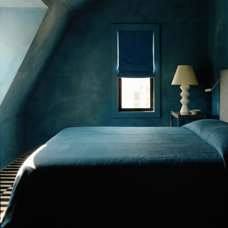
Above: For the guest rooms, North went with a relaxing, neutral color palette—except on the bold, semi-glossed ceilings. “It was important, just to give the room better personality and make it feel much more warm and cozy, to have a darker color on the ceiling,” he says. For a similar result at home, opt for a contrasting hue in a glossy finish.

5. Invest in a headboard.

every guest room in every hoxton hotel includes a statement headboard that& 21
Above: Every guest room in every Hoxton hotel includes a statement headboard that’s unique to its location. “It’s just the main feature in the room, really,” North says. “Here, we added that striped fabric detail to give it a bit of more of a residential feel.”

6. Pick a shape and repeat it.

for another playful nod to the mid \20th century, north incorporated wavy lines 22
Above: For another playful nod to the mid-20th century, North incorporated wavy lines throughout the guest rooms. The shape starts with the headboard’s twin humps and moves to the scallop-print throw pillow, undulating lamp shade, squiggly mirror, and metal dado rail that accommodates it.

7. Go for statement windows.

though most of north&#8\2\17;s decisions were based on the identity of shep 23
Above: Though most of North’s decisions were based on the identity of Shepherd’s Bush, he selected Crittall-style windows to honor The Hoxton’s signature look. “It goes back to some of our more our old-school properties, which have got that slightly industrial feel,” he says. “It adds a bit of distinction that makes it feel more elevated than just the plain glass window.”

8. Install dimmers everywhere—especially in the bath.

proper lighting is everything, down to the bulbs. &#8\2\20;we always make s 24
Above: Proper lighting is everything, down to the bulbs. “We always make sure that we don’t have spotlights—that’s our golden rule,” says North. “You don’t ever want lights shining directly on your face. You don’t want shadows, so we use wall lights, table lamps, and floor lamps to give a mixture of heights of lighting. It’s all within your eye level, not above you, looking down. The light bulb is really important, too. We’re using the latest LED technology, so they get warmer as you dim them, like an old filament bulb.”

9. Choose drapes with small prints.

north chose the small patterned curtains for their effect when the windows are  25
Above: North chose the small-patterned curtains for their effect when the windows are concealed. “When you close the curtains and you’ve got a wall of fabric, to have a big pattern actually makes the room feel smaller. We always try and do a smaller pattern on the drapery because it’s quite impactful. It’s basically a whole wall of your room,” he says.

For more on the property, head to The Hoxton Shepherd’s Bush.

And for more ideas to borrow from hotels worldwide, see:

(Visited 2,815 times, 1 visits today)
You need to login or register to view and manage your bookmarks.

Have a Question or Comment About This Post?

Join the conversation

v5.0