Icon - Arrow LeftAn icon we use to indicate a rightwards action. Icon - Arrow RightAn icon we use to indicate a leftwards action. Icon - External LinkAn icon we use to indicate a button link is external. Icon - MessageThe icon we use to represent an email action. Icon - Down ChevronUsed to indicate a dropdown. Icon - CloseUsed to indicate a close action. Icon - Dropdown ArrowUsed to indicate a dropdown. Icon - Location PinUsed to showcase a location on a map. Icon - Zoom OutUsed to indicate a zoom out action on a map. Icon - Zoom InUsed to indicate a zoom in action on a map. Icon - SearchUsed to indicate a search action. Icon - EmailUsed to indicate an emai action. Icon - FacebookFacebooks brand mark for use in social sharing icons. flipboard Icon - InstagramInstagrams brand mark for use in social sharing icons. Icon - PinterestPinterests brand mark for use in social sharing icons. Icon - TwitterTwitters brand mark for use in social sharing icons. Icon - Check MarkA check mark for checkbox buttons.
You are reading

Good in Bed: 8 Tips for a Better Bedroom, from Designer Pernille Lind

Search

Good in Bed: 8 Tips for a Better Bedroom, from Designer Pernille Lind

February 14, 2024

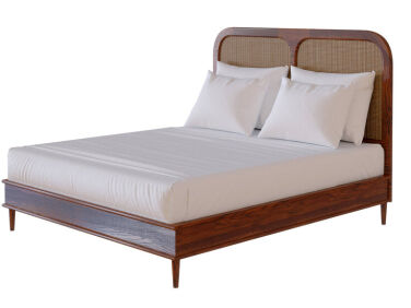
We first became fans of Pernille Lind back in 2017, when we covered the opening of Hotel Sanders, an intimate Copenhagen property she designed with her Lind + Almond co-founder Richy Almond. Of all the warm Scandinavian furnishings the duo used to transform three late-1800s houses into a cozy hotel, one stood out in particular: the custom European oak and rattan bed with a rounded headboard and tapered legs. This bed was (and remains) so beloved that the London-based pair started selling it on their website. And Pernille has been on our radar ever since.

Now, Pernille also has a solo design practice, Pernille Lind Studio, where she infuses (primarily) residential projects with her Danish and Thai roots and a strong mid-century modern foundation. Our favorite part of her work, though, is her ability to create bedrooms with that elusive hotel vibe. Again and again, she manages to replicate the feel of checking into a boutique guest room—and we found out how she does it.

Here, Pernille’s eight tips for building a better bedroom:

Photography by Joachim Wichmann, except where noted.

1. Keep to a muted palette.

for a soothing bedroom, pernille opts for muted tones like the beiges and dusty 17
Above: For a soothing bedroom, Pernille opts for muted tones like the beiges and dusty blues in this Danish beach house project. “I wouldn’t do high contrast, as you’re waking up and going to bed,” she says. “I wouldn’t want to have really white or really dark walls. I like anything that is that dusk or sunset toned. You could go with pastels or neutrals…whatever suits you. It’s all about winding down or easing into the day.”

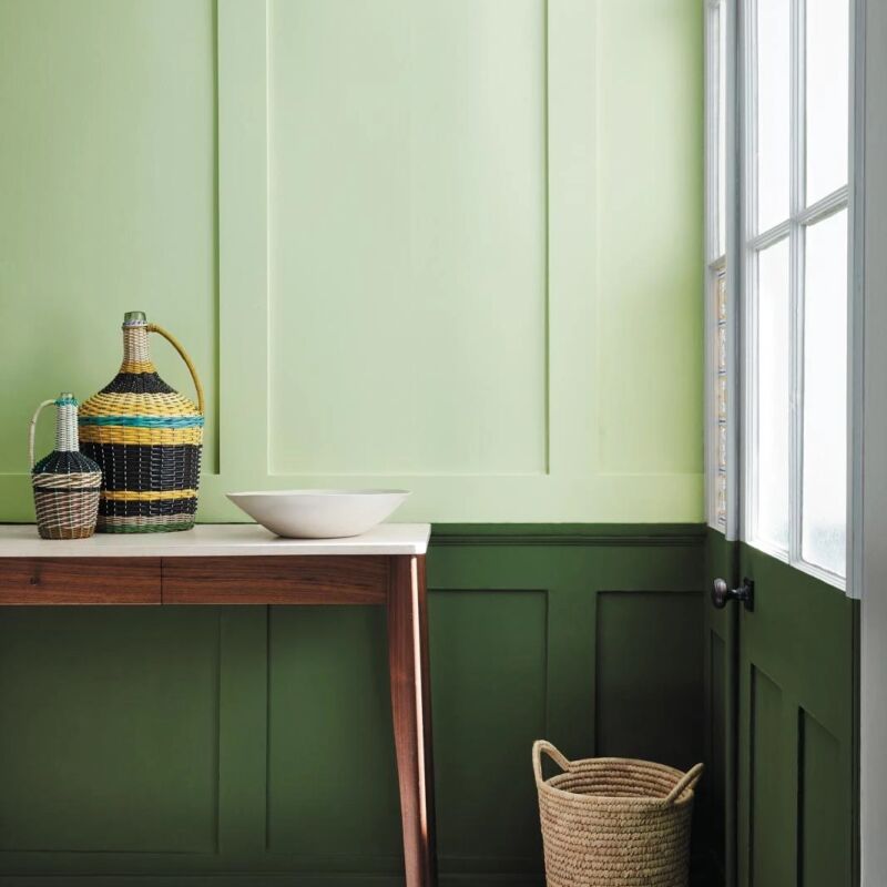
Her two favorite bedroom paint colors? Bath Stone by Little Greene, a light, dusty yellow, and Slipper Satin by Farrow & Ball, a pale off-white that she chose for her own bedroom.

2. You can’t go wrong with a headboard.

pernille is a believer in statement headboards: &#8\2\20;headboards are her 18
Above: Pernille is a believer in statement headboards: “Headboards are here to stay,” she says. “I’m always looking for one that’s in proportion with the height of the room and the size of the space. For example, the Sanders headboard was great for a hotel because you want that ‘wow’ factor, regardless of how small the rooms are. But for this beach house, I redesigned it to be smaller, lowering the headboard and slimming down the frame slightly to give it that understated design detail that mid-modern furniture would have. “

3. Rebrand bunk beds.

bunk beds can help squeeze in extra guests—of all ages. here, pernille&a 19
Above: Bunk beds can help squeeze in extra guests—of all ages. Here, Pernille’s custom oak bunk bed doesn’t look childish at all; with its bullnose details that she borrowed from the Sanders and Walford beds, it’s fully adult approved.

4. Be picky about rug placement.

pernille is particular about area rugs in bedrooms. &#8\2\20;i never have t 20
Above: Pernille is particular about area rugs in bedrooms. “I never have the rug fully under the whole bed,” she says. “The back legs and bedside tables never stand on the rug.” To replicate: “Pull the rug slightly forward from the bedside tables to look intentional. And obviously make sure there’s enough rug on either the side, so that when you get out of bed you still are standing fully on the rug.” Photograph by John and Maura Stoffer.

5. Shrink the bedside table.

especially in a compact bedroom, pernille likes tiny bedside tables that can ac 21
Above: Especially in a compact bedroom, Pernille likes tiny bedside tables that can accommodate just two things: a book and a glass of water. She designed these floating semicircular nightstands—shelves, really—for a Chicago bedroom with a specific spatial challenge: “There was an original radiator they didn’t want to lose, which I understand, but it was also in the way,” she says. “So we used the leftover marble from the kitchen island to create these half-moon tables. We painted them to match the walls, so they kind of disappear. A little bedside table is all you really need.” Photograph by John and Maura Stoffer.

6. Be a bedding minimalist.

for pernille, less is more when it comes to building a better bed. &#8\2\20 22
Above: For Pernille, less is more when it comes to building a better bed. “I keep it quite minimal,” she says. “Definitely two nice, fluffy, big pillows. Obviously, one double duvet makes the bed look really calm, but coming from Scandinavia, we’re very used to having individual duvets. It doesn’t dress as well, but I prefer it. I quite like cotton, if it’s good quality, and linen; it just needs to be not too thin.” Finally, resist bright white: “I’d choose something just off-white, not a hundred percent optic white. You can get oatmeal or ivory, which just takes off the edge. If you want to add a big, cozy, comforting wool throw, that can have a pattern or more of a color.”

7. Resist the spotlight.

pernille prefers diffused, indirect lighting in the bedroom. &#8\2\20;i alw 23
Above: Pernille prefers diffused, indirect lighting in the bedroom. “I always avoid any architectural lighting, spots, and glares from bulbs because a bedroom needs to be a soft, cozy, inviting space,” she says. “You can have a pendant over your bed, but I always make sure that it is not open at the bottom so that you can’t see the bulb. And it’s always on a dimmer. You could light corners with floor lamps and then wall lights on either side of the bed, if you wish to have something that doesn’t clog up your bedside table. I would also happily just have a few candles on my bedside table.”

8. Don’t forget to close the shades.

the power of curtains, drapes, and shades is not lost on pernille, who includes 24
Above: The power of curtains, drapes, and shades is not lost on Pernille, who includes them in every bedroom she designs. “Closing your curtains instantly blocks off the world and creates a new backdrop,” she says. “Window treatments are another way of adding some personalization, pattern, color, or more texture.” Photograph by John and Maura Stoffer.
pernille in her own bedroom. 25
Above: Pernille in her own bedroom.

More expert tips for building a better bedroom:

(Visited 12,115 times, 6 visits today)
You need to login or register to view and manage your bookmarks.

Product summary  

Have a Question or Comment About This Post?

Join the conversation

v5.0