Icon - Arrow LeftAn icon we use to indicate a rightwards action. Icon - Arrow RightAn icon we use to indicate a leftwards action. Icon - External LinkAn icon we use to indicate a button link is external. Icon - MessageThe icon we use to represent an email action. Icon - Down ChevronUsed to indicate a dropdown. Icon - CloseUsed to indicate a close action. Icon - Dropdown ArrowUsed to indicate a dropdown. Icon - Location PinUsed to showcase a location on a map. Icon - Zoom OutUsed to indicate a zoom out action on a map. Icon - Zoom InUsed to indicate a zoom in action on a map. Icon - SearchUsed to indicate a search action. Icon - EmailUsed to indicate an emai action. Icon - FacebookFacebooks brand mark for use in social sharing icons. flipboard Icon - InstagramInstagrams brand mark for use in social sharing icons. Icon - PinterestPinterests brand mark for use in social sharing icons. Icon - TwitterTwitters brand mark for use in social sharing icons. Icon - Check MarkA check mark for checkbox buttons.
You are reading

House Tour: A Flexible Pied-à-Terre in London for a Jewelry Designer and Her Family

Search

House Tour: A Flexible Pied-à-Terre in London for a Jewelry Designer and Her Family

June 13, 2018

London architect Eryk Ulanowski, who loves to collaborate with artists and makers, got something of a dream client when a Hong Kong jewelry designer commissioned him to design a pied-à-terre in London for her family. The designer and her husband, a financier, sometimes travel to London for work, and since their two children began attending school in nearby Oxfordshire, they’ve been spending more time in the city.

They had the space picked out (the homeowner’s parents own the apartment next door): a 1,450-square-foot flat on the fifth and sixth floors of an apartment building overlooking Covent Garden Market and the Royal Opera House. It already had three bedrooms with ensuite baths, and a living/dining/kitchen—everything the family needed—but had been built by a developer with “no design to speak of,” plus a windowless master bedroom and an unworkable layout for the bathrooms.

A soulless house wouldn’t do for the homeowner, who according to her architect “has impeccable style: very simple, but sharp and bold.” Her directive to him was simple, though she would be involved throughout the process: a home that represented her family, both in style and substance, with more light, room for dinner parties, and flexible design for growing kids.

Photography by Michelle Young, courtesy of Studio Ulanowski.
studio ulanowski london flat 13
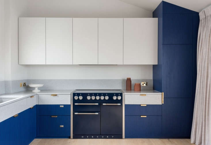
Above: The custom kitchen cabinets have oak interiors and hand-painted wood fronts. “We wanted to keep the grain of the wood and the brushwork showing through,” the architect says, “rather than use a sterile polyurethane spray.” Drawer pulls are Baston in unlacquered brass from A&H. The lighter-colored drawer fronts, backsplash, and countertop are all gray terrazzo from Diespeker.
The blue cabinet fronts are fluted via CNC machine, “echoing the cedarwood slats of the master suite” upstairs, visible at some angles from the kitchen via an interior window in the living room.

studio ulanowski london flat 6
Above: An Alley Dining Table in oak from Danish company Woud delineates the space between the kitchen and living room. The blue Diagonal Bench is from the same brand. The windows at right overlook impressive city views.
The father of the family is a lover of the outdoors and industrial design; though he was “relatively hands-off” throughout the process, Ulanowski says, he tried to blend his interests in machines and nature with his wife’s love of “clean lines and contrasts of vivid color.”

studio ulanowski london flat 7
Above: The dining table can be rotated, and two end extensions pulled out, to accommodate up to 12 diners. The leather lounge chair at the table is by Gareth Neal for The New Craftsmen.

During the initial design phase, Ulanowski developed two concepts: one was “bright, light, and colorful, the space broken down into a versatile, modular, and flowing design.” The second was “simple and muted, with wood and metal details, and a fluorescent pink Donald Judd–esque kitchen.”

“We knew which design the client would go for,” says the architect. “The second was more of a control design to keep us on track.”

studio ulanowski london flat 10
Above: The blue credenza that runs the length of the living room is a Scorched Shake Sideboard by Sebastian Cox for The New Craftsmen. The entrance to the main living space is through a dramatic, double-height arched doorway. The master suite looks over the living space through the bank of green-framed windows above.
studio ulanowski london flat 11
Above: Linking the flat’s two floors is a dramatic blue perforated aluminum staircase by fine art fabricator Joseph Waller. It is inspired by “the iridescence of a butterfly wing; the soft, sculptural folds of Issey Miyake’s iconic clothing; and the mechanical design of motorbike engines,” the architect says. It was an engineering feat that took more than a year of experimentation and testing to fabricate.

The front door is located to the left, under the stairs, and the door leads to one of two kids’ bedrooms on the first floor.

studio ulanowski london flat 16
Above: The New Craftsmen’s Jochen Holz and Malgorzata Bany designed a light installation of neon and Jesmonite for under the stairs. Holz was “particularly interested in how the two neon colors would interplay with the perforations of the stair,” says Ulanowski.
studio ulanowski london flat 15
Above: The boy’s bedroom, which has an ensuite bathroom with terrazzo floors.
studio ulanowski london flat 5
Above: The girl’s bedroom has a hidden desk tucked inside the wardrobe.

In the two downstairs bedrooms and small entry hall, a colored strip is painted on the lower halves of the walls. These rooms are actually sunken, relative to the main living room and kitchen, and the paint strip corresponds exactly to the degree they’re proverbially “underground.” “As the main living space and its views were so important, we wanted to keep a reminder of that connection in the back bedrooms,” Ulanowski says.

studio ulanowski london flat 9
Above: At the top of the stair is a landing with a laundry closet.
studio ulanowski london flat 1
Above: Cedarwood sliding doors and screens define the entrance to the master suite, with bathroom at left and sink on the right, part of a continuous, 26-foot-long wall of slatted wood joinery. “By hiding the sinks,” the architect says, “you didn’t feel like you were walking through the bathroom to get to the bedroom.”

The impetus for the screens is that the master suite is oriented for only one window, which was given to the sleeping space over the bathroom. But then the would-be bathroom space needed to accommodate a standing shower, sinks, the toilet, and an entrance to the suite—so the architect moved the sinks out of the original bathroom and opened up the walls via screens.

“We had to be very creative with the new layout of the master suite,” the architect says. “The key was to think differently about the boundaries of what the bathroom was and how separate it needed to be from the bedroom.”

studio ulanowski london flat 2
Above: Two Vola polished brass faucets empty into a terrazzo sink with a wall of handmade green Moroccan tiles from Emery et Cie behind.

“Taking reference from Japanese onsen (natural hot-spring baths), we wanted the delicate scent of the cedarwood to create atmosphere in the space,” the architect says.

studio ulanowski london flat 3
Above: A cedar closet runs continually along the back wall of the bedroom.
studio ulanowski london flat 12
Above: The lacquerware headboard on the master bed is by Pedro da Costa Felgueiras of The New Craftsmen. The homeowner steered the design, says Ulanowski: “We wanted this to be a sculpture in the middle of the bedroom.” Aimee Betts designed the gold silk and linen cushion, which has hand-braided, black and gold piping on its edges.

Before

ulanowski before photo 2
Above: The existing main living space “had no flow or interest,” says the architect.

Have a compelling transformation of your own? Don’t forget to enter our Considered Design Awards contest by submitting up to 10 photos of your project by Friday, June 22. There are separate contest categories for professional and amateur designers on both Remodelista and Gardenista, and winners get a $500 gift card to shop Schoolhouse.

F0r more favorite before and after projects from across our sites, see:

(Visited 786 times, 1 visits today)
You need to login or register to view and manage your bookmarks.

Product summary  

Have a Question or Comment About This Post?

Join the conversation

v5.0