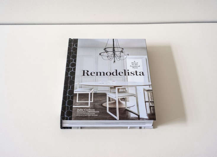
On a sunny morning last spring, our team–including photographer Matthew Williams, Francesca Connolly (carrying great bundles of leafy branches), and me with my notepad–arrived on the doorstep of Julianne Moore’s 1840s townhouse to photograph her just-finished kitchen for our book, Remodelista, A Manual for the Considered Home. It was our final shoot, planned months in advance with her talented architect (and brother-in-law), Oliver Freundlich, and it was the project that made the 400 pages suddenly feel complete.

Above: Scenes from Julianne Moore’s kitchen; photos by Matthew Williams. See pages 178–185 of Remodelista, A Manual for the Considered Home for a detailed look at the kitchen, complete with sourcing information down to the flatware and doorknobs.
Julianne led the way to the just-finished room, which feels like a glimpse into the future: a fully equipped, heart-of-the-house kitchen designed like a living room, with freestanding furniture-like cabinetry, large-scale contemporary photos hung gallery-style, and a Berber carpet under the table. It’s a room that’s at once formal and informal, welcoming and grand. “Isn’t it risky to have a shaggy wool rug in the kitchen?” we asked. “Actually, it’s incredibly forgiving,” she said. “Everything comes out of wool.”
She may be one of the great actresses of our day, but she moonlights as one of us: a design junkie (case in point: she acted as the shoot stylist, looking into the camera and readying every angle). Just get her on the subject of doormats, and you know she’s fully committed. During idle moments on movie sets, she told us, she strikes out in search of ceramics (“I like local pottery, utilitarian things”), such as the stoneware candelabra on her kitchen table, a find from the Mississippi Mud shoot near Marigold, Mississippi.

Above: Photograph by Alexa Hotz. Original photography shot with the Canon EOS 5D Mark III digital SLR. The filmmaker’s camera.
Over the years, Julianne has developed her own design rules–inspired in part by the spare yet warm aesthetic of Belgian architect Vincent Van Duysen (“I steal from his stuff all the time”)–which go something like this:
• Control the colors you allow into your life. The palette in the house (and even the backyard garden) is limited to ivory, gray, black, brown, and the occasional touch of purple. When she initially remodeled the townhouse 10 years ago, the first floor was done in shades of gray (shots of it buzzed around the web, inspiring copycat paint jobs the world over). But she started longing for a brighter outlook and went for an off-white: “It felt dark in here. White lets the furniture to pop.”
• Spotlight interesting textures. “Color is just not what I like to look at,” she says. “I like natural things.” Toward that end, a giant sea sponge rests on an Eames pedestal, antique turtle shells decorate the back wall, a brown sheepskin from the Union Square Farmer’s Market drapes over a wooden armchair, and a thrift store driftwood lamp stands like an animated scarecrow next to the sink. Also high on her list: natural materials like plaster, wax, rattan, and rice paper (the latter is what the room’s giant Noguchi lantern light is made of).

Above: Photograph by Alexa Hotz. Original photography shot with the Canon EOS 5D Mark III digital SLR. The filmmaker’s camera.
• Matte trumps shiny. Oliver knows never to suggest any finish that gleams. The counter is honed black granite. The backsplash is made from concrete squares that closely match the color of the wall. (And it was such a hard sell that Julianne only agreed to add it to the stove area; the kitchen sink is deep enough that it gets away without a backsplash.) And the table, a modern farmhouse design, has a vegetable-based finish that she points out is satisfyingly “super matte.”
• Art should be everywhere. It elevates a room and works its magic over a sink just as much as it does over a formal mantel (yes, the kitchen has one of those, too, a holdover from its days as a parlor). Currently on display: Large-scale photos by Jack Pierson, Ori Gersht, and Nan Goldin.
• Everything should be put to use–or else nixed. Julianne credits this philosophy to her mother: “I was a military brat and we moved a lot, but my mother knew how to pull together a room and liked a Scandinavian aesthetic. She inspired my interest in design.” The use-everything approach extends to the furniture: “Nothing should be so precious that children and dogs aren’t welcome on it.”

Above: Photograph by Matthew Williams.
Nice way to live, right? For a full exploration of the kitchen, see our new book, Remodelista, A Manual for the Considered Home, with a foreword written by Julianne Moore herself. And you can get copies autographed by Julie Carlson via Book Passage.
For a look at the kitchen in its former guise, go to Steal This Look: Julianne Moore’s West Village Living Room. Check out more of Oliver’s work at Oliver Freundlich Design.


Have a Question or Comment About This Post?
Join the conversation (9)