“I don’t think there’s been anybody in my house who hasn’t said, ‘Sign me up’ after ten minutes,” architect Barbara Chambers says, referring to her minimal, almost extreme tidiness. “I design houses to be about having what you need, and nothing more.”
After more than 20 years as a residential architect in Mill Valley, California, Barbara got the chance to design her dream home when she found a too-large lot in the neighborhood and convinced the owner to split the property so she could buy half. On it, she designed a house “that is actually quite small”—2,500 square feet of daily living space, plus a separate, rentable unit perched on top of the garage.
“I designed the house the way I am,” Barbara says, “tidy and simple and straightforward, with no frills.” With children grown and gone, Barbara created a simple floor plan to accommodate herself and her husband, focusing on what mattered to her most: flow, light, and symmetry. Let’s take a closer look.
Photography by Andres Gonzalez for Remodelista.


The living room wall sconces are from Boyd, and the flooring throughout is wire-brushed, fumed oak with a simple oil finish. Barbara used Farrow & Ball paints everywhere: Clunch, her “all-time favorite,” is used in the living room.

The stainless steel hood is custom-made by commercial supplier Berlin Food Equipment in San Francisco. The countertop is statuary marble and the kitchen faucet is from Lefroy Brooks. The wood stools were made by a San Francisco artist.

“I wanted my kitchen to be an example for clients to visit and experience what a minimal kitchen feels like,” she said. When shown a simple kitchen on paper, Barbara reports, clients often think it’s not big enough. “But once they see it in person, they realize it’s plenty big. All their needs are met, just not in a standard way.”


A rolling ladder in the pantry leads to an apartment unit above the garage. That unit has its own separate, private entrance; the ladder is the only access point between the apartment and the interior of the house, and it can easily be closed off. The ladder is mainly used (and loved) by grandkids when they come to stay.

“I wanted to do something different with the pantry,” Barbara says. “I realized this could be a fun design if I focused on what it looked like instead of what I was going to stuff in there.”
For starters, she says, pantries are typically dark, and “it doesn’t feel good to be in them.” She knew she wanted to flood hers with light. “Wherever there is light coming in, that pulls you out into the garden.”

“I’m a devoted follower of Marie Kondo,” Barbara says, referring to the author of the cult-hit organization tome The Life Changing Magic of Tidying Up. “I was doing that before the book came out and was pleased to see someone else validate it.” (The book in a sentence: Only keep things you love and that bring you joy.)
To Barbara, the concept extends even to food. “I buy only what I need,” she said, “and I celebrate it.”

Barbara is part architect, part organization coach to her clients. She gives Kondo’s book to each one before starting work, and “if it doesn’t light a fire inside them, they’re not the clients for me and we’re not going to get along,” she says. “Most people want that, they just don’t know how to achieve it.”
“When clients tell me they need storage space for their eight sets of China, I tell them we’re getting rid of seven.”

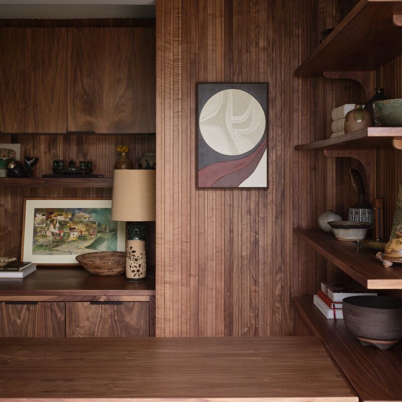
“Every house needs this space,” said Barbara: “The entry the family uses ninety percent of the time, where everyone can hang coats and take their shoes off.” Hanging pegs installed in the wood trim hold coats and dog leashes, and storage cabinets are recessed into the paneling to look like part of the wall.


“There’s always more space behind something,” she says. “Try to use every nook and cranny you can find.”

“All of these things together—the openness, the minimal detailing, the axial relationships—make for a really nice house,” she said. “They all speak to the same vocabulary.”


See a full tour of Barbara’s garden on Gardenista in Architect Visit: Barbara Chambers at Home in Mill Valley.
Browse more architecture projects in:
- In California Wine Country, A Modern Farmhouse for a Brit and a Texan
- The Artful Shoebox Apartment, Workstead Edition
- A Light-Filled Writing Studio (plus Outdoor Shower) for a London Author


Have a Question or Comment About This Post?
Join the conversation (9)