Last week, on a snow escape in LA, my mother, sister, and I made a pilgrimage downtown to visit Dosa and inspect the overnight gentrification we’d been hearing about. “Well, this is a bit of ghost town,” my mother said as we hobbled along gritty South Broadway. And then we spotted in quick succession, the sparkling new Acne Studios boutique and Hello LA on the side of very grand tower. We followed the greeting and found ourselves in the exalted lobby and cafe of the new Ace Hotel. “Now it feels like we’re on vacation,” my mother said, approvingly taking in the Ace’s surprising mix of opulence, functionality, and wit. How we wish were still there.
Our photographer friend Laure Joliet dropped in on the Ace on a blue sky day just after we did, camera in hand. Here’s her visual report (and apologies to all of you who are snowbound, we don’t mean to torment you).
Photographs by Laure Joliet for Remodelista.
EXTERIOR & LOBBY

Above: According to the Ace team, the Spanish Gothic design of its building, the 1927 United Artists theater and adjoining tower, was inspired by “Mary Pickford’s love for the ornate detail and stone spires of Spanish castles and cathedrals.” The 13-story structure served over the decades as Texaco’s headquarters and, more recently, as as a Christian ministry center (complete with giant neon “Jesus Saves” sign, still intact). Reborn as the latest outpost of the Ace Hotel, it anchors a formerly barren stretch of Broadway in Downtown LA, now in the midst of a dramatic revitalization.

Above: The lobby’s new doors are adorned with stenciling and original Gothic trefoils–the Ace way is to combine historic details with affordable contemporary flourishes, which it terms “a mixture of reverent awe and irreverent independence.” The Ace LA is the sixth Ace (the upstart group also has locations in Portland, Oregon, NYC, Palm Springs, Seattle, and London).

Above: The entry has a cathedral-like feel. The extraordinary remodel and recasting of the building is the work of LA design collective Commune led by project designer Roman Alonso and his business partner Pam Shamshiri. Summarizing the three year project, Alonso says, “We stripped down the interior of the tower and discovered a modernist, brutalist concrete structure. We recreated it from there, looking to LA’s mishmash of Gothic historic styles and also the work of LA modernists. We wanted it to be the voice of LA.”

Above: A view of the lobby through a newly created arched entry with original restored plasterwork that once surrounded movie posters. The black and white tiles are cement.
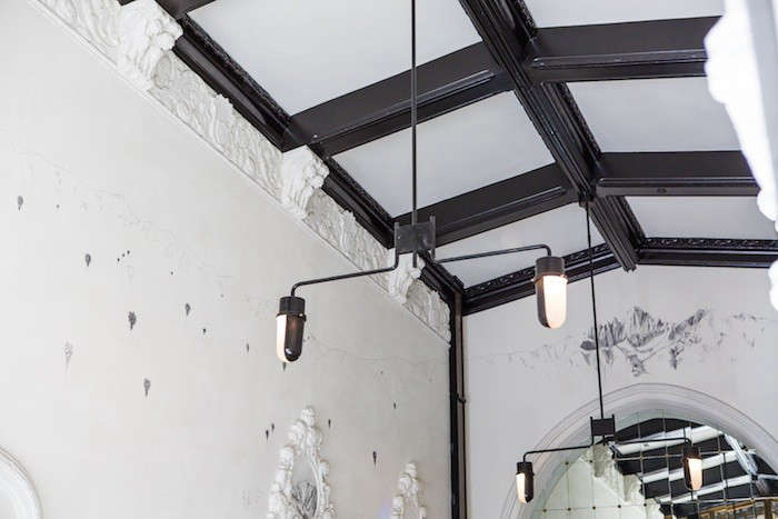
Above: Pencil drawings by the Haas Brothers–28 year old twins in LA who collaborate on art and design–adorn the walls. “We asked them: if there were cave paintings of life in LA over the last 100 years, what would they look like?” says Alonso. They responded with graphite glyphs of missile-like floating palms, personalities (Diane Keaton, Ed Ruscha, Abbot Kinney), and local mountain ranges (visible over the front door). As with all Ace hotels, local artists and artisans were recruited to have a hand in all the details.

Above: The reception desk was built by the Haas brothers using carved paneling salvaged from an office in the building; they carved their own swirling pattern into the wood and inset oil paintings of palm trees in the smog.

Above: “The lobby was an exercise in covering up ugly ducts and mechanical stuff,” confides Alonso. Commune inventively responded to the challenge by turning perforated metal into retail display areas. The grand looking paneled ceiling is a stage set of sorts: inexpensive black-painted homasote crowned with shelves that display theater books (accessed, if necessary, by ladder). My mother, sister and I were so taken with it all that we crowded into the lobby photo booth and then splurged on an Ace Sweatshirt (for my son whose nickname is Ace).
RESTAURANT
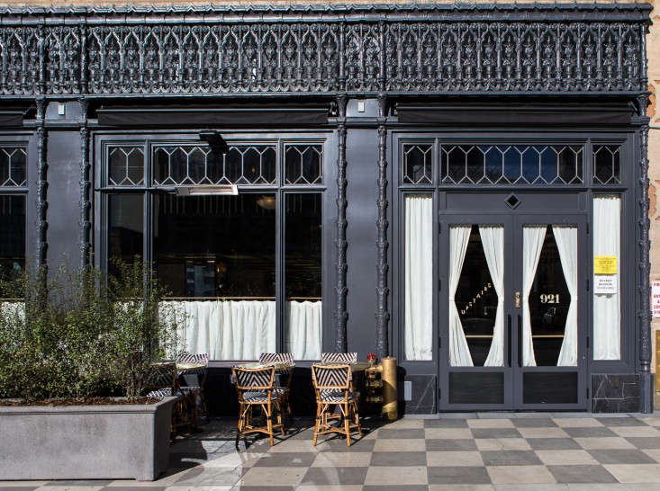
Above: Commune restored the building’s iron grillwork and entirely created a storefront for the in-house restaurant, LA Chapter. The checked sidewalk is original.
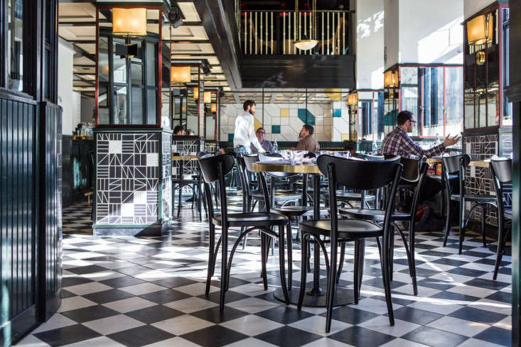
Above: LA Chapter is from the team behind Brooklyn hotspot Five Leaves. It’s furnished with classic Thonet Banana chairs and custom tables with brass tops and Adolf Loos-style sconces. “It’s meant to evoke a Viennese coffee house built in LA in the late 1920’s,” says Alonso.

Above: The coffee window–we recommend pairing a pot of Earl Gray with the house ginger cookies, which are both sweet and salty and the best any of us had ever tasted. More of the Haas brothers’ drawings are visible in the restaurant–inspiring my artist sister to text her husband and alert him that she plans to start sketching all over their house.

Above: Patterned tiles–yet another detail we’d like to bring home, and it turns out we can. Inspired by the work of Brazilian artist Burle Marx, they’re part of Commune’s Sitio Collection from Exquisite Surfaces. (Have a look at Commune’s wood floors from Exquisite Surfaces here.)

Above: A counter situated by the elevator has a stained glass view into the restaurant. The glass is the work of The Judson Studios, a fifth generation workshop in LA’s Highland Park. Commune wanted to feature a Mondrian-esque design, but the local Historic Preservation Society (which oversees the landmarked theater) insisted on something Gothic–”so we blew up a Gothic design and turned it on its side,” says Alonso. See more in our recent post Downtown LA’s Splashiest New Restaurant.
MEZZANINE

Above: Two sizes of tongue and groove paneling–3 inch and 9 inch–were used in the restaurant and stair that leads to a satellite sitting area. The woodwork is painted a dark green that reads almost as black–a shade modeled after Fine Paints of Europe’s Color 7589.

Above: The mezzanine overlooks the restaurant (and offers table service). The rattan chairs are vintage and the 1950s sofa is upholstered in a signature Ace material, recycled army tent fabric.

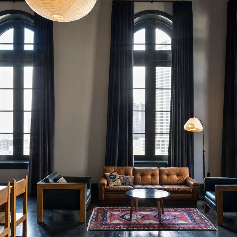
Above: In lieu of lounging in the lobby, the mezzanine offers a variety of seating options.
ROOMS

Above: Witty DIY wallpaper: each landing is decorated with wheatpasted pages from old Hollywood scripts that provide a backdrop for stenciled signage.

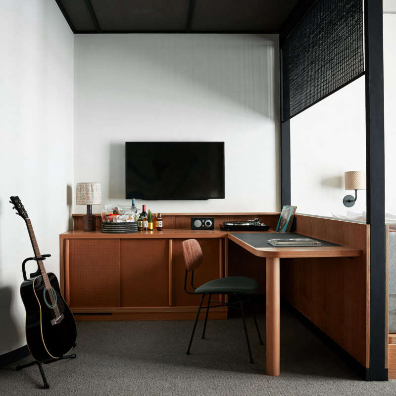
Above: The guests rooms take their cues from the modernist designs of LA architect Rudolph Schindler, and also make great use of economical materials. Walls are paneled with homasote boards for warmth, texture, and sound proofing. (An age-old green material made of paper pulp–and a Schindler favorite–the panels are affixed with steel screws and leather construction washers.) The built-in furniture is inexpensive and durable MDF that’s been stained black. Aside from the Noguchi globes, all of the lighting in the hotel is by Atelier de Troupe, one of our LA favorites.

Above: “We maintained as much of the original concrete, as we could; it had so much character,” says Alonso. In contrast to the industrial ceilings, the beds have custom Mondrian-patterned Pendleton blankets, available from the Ace gift shop. The carpeting is in a midcentury color Commune dubbed “Grandma gold.” There are a total of 182 rooms, and a lucky few come with acoustic Martin guitars.
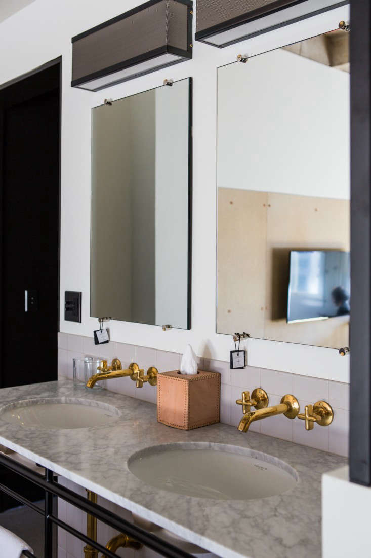
Above: A double sink with a honed Carrara marble top rests on a steel base that was inspired by the balconies of the Bauhaus in Dessau, Germany. The cross-handled faucets are unlacquered brass from Waterworks’ .25 Collection. The custom mirrors each have a support that doubles as hook for hanging soap. The tissue box is stitched saddle leather made in Mexico for Commune.
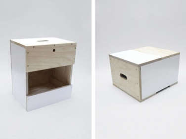
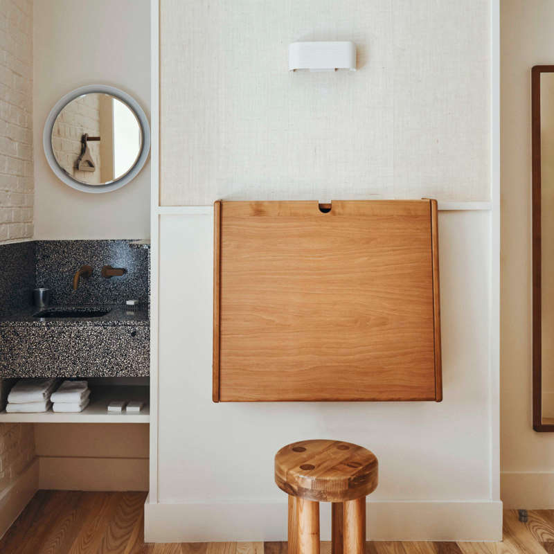
Above: In order to incorporate showers into small guest rooms, the designers installed steel and glass partitions in place of walls. What looks like a shoeshine stool is the work of the Moreras, a father and son team in Culver City, who spent two years making more than 200 for the Ace. (The Morera Work Box, in a patchwork of woods and laminates, is available from the Commune Shop.) For more on the Ace bathrooms, see our recent Steal This Look.

Above L: The Do Not Disturb sign reinvented in particle board. Above R: A braided saddle leather TP holder. Handmade in Mexico, it hangs from a bolt and hook–”not the easiest thing to install,” says Alonso, “It’s secured to dry wall with blocking behind it. Like so much that’s here, it really had to be engineered.”
For reservations, go to the Ace Hotel.
We’ve loved and visited all of the Ace’s outposts; have a look at our Ace Hotel posts, including the hotel that launched the look, the Ace in Portland, and the Ace Hotel Shoreditch, which opened in London this past fall.



Have a Question or Comment About This Post?
Join the conversation (7)