Icon - Arrow LeftAn icon we use to indicate a rightwards action. Icon - Arrow RightAn icon we use to indicate a leftwards action. Icon - External LinkAn icon we use to indicate a button link is external. Icon - MessageThe icon we use to represent an email action. Icon - Down ChevronUsed to indicate a dropdown. Icon - CloseUsed to indicate a close action. Icon - Dropdown ArrowUsed to indicate a dropdown. Icon - Location PinUsed to showcase a location on a map. Icon - Zoom OutUsed to indicate a zoom out action on a map. Icon - Zoom InUsed to indicate a zoom in action on a map. Icon - SearchUsed to indicate a search action. Icon - EmailUsed to indicate an emai action. Icon - FacebookFacebooks brand mark for use in social sharing icons. flipboard Icon - InstagramInstagrams brand mark for use in social sharing icons. Icon - PinterestPinterests brand mark for use in social sharing icons. Icon - TwitterTwitters brand mark for use in social sharing icons. Icon - Check MarkA check mark for checkbox buttons.
You are reading

Hotel Panache: The Power of Jolie Laide Style

Search

Hotel Panache: The Power of Jolie Laide Style

February 21, 2017

Dorothée Meilichzon is an inventive Paris designer who dares to explore the concept of jolie laide, or unconventional beauty. “I’m not a gray-beige person,” she tells us. “I like layering colors, and finding—and setting—the limits of what is ‘too much.'”

Trained as an industrial designer (who was an exchange student at RISD and received the Maison & Objet Designer of the Year Award in 2015), she runs her own firm, Chzon, specializing in hotels—and to date has four Paris locations under her belt, including the neo-Deco Hotel Bachaumont. Her newest, the Hotel Panache owned by upstart hotelier Adrien Gloaguen, presented her with the challenge of working in a corner building with almost no right angles.

Photography courtesy of Hotel Panache.

located in the ninth arrondissement, near the folies bergères cabaret 17
Above: Located in the Ninth Arrondissement, near the Folies Bergères cabaret, Hotel Panache is in a late-19th-century building on the corner of Rue Geoffroy Marie and Rue du Fauborg Montmartre that, says Meilichzon, “has an unusual shape for Paris, it’s an acute angle.”

The structure’s proportions led it to be compared to New York’s 1902 Flatiron building and inspired Meilichzon to reference that era. And to deploy geometric shapes and patterns throughout, starting with the angular marble lobby counter trimmed in black and white. On the floor, mosaic tiling “shaped as open umbrellas” meets ebonized oak in a chevron pattern.

the in house bistro, restaurant le panache, has custom velvet upholstered  18
Above: The in-house bistro, Restaurant Le Panache, has custom velvet-upholstered banquettes detailed with brass banding.
burnt orange meets navy in the dining room, where the walls are tiled in a diam 19
Above: Burnt orange meets navy in the dining room, where the walls are tiled in a diamond pattern. “Orange and blue are complementary colors, so you don’t expect to see them together,” Meilichzon explains. “But they really help each other.”
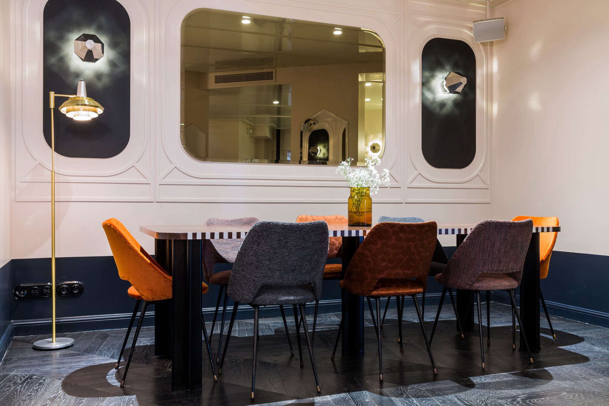
the sconces, here with diamond shaped shades, are set off by charcoal back 20
Above: The sconces, here with diamond-shaped shades, are set off by charcoal backdrops and framed by moldings. The dining chairs are vintage and newly upholstered in a variety of textured fabrics in oranges and blues.
the hotel has seven floors. the winding stair is carpeted in a custom pattern i 21
Above: The hotel has seven floors. The winding stair is carpeted in a custom pattern inspired by old coats of arms.
statement beds are one of meilichzon&#8\2\17;s specialities. there are 40 g 22
Above: Statement beds are one of Meilichzon’s specialities. There are 40 guest rooms and no two are designed exactly alike, but all have a custom iron-and-cane headboard modeled after Thonet bentwood chairs.
each room has a different wallpaper pattern, some designed by meilichzon,  23
Above: Each room has a different wallpaper pattern, some designed by Meilichzon, others from specialists such as Cole & Son. All rooms also have triangular mirrors hung from corners: “They were a good way to play with angles and reflect light,” says the designer, who notes: “Just about every piece of furniture, except the bed, is a triangle. It was very fun to do: There are so many angles, but you don’t even notice them anymore.”
the malachite wallpaper is a fornasetti pattern from cole & son. the in hou 24
Above: The Malachite wallpaper is a Fornasetti pattern from Cole & Son. The in-house wall phones are replicas of the Ericsson 1931 and the light-switch covers are black ceramic (for sourcing ideas, see Switched On).

Of her pattern play, Meilichzon explained in a Maison & Objet video: “Prints enable me to give layers of personality to a place. It’s a fun game to play: exploring the limits of vulgarity—it’s a kind of risk-taking and a challenge that I find interesting.”

meilichzon paired the wallpaper (her black and white arrow pattern is shown her 25
Above: Meilichzon paired the wallpaper (her black-and-white arrow pattern is shown here) with two-toned walls in blue and white with a brass-trimmed wainscot. Many of the rooms have angular vanity tables. The brass pendant lights were made for the hotel by Atelier Areti (see 7 Favorites: Minimalist Brass Pendants and Avian-Inspired Lighting).
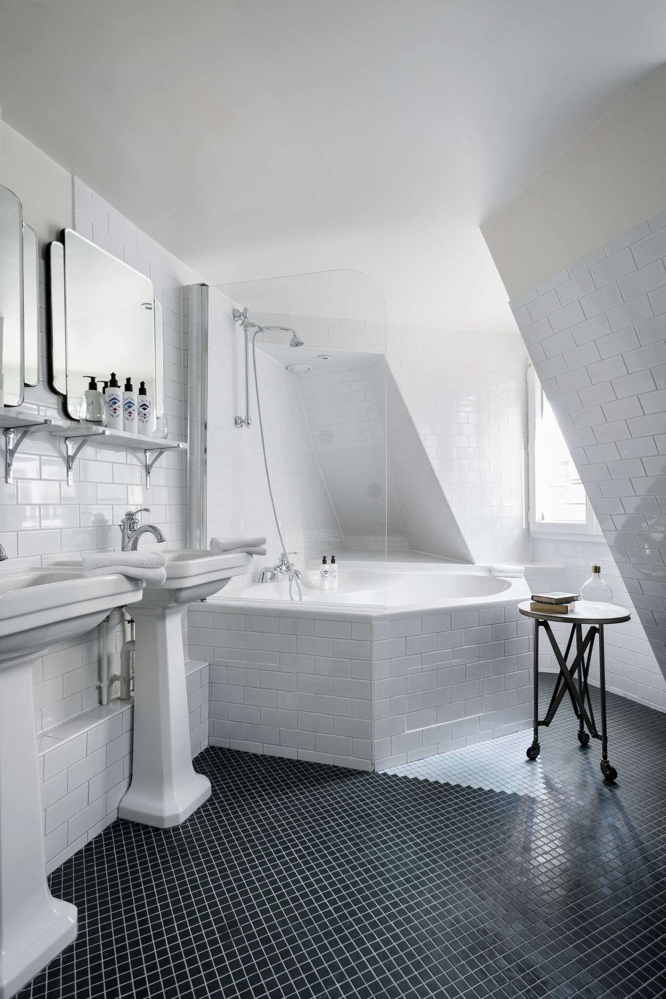
tucked under the mansard roof on the top floor, a corner tub with a view. 26
Above: Tucked under the mansard roof on the top floor, a corner tub with a view.
meilichzon told us she sourced the pedestal sinks from imperial and kohler and  27
Above: Meilichzon told us she sourced the pedestal sinks from Imperial and Kohler and the mirrors from Objet de Curiosité. She used stacked subway tile on the walls and tub and playfully planted a white tile triangle on the black-tiled floor.
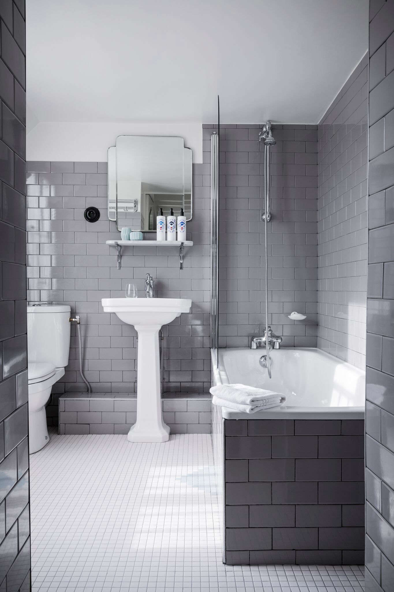
none of the bathrooms are predictable: this one features stacked subway tile in 28
Above: None of the bathrooms are predictable: This one features stacked subway tile in a warm gray.
in a suite, a two person sink in a minimalist marble vanity set off by her 29
Above: In a suite, a two-person sink in a minimalist marble vanity set off by herringbone-patterned subway tiles. For shaped mirrors, see Pottery Barn’s Eleanor Frameless Mirrors.
a guest room sitting area is furnished with a vintage sofa, pointed mirror, and 30
Above: A guest room sitting area is furnished with a vintage sofa, pointed mirror, and custom marble-topped table with an iron base, a companion design to the headboards. Meilichzon says she looked at old kilim when coming up with the black-and-white wall-to-wall carpeting pattern. “The triangle,” she notes, “is very present here.”
the building itself is black and white, and composed of a series of triangles.  31
Above: The building itself is black and white, and composed of a series of triangles. Rooms start at €130 ($137); go to Hotel Panache for more details.

Planning a trip? Get ideas from our Design Travel guides.

Here are three more Paris hotels filled with inspired design ideas:

(Visited 972 times, 1 visits today)
You need to login or register to view and manage your bookmarks.

Have a Question or Comment About This Post?

Join the conversation

v5.0