Icon - Arrow LeftAn icon we use to indicate a rightwards action. Icon - Arrow RightAn icon we use to indicate a leftwards action. Icon - External LinkAn icon we use to indicate a button link is external. Icon - MessageThe icon we use to represent an email action. Icon - Down ChevronUsed to indicate a dropdown. Icon - CloseUsed to indicate a close action. Icon - Dropdown ArrowUsed to indicate a dropdown. Icon - Location PinUsed to showcase a location on a map. Icon - Zoom OutUsed to indicate a zoom out action on a map. Icon - Zoom InUsed to indicate a zoom in action on a map. Icon - SearchUsed to indicate a search action. Icon - EmailUsed to indicate an emai action. Icon - FacebookFacebooks brand mark for use in social sharing icons. flipboard Icon - InstagramInstagrams brand mark for use in social sharing icons. Icon - PinterestPinterests brand mark for use in social sharing icons. Icon - TwitterTwitters brand mark for use in social sharing icons. Icon - Check MarkA check mark for checkbox buttons.
You are reading

Pop Romance: 11 High/Low Design Ideas to Steal from Hero in Paris

Search

Pop Romance: 11 High/Low Design Ideas to Steal from Hero in Paris

February 11, 2019

Here’s a use of pink we can get behind: the rosy interiors at Hero, a tiny restaurant on Paris’s Rue St. Denis specializing in unlikely fare for the City of Lights: Korean fried chicken, soju, and copious amounts of champagne. But the small interiors—designed by Swedish-born, New York–based Jeanette Didon of Byblack—stop short of feeling too romantic thanks to a graffiti twist: blush pink banquettes and tinted glassware are mixed with blue chalk-patterned walls, kitschy neon, and a central concrete sink with exposed fixtures. And the soundtrack: “Accompanying your meal will be over thirty years of French and Anglo hip-hop mixed with a selection of the latest K-pop anthems,” say restaurateurs Quixotic Projects (they’re also behind Remodelista favorites Glass and Le Mary Celeste). Here are a few romantic/grunge ideas to take away.

Photography by Danielle Rubi, courtesy of Hero and Byblack, except where noted.

1. Rethink a fairy-tale palette.

the small dining room. the pale pink and blue palette could feel overly soft an 17
Above: The small dining room. The pale pink and blue palette could feel overly soft and romantic, were it not for a little edge and texture: “We were constantly looking for ways to create details with a Korean vibe, to look for patterns and techniques, but use them in a modern more European twist,” designer Didon says. She found the “painted-on with brushstrokes” fabric at an online British fabric shop and used it for the banquettes, which surround the small space.

2. Create a concrete focal point.

a concrete sink in the center of the room serves both aesthetic and practical p 18
Above: A concrete sink in the center of the room serves both aesthetic and practical purposes: With exposed-pipe fixtures, it’s an industrial counter to the room’s delicate feel, and serves as a convenient place to wash Korean fried chicken from one’s hands. Note also: the bubblegum-pink towels stashed beneath. Photograph by Thomas Smith, courtesy of Hero and Byblack.

3. Leave chalk marks.

&#8\2\20;the key was to strive for a handcrafted look,&#8\2\2\1; didon  19
Above: “The key was to strive for a handcrafted look,” Didon says. For texture, she created a pattern on the walls above the banquettes using an unlikely method: chalkline, a tool that contractors use to mark straight lines, finished with a sealant. “The initial aesthetic idea was to create a pattern of a retro gridded notebook, and this worked great,” she says.
a detail of the imperfect crosshatching and the painterly fabric of the banquet 20
Above: A detail of the imperfect crosshatching and the painterly fabric of the banquettes. “My little brother flew in from Sweden to help me out with the chalkline, and together we spent probably 24 hours snapping on the pattern and sealing it. I like the effect of the ‘bleeding’ chalk,” Didon adds.

4. Make your own lights.

no need to invest in expensive pendant lights: the fabric lights that hang in t 21
Above: No need to invest in expensive pendant lights: the fabric lights that hang in the dining room were also handmade by Didon.

“We wanted to create something that was obviously handcrafted that included a lot of textiles and tassels, as an homage to Korean crafts, and at the same time create a tiny ‘gallery’ for Korean imagery pinned up with tiny clothing pins—something for the guests to discover when dining,” Didon says. The project’s contractor built the brass frames, which Didon then wrapped in a “bird’s nest” of string (“enough to diffuse the light, but not to block any of it,” she adds). She finished the lights with vintage tassel detailing that she and Carina of Quixotic Projects found at a Paris flea market.

5. Enlist pink glassware.

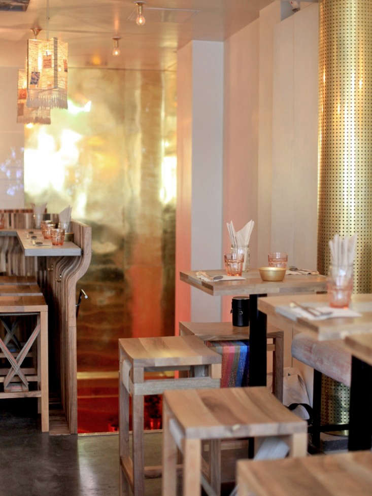
tables are set simply, with rose colored glasses. (for something similar, consi 22
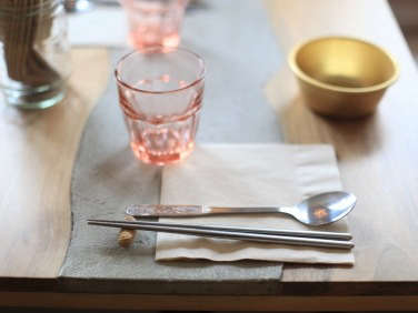
Above: Tables are set simply, with rose-colored glasses. (For something similar, consider the Bormioli Rocco Rocks Glasses in peach, and see 10 Easy Pieces: Colored Glass Tumblers.) Note also: peanut as chopstick rest.

6. Customize seating with string.

Above: The dining room leading into the tiny bar area. Note the custom bar stools, which the team wrapped in string to create an extra textural detail.

7. Aim for imperfect paint jobs.

the bold bathroom was painted by hand, and allowed to be imperfect. note the ti 25
Above: The bold bathroom was painted by hand, and allowed to be imperfect. Note the tiled vanity, which Didon splatter-painted herself, and the haphazardly striped walls, inspired by bamboo. “This was a bit harder to create as the pattern is not a random pattern, like the splatter. I tested out a lot of techniques before painting on the actual wall, especially how much paint and pressure per brush stroke to get the paint to ‘run out’ after an inch or so,” Didot says. Photograph by Jeanette Didot, courtesy of Hero and Byblack.
a new take on the antiqued mirror: didot stripped the protective paint from the 26
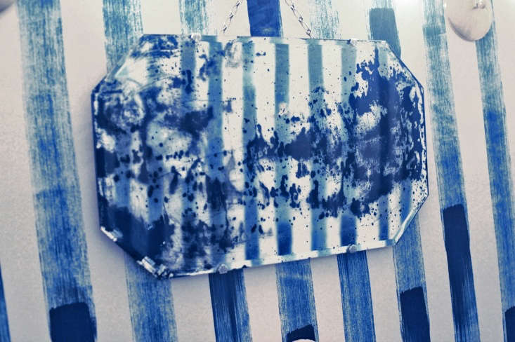
Above: A new take on the antiqued mirror: Didot stripped the protective paint from the back of the bathroom mirror, then splattered acidic brick cleaner to create the faux-damage effect. “Usually to get an antique effect you use various shades of brown, but in this case I used a bright indigo color,” she explains. Photograph by Jeanette Didot, courtesy of Hero and Byblack.

8. Clip tiny moments of art.

Above: Adding to the graffiti appeal: collages of found imagery and graphics clipped to the windows and hung in the neon-lit entryway.

9. Mix romantic with industrial.

industrial details throughout the space stop it from feeling too delicate. in t 29
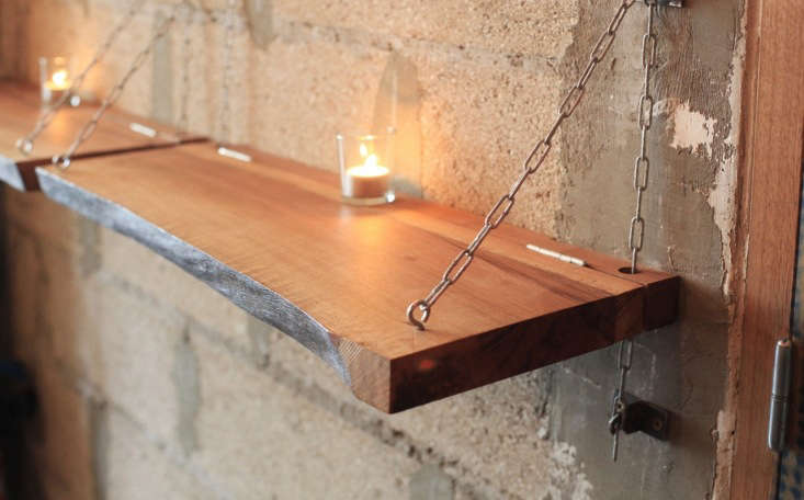
Above: Industrial details throughout the space stop it from feeling too delicate. In the entryway, the team countered concrete with a pink marble bar: “We went for a huge chunk of pink marble to contrast with the very casual finishes—all concrete and very simple shelves and lighting fixtures. We felt it was an important area to make something impactful, as it is the first and only thing you see when entering,” Didon says.” Shown here: candlelight pairs with rough-hewn walls. Photograph by Thomas Smith, courtesy of Hero and Byblack.
cinder blocks, transformed into planters, line the entry stairwell. 30
Above: Cinder blocks, transformed into planters, line the entry stairwell.

10. Bring back neon.

embrace kitsch: a neon sign hints that the interiors won&#8\2\17;t take the 31
Above: Embrace kitsch: a neon sign hints that the interiors won’t take themselves too seriously. Photograph by Thomas Smith, courtesy of Hero and Byblack.

11. Adopt a “champagne meets fried chicken” mentality.
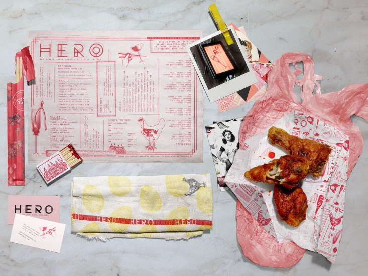
when it comes to design, think high meets low, kitschy meets romantic, to avoid 32
Above: When it comes to design, think high meets low, kitschy meets romantic, to avoid overly sweet interiors. The restaurant’s graphics are by New York City–based Safari Sundays. Photograph courtesy of Hero and Byblack.

We’ve sleuthed many more design ideas to steal from the world’s most design-forward restaurants. Take a look:

N.B.: This post is an update; the original story ran in February 2018.
(Visited 640 times, 1 visits today)
You need to login or register to view and manage your bookmarks.

Product summary  

Have a Question or Comment About This Post?

Join the conversation

v5.0