Icon - Arrow LeftAn icon we use to indicate a rightwards action. Icon - Arrow RightAn icon we use to indicate a leftwards action. Icon - External LinkAn icon we use to indicate a button link is external. Icon - MessageThe icon we use to represent an email action. Icon - Down ChevronUsed to indicate a dropdown. Icon - CloseUsed to indicate a close action. Icon - Dropdown ArrowUsed to indicate a dropdown. Icon - Location PinUsed to showcase a location on a map. Icon - Zoom OutUsed to indicate a zoom out action on a map. Icon - Zoom InUsed to indicate a zoom in action on a map. Icon - SearchUsed to indicate a search action. Icon - EmailUsed to indicate an emai action. Icon - FacebookFacebooks brand mark for use in social sharing icons. flipboard Icon - InstagramInstagrams brand mark for use in social sharing icons. Icon - PinterestPinterests brand mark for use in social sharing icons. Icon - TwitterTwitters brand mark for use in social sharing icons. Icon - Check MarkA check mark for checkbox buttons.
You are reading

Kitchen of the Week: ‘A Secret Retreat’ Above a Violin Store

Search

Kitchen of the Week: ‘A Secret Retreat’ Above a Violin Store

September 24, 2020

Designers often say that the best renovations come about after you’ve actually clocked some time living in a space, so that you can have a better understanding of how your home supports (or hinders) your daily routine. Architect Jack Tsai’s clients, a couple in their 60s, had 15 years to figure out what was wrong with their living quarters.

The couple own a violin shop and had been living atop of it in a dark, rundown apartment for a decade and a half before they brought in Jack to reimagine it—and by then, they knew exactly what they wanted: more light, a real bedroom (theirs was essentially a studio apartment), a guest bedroom, a bathroom on the second floor (they had to trek downstairs to the store level to use the loo), and outdoor space.

“In many ways, it was not hard to improve on what they previously had,” says Jack of their formerly depressing and uninspired apartment. “We wanted to create a living situation filled with daylight, with courtyards, balconies and rooftop decks—a secret retreat that’s hidden behind the heritage façade.”

He succeeded in delivering just that, plus an open kitchen and living room that feels like a sanctuary. Below, we dissect this serene, light-filled space.

Photography by Tess Kelly, courtesy of Tsai Design.

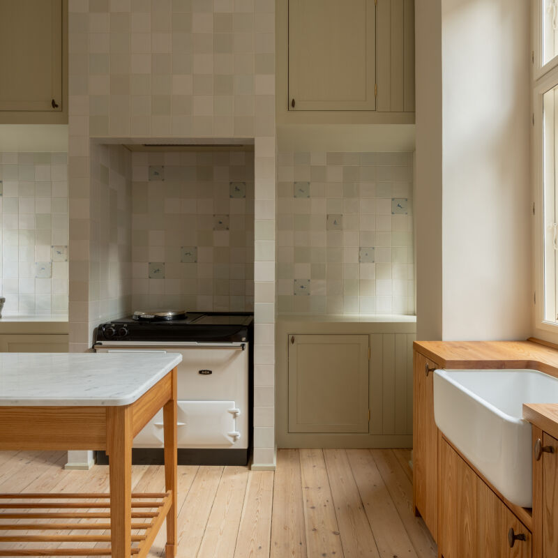
the kitchen references the outdoors with sage green accents. on the walls here  17
Above: The kitchen references the outdoors with sage-green accents. On the walls here is Dollar by Australian paint company Dulux. The tiles are from the Piemonte collection (in apple) by Classic Ceramics.
the faucet is from methven. (for similar faucets, see \10 easy pieces: modern s 18
Above: The faucet is from Methven. (For similar faucets, see 10 Easy Pieces: Modern Single-Lever Gooseneck Kitchen Faucets.) The leather handles are from Melbourne-based company Made to Measure.
the kitchen cabinets were custom made by mtr designer cabinets using laminex bo 19
Above: The kitchen cabinets were custom-made by MTR Designer Cabinets using Laminex boards in Elegant Natural Oak finish. The pantry features doors fronted with with green panels of furniture linoleum by Forbo. The same linoleum was used to top the 18-mm birch plywood countertop as well.
the eco friendly cork flooring is from market timber. 20
Above: The eco-friendly cork flooring is from Market Timber.
for a cohesive look, the built in storage units in the living and dining areas  21
Above: For a cohesive look, the built-in storage units in the living and dining areas are constructed from the same Laminex material used for the kitchen cabinets.
just beyond the living room is the dining area, over which hangs two pluto pend 22
Above: Just beyond the living room is the dining area, over which hangs two Pluto Pendant lights from About Space. The fireplace surround and steps leading to the roof deck are tiled with bluestone.
tsai design violin shop home kitchen8
Above: The dining table and chairs are from Japanese furniture store Apato, in Victoria.
behind the built in bench is the lightwell. it is jack&#8\2\17;s favorite p 24
Above: Behind the built-in bench is the lightwell. It is Jack’s favorite part of the project: “The simple gesture of removing the roof became the centerpiece of the house, figuratively and literally. It is a transition space that divides work and home. And also divides the open-plan living space from the private bedrooms.”
the view from the lightwell looking into the living and dining area. &#8\2\ 25
Above: The view from the lightwell looking into the living and dining area. “We kept the original stairwell but simply removed the ceiling and roof above, replacing it with a polycarbonate roof, to bring in much needed daylight. Throughout the day, you move through the space and feel as if you are passing from indoor to outside, a brief moment of replenishment from the sunlight that beams down from above.”
just beyond the stairs are two bedrooms; below is the store and workshop. about 26
Above: Just beyond the stairs are two bedrooms; below is the store and workshop. About the half-painted railing: “The owner, being a violin maker, wanted to take on a bit of the timber restoration work himself, but he never got to finish it. During all the construction process, I think it just fit in so well with the character of the space, with the exposed structures, so the decision was to leave it as it is,” explains Jack.
the front of the building, with the store on the street level and the couple&am 27
Above: The front of the building, with the store on the street level and the couple’s kitchen just above it.

For more clever work/home setups, see:

(Visited 1,227 times, 1 visits today)
You need to login or register to view and manage your bookmarks.

Product summary  

Have a Question or Comment About This Post?

Join the conversation

v5.0