Icon - Arrow LeftAn icon we use to indicate a rightwards action. Icon - Arrow RightAn icon we use to indicate a leftwards action. Icon - External LinkAn icon we use to indicate a button link is external. Icon - MessageThe icon we use to represent an email action. Icon - Down ChevronUsed to indicate a dropdown. Icon - CloseUsed to indicate a close action. Icon - Dropdown ArrowUsed to indicate a dropdown. Icon - Location PinUsed to showcase a location on a map. Icon - Zoom OutUsed to indicate a zoom out action on a map. Icon - Zoom InUsed to indicate a zoom in action on a map. Icon - SearchUsed to indicate a search action. Icon - EmailUsed to indicate an emai action. Icon - FacebookFacebooks brand mark for use in social sharing icons. flipboard Icon - InstagramInstagrams brand mark for use in social sharing icons. Icon - PinterestPinterests brand mark for use in social sharing icons. Icon - TwitterTwitters brand mark for use in social sharing icons. Icon - Check MarkA check mark for checkbox buttons.
You are reading

Going to the Dark Side with Mad About the House in London

Search

Going to the Dark Side with Mad About the House in London

September 15, 2017

Kate Watson-Smyth runs the interiors blog Mad About the House, which she set up in 2012. A journalist who has written for most of the UK national press, she wanted to find her own corner of the Internet to tell readers about products and designs tips that she had learned about after 25 years in newspapers. An early post on how to choose the right shade of gray paint led to a book—Shades of Grey—and numerous blog awards. Her second book will be out next March. Here, Kate documents how her house, which she bought with her husband, Adam, in 2010, started out white and has gradually gone to the dark side over the years.

Photography by Rory Gardiner for Remodelista. Styling by Emma Archer. Produced by Christine Chang Hanway.

mad about the house rory gardiner 3
Above: The extension was initially painted in Wimborne White from Farrow & Ball, the same as the interior of the house. It was never a particularly interesting build architecturally and, to start with, we were so busy concentrating on the inside that we didn’t really think about the outside.
“I didn’t even realize it had happened until we painted the very boring white extension in Railings No. 31 PaintRailings by Farrow & Ball and I posted the picture on Instagram, where it became my most liked picture. Suddenly I started looking at the rest of the house and realized that over the years various shades of gray have made their way into most rooms. When we bought this house, which was two rental flats that we converted back into one, we just wanted to make it livable as fast as possible. Our previous house was very dark—at the bottom of a slope with trees at the back and we had the lights on in the kitchen all the time. When we first moved to our new place I was constantly shouting at the children (now aged 16 and 14) to turn the lights off and then realizing it was just natural daylight. We chose to paint everything—walls, ceilings, floors, and woodwork in Wimborne White by Farrow & Ball to make the most of that light.

“That was fine for a year or so. The sitting room was the first to change. We both just felt it needed a bit more oomph and I remember pulling the sofa in to the middle of the room and painting the walls in Down Pipe by Farrow & Ball while the Queen’s Silver Jubilee parade down the river Thames was on the television. A friend of ours was also in labor in a hospital a few miles away, so we were getting regular updates on that too.”

mad about the house rory gardiner 2
Above: “The kitchen cupboards began life as white. The tin ceiling was added to give some interest to the extension which doesn’t have a particularly high ceiling. It also reflects light back into the room. The cupboards have now been painted in Farrow & Ball Railings.
“Next to go was the kitchen. Having seen how dark gray is such a brilliant backdrop for paintings and pictures, I felt that the open shelves in the kitchen would only look better if they were dark. Initially we painted them also in Down Pipe and left the cupboards pale. At that stage the leather handles were black. A year later we decided to change the whole lot and go slightly darker. This time it was Railings by Farrow & Ball. It hasn’t made the room dark, as the floor and walls are still white and there is a large skylight over the shelves. We changed the leather handles to tan to warm it up a little.”

mad about the house rory gardiner 1
Above: “The open shelves were also white to begin with, then they went to dark gray and finally to an even darker blue-black shade.”
mad about the house 9
Above: “The sitting room was painted white until one day we just decided it would look better gray and painted it Down Pipe by Farrow & Ball. It was an instant success. That shade of gray is brilliant in both natural and electric light, which is a key factor for a sitting room and I still adore it. It might even be my favorite wall color of all time. It is both cozy and dramatic and works at all times of day and in all weathers.”
mad about the house 12
Above: Kate in her dramatically toned sitting room.
mad about the house 8
Above: “This was the first room to go over to the dark side and we have never looked back. I love it just as much now as I did when we painted it.”
mad about the house rory gardiner 4
Above: A view of the mantel.
mad about the house rory gardiner 7
Above: “The shelves in the loft were always going to be dark. Once you see how brilliant everything looks on a dark shelf you can’t imagine painting them white again.”
mad about the house 10
Above: The windows are wooden and painted dark.

“When we converted the loft I was very keen to have dark windows as they frame the view so well, and, having been converted to the beauty of dark shelves downstairs, it was clear I would do the same thing again up there. I wanted Crittall originally, but they are ruinously expensive and not really in keeping with a Victorian house. However, traditionally window panes got smaller the higher up the house you went as glass was expensive and it was reckoned that the servants who lived in the attic didn’t need expensive and large panes of glass. Architecturally small windows were in keeping.”

mad about the house 11
Above: The bedroom is painted in the palest gray of any room in the house; it’s Pavilion Gray by Farrow & Ball. The color was the subject of much heated debate.
“The most recent changes were in our bedroom and en suite. The problem started when it came to the bedroom. As the two spaces adjoin each other there needed to be some continuity between the two. We had already chosen some silver wallpaper by Neisha Crosland, so I suggested the walls could be blush, or millennial pink. Himself was not at all keen on this. I tried a trick that many of my girlfriends have used and told him it was beige. He saw straight through that. I persuaded him to look at lots of samples on the wall. But even I could see that none of them were right. Then I suggested painted the ceiling in Down Pipe to link with the walls next door. He was reluctant. I begged. He gave in. It was a disaster. I spent Sunday painting it dark myself and Monday paying a painter to make it light again. “What color do you want then,” I asked in exasperation.

“I quite fancy one of those pinks after all,” he said. My response is not printable but the upshot was that I had completely gone off the idea of pink. We settled on a shade of gray. It’s Pavilion Gray by Farrow & Ball. We both love it. It’s a soft warm gray that is almost velvety when the sun pours in which, as it’s a south-facing room in North London does happen occasionally.”

mad about the house rory gardiner 6
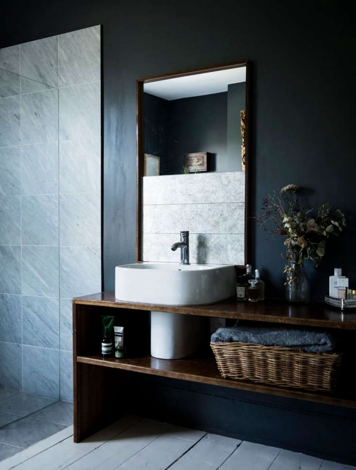
Above: The en suite bathroom is dark and dramatic and painted in Down Pipe. Large mirrors and a window prevent it from being too dark.
“I had long had a picture of a dark bathroom with a large gold mirror on my Pinterest board and I was keen to replicate that look as we had a similar mirror. Initially I wanted to go green in there but we couldn’t find the right one. My husband was worried that Down Pipe (again!) would be too dark but with the white floor and sanitaryware as well as a large window and lots of mirrors to bounce the light around it’s not a problem. I absolutely adore this bathroom now.

mad about the house rory gardiner 5 1
Above: Another view of the bath.

“We have finished painting. For now.”

Before

mad about the house before 03
Above: The sitting room was originally painted in Wimborne White by Farrow & Ball.
mad about the house before 01
Above: The master bath before it went to the dark side.
mad about the house before 02
Above: The rear extension in its original state.

See more moody interiors inspiration:

(Visited 2,210 times, 1 visits today)
You need to login or register to view and manage your bookmarks.

Product summary  

Have a Question or Comment About This Post?

Join the conversation

v5.0