Just opened in Hudson, New York: Wm. Farmer & Sons, a new farm-to-table restaurant from husband-and-wife team William “Kirby” Farmer, the chef (and son of “Wm.”), and creative partner Kristan Keck.
The space was designed by SchappacherWhite Architecture, members of the Remodelista Architect/Designer Directory, led by husband-and-wife team Steve Schappacher, who served as the architect, and Rhea White, the designer.
Farmer and Keck had already settled on turning three buildings dating from the 1830s into one new structure to serve as their new restaurant and bar, mercantile, and boardinghouse when they contacted the firm. They had discovered the work of SchappacherWhite years earlier and had “instantly fallen in love with their style.” But, says Keck, “we also chose to do this project with them because we like that they are a married couple as well as business partners. We thought that would help them to understand us and this endeavor.”
Sure enough, it did, and led to an informality that maximized creativity. “At one point during the design process,” says Rhea White, “Kristan and Kirby came to Shelter Island to see our new home. We discussed our goals, the design, and sat down to an amazing dinner by Kirby.” The team benefited from an open-mindedness about the end result: “It was a process, with input by all trades, the owners and us,” says Schappacher. “The drawings were not 100 percent completed in advance; we all allowed flexibility in ideas and results.”
Photography by Jason Linberg.
Above: Most of what was saved from the original buildings and used in the restaurant is visible here at the restaurant entrance (other elements are used in the boardinghouse upstairs). The brick and stone wall at the back is original, as is the ceiling above it. A steel hostess stand and custom shelves are new and display votive candleholders made of horn.
Above: The challenges of renovating nearly-200-year-old buildings were plenty. Says Keck, “There is not a square angle in the entire place,” noting that the finished building sits on a corner and slopes downward on both sides. “The general contractor’s determination of ‘level’ was a mental equation in his head only. If anything was hung using an actual level, it would be terribly crooked.”

Above: The main part of the dining room has new, finished ceilings. A large communal table is a SchappacherWhite design, made of soapstone from M. Teixeira in a steel frame by David DeSantis of Forged Artistry. The new fireplace behind it sports a ledge of the same stone.
Since the materials were sourced from so many different periods, the team decided to avoid color and let the myriad textures balance themselves out. “From the start, we discussed texture as opposed to color, and using all-natural elements for depth,” says Keck. “Rhea White is a master at this.”
Says Schappacher of the design—a range of texture and aged materials against a palette of off-white to dark gray—”with so much contrast, it almost seems colorful.”

Above: For the dark walls, the designers had beadboard paneling installed backward to look like wide plank boards. They stained it in a flat, dark gray.
Sourcing the stained wood chairs was a “happy accident,” according to Keck. While in Baltimore for the holidays, she found 60 chairs at Housewerks, just salvaged from King Hall, the dining hall at the US Naval Academy in Annapolis. The chairs have built-in shelves on the bottom, where cadets would once place their hats while eating. “We bought all 60 on the spot,” she says.

Above: The architects wanted to keep the original heavy timber ceiling beams, but they were no longer structurally sound from many modifications over time. The team spent months searching for an old barn with similar beams that could support the restaurant, but in the end they turned to newly milled heavy timber beams that they fumed for color. They are supported by vertical steel I-beams that were just beginning to rust at the steel yard, which they collected as is for the patina.

Above: The floors were one of the most challenging materials to source. The team considered all options: new wood, reclaimed wood, hand-scraped, etc., and settled on boards they found in a local millyard: wide-plank, circular sawn white oak boards, nine inches wide with a rustic, ripped edge. They then fumed the boards for patina. The dining tables are stock metal bases with custom wood tops, and the banquettes are SchappacherWhite designs.
Lighting the space was an additional challenge. They settled on low-level light fixtures (semi-custom O’Lampia table lamps with linen shades) to provide warm illumination on the tables and the requisite dinnertime “glow to the face.” Says Schappacher, “If only overhead lights are used, it casts shadows on guests’ faces and is very unflattering.”

Above: The bartop is made of the same soapstone from M. Teixeira used elsewhere in the restaurant. The gas lanterns are from Bevolo in New Orleans; they function “like candles and make the bottles glow.”

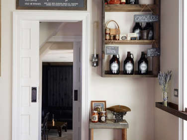
Above: A small mercantile at the side of the restaurant offers takeaway coffee, pastries, and dry goods. Both the floors and the exposed joists on the ceiling are original to the 1830s buildings. The walls are painted in Seapearl by Benjamin Moore, with pocket door and trim in Paper White.
The two doorways visible here separate the bar from the boardinghouse entryway and the mercantile.

Above: The mercantile case is an antique jewelry shop cabinet discovered in Asheville, North Carolina—Kirby Farmer’s hometown.
Steve Schappacher found working with a Hudson-based crew to be a dream. “There is a love of craft and the handmade here,” he says. Even the general contractor had a love of the buildings and their history.
Says White, “Kirby forms relationships with local farmers for his food sources, and we did the same with local sources for materials and construction.”

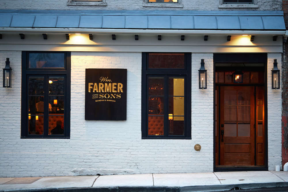
Above: The team installed new gas lanterns on both facades, and new street-level windows.

Above: The exterior is painted in Revere Pewter by Benjamin Moore, with trim in Valspar’s Dark Kettle Black, to accompany the custom signage.

Above: Two staircases lead from the street to the boardinghouse. One stair runs through the bar and restaurant, and during service hours, there is an interaction between the boardinghouse guests and the bar and dinner patrons, just as there might have been in a boardinghouse from 200 years ago. Says Schappacher, “Guests using the staircase become involved in the restaurant even before going in for a drink or a meal.”
For more from the designers, see Shelter Island House by SchappacherWhite and Tribeca Loft by SchappacherWhite.


Have a Question or Comment About This Post?
Join the conversation (1)