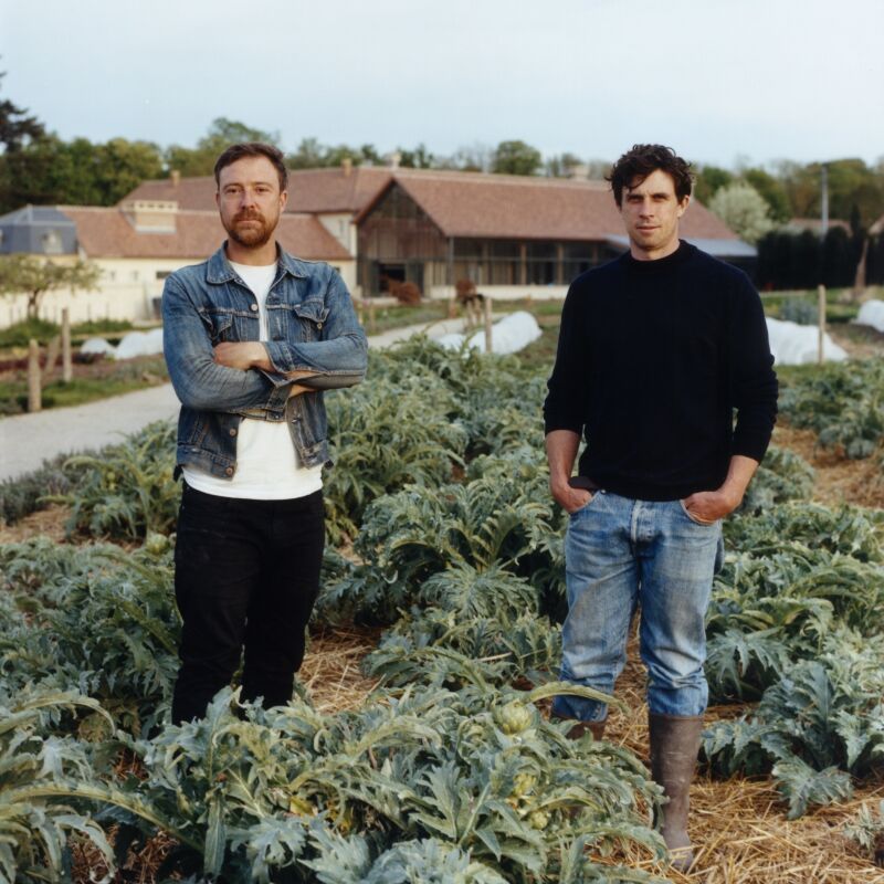
I first got to know San Francisco architect Malcolm Davis of Malcolm Davis Architecture when he designed my friend Berry’s house (coincidentally, years earlier I had ripped out one of his projects from a magazine). Among the many highlights of his projects? The bathrooms, which are light, airy, and full of well-considered details. So who better to turn to for advice?
What do your clients typically ask for in a bathroom?
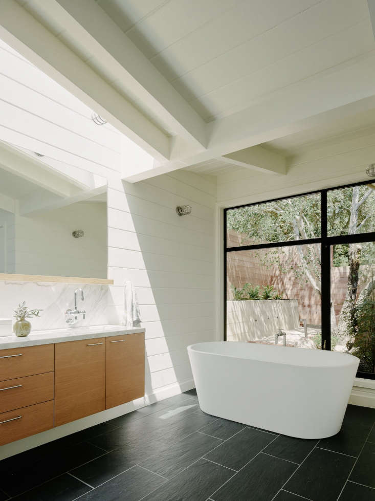
Malcolm Davis: When someone comes to me, they usually know what bathrooms I design; there’s always some sense of the outdoors and as much daylight as possible. When clients start looking at imagery, I ask them to think of their house as the best version of what they want it to be and what look will go with that in the bathroom, as opposed to their dream bathroom. I try and have a thread of the rest of the house incorporated in the bathroom so it feels connected.

How do you manage to make your bathrooms so light and airy?
MD: If I have any way of getting daylight into the bathroom, I do it. I always try and get a bathroom on an outside wall. In a city, you don’t always get that option, so then I go for a skylight. It’s important to have a visual link to the outdoors; it’s neat to have some clear glimpse of the outside, even if it is just one panel of a window where you can see a tree outside or a skylight where a bird flies overhead. The more light, the better. Sunlight is the best killer of mold. If you can make the windows larger that’s the biggest change you can make.

What’s your approach to design?
MD: I like some bandwidth in the bathroom. It needs to be a place where if you are putting yourself together you can be the most spot on, but it’s also a place where if you feel terrible you can unwind in warm water and find some solace. The bathroom has to provide a good backdrop, and not work against you. It should convey a sense of simplicity and clarity.
How do you create a serene backdrop?
MD: I use simple, nice materials and work with a limited palette. I really like limestone, marble, and slate. I like to bring in some sense of nature, a piece of natural wood or a Heath tile that has a handmade quality. I use a wood shelf in a lot of bathrooms. If the surfaces feel too hard and shiny, it can feel too perfect. With materials that have a softer organic feel, that’s when the person starts to feel they fit in.
What about storage?
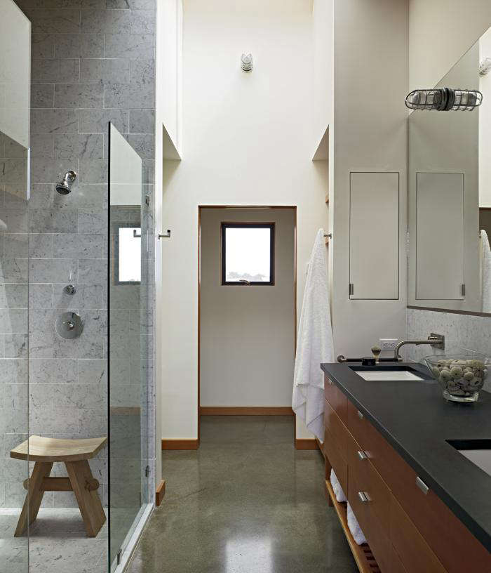
MD: I like hidden storage (there’s something about having a million little cupboards that looks overwhelming). I like to place a couple of tall shallow cabinets hidden in a stud bay. You don’t need deep shelf storage, a shallow shelf can store a lot. I try and make as many things as dual function as possible. I like to put a recess in the shower and I try and integrate towel bars to feel built in. It’s hard to pull off as it depends upon the space

What materials do you use?
MD: A bathroom is going to last for a long time, so I like to keep it simple. It’s not clothing. When it comes to materials, I always question whether it will last for a long time. I advise clients to set out a couple of materials they like and look at them every day before deciding. Often it’s the one you thought was boring that works in the end.
What height is best for the counter or vanity?
MD: A tabletop is at thirty inches, so the sink needs to be higher so you don’t have to bend over so much. I usually have the sink height at 34 to 36 inches high, although I am currently doing a gentleman’s sink that’s higher.

What lighting is best?
MD: Industrial-looking Stonco lighting is my go-to. It’s a vapor tight light with a guard and they are great for tucking in a skylight shaft.
What are your favorite fixtures?
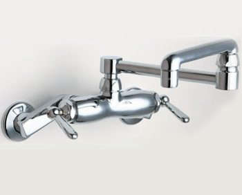
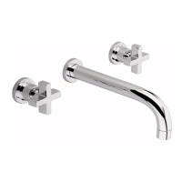
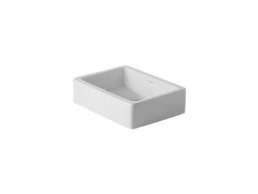
MD: I like porcelain. Duravit sinks are a favorite, and the Dornbracht Tara line is super classic, although sometimes it can be a challenge to get the hot and cold taps to line up straight. I like Chicago Faucets, but it’s too bad they don’t have a bigger line.

Anything else to note?
MD: Bathrooms don’t have to be huge. When I see a large stand-alone tub floating in space, that’s a lot of space it’s taking up. I always put my mind into the small places of New York or Europe and consider how you make a space compelling.
See more work from Malcolm Davis Architecture.
Need a fixture? Check out all our Faucets and Fixtures posts. And for more expert advice on bathrooms:
- Expert Advice: How to Create the Perfect Bath, from the Grande Dame of Bath Design
- Expert Advice: 6 Tips for Making the Spare Room Guest-Ready, with Tricia Rose
N.B.: This post is an update; the original story ran on March 1, 2013.



Have a Question or Comment About This Post?
Join the conversation (1)