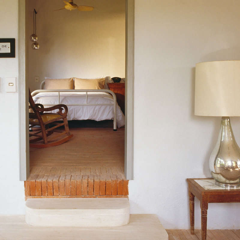
Bedrooms are often the least loved rooms in the house; it’s all too easy to leave their decoration for last, focusing first on more public areas of the home. But the joy of bedrooms is that they rarely require a complete overhaul; often, a little attention–via a few cushions, table lamps, and the right coat of paint–can transform a bedroom overnight.
Here, seven of our favorite designers (many of whom are members of our Architect/Designer Directory) share their tips and tricks for taking the bedroom to the next level. Their polished boudoirs have several things in common: They all start with a timeless, easy-to-update bed, a single great bedspread or blanket, and a fresh coat of paint in a calming hue. From there, cushions, reading lamps, and framed artwork seal the deal.

Above: London designer Ben Pentreath believes bedrooms are places of retreat and should be painted in neutral shades of off-white and gray. Here, he added a wall of beadboard paneling to cover an unsightly chimney, creating a cabin feel in the room.

Above: This modern, rustic bedroom by Lauren Geremia of Geremia Design fits a couple who travel constantly and love the outdoors. Says Geremia, “We chose art, furniture, and finishings that are harmonious with a nature lover’s lifestyle.”

Above: Blogger Emily May of GoHausGo updated her own bedroom. Here, the “before” photo.

Above: The “after.” Says May, “For me, the bedroom really started to work when I began to embrace its difficult features (the large off-center window, the fireplace, the orange-y oak laminate). I won’t even tell you how long I tiptoed around those items!” Once she made peace with the room’s quirks, her task became easier. “Finally, I threw up my hands and used the large window as the focal point behind the bed (with strategically placed curtains to hide the asymmetry), painted and added logs to the fireplace, and picked colors that complemented the floors.”

Above: This bedroom by SIMO Design makes deft use of a common recommendation for bedrooms–to limit variety in color. Dark blue nightstands and rug, black-and-white artwork and lamps, and a purple-gray throw and shams make the room look polished but still calm.

Above: The “before” photo of a bedroom in need of help from New York City designers 2Michaels Design.

Above: The “after.” Their client wanted a crisp, fresh bedroom but wanted to avoid an overly “decorated” look. Says designer Jayne Michaels, “The bedside tables don’t match, neither do the lamps. The combination of light wood furniture and pale Swedish colors pulls the room together organically.”

Above: Architect Michael Howells of Howells Architecture + Design in Portland, OR, believes the crucial bedroom element is the bed itself. Says Howells, “A well-made bed spruces up a room instantly. Add a patterned blanket if the rest of the room is muted. Contrast keeps things interesting.” Photo by David Agnello.

Above: A bedroom-to-be awaiting a renovation by Dash Marshall in NYC. Says the architect of his clients, “They had too much stuff and wanted to be able to live in serenity, without being reminded of their earthly possessions on a daily basis.”

Above: Marshall wrapped the bedroom in walls of built-in storage so that everything has its place. The resulting bright, über-minimal space won the award for Best Professionally Designed Bedroom in our Considered Design Awards.


Have a Question or Comment About This Post?
Join the conversation (4)