Icon - Arrow LeftAn icon we use to indicate a rightwards action. Icon - Arrow RightAn icon we use to indicate a leftwards action. Icon - External LinkAn icon we use to indicate a button link is external. Icon - MessageThe icon we use to represent an email action. Icon - Down ChevronUsed to indicate a dropdown. Icon - CloseUsed to indicate a close action. Icon - Dropdown ArrowUsed to indicate a dropdown. Icon - Location PinUsed to showcase a location on a map. Icon - Zoom OutUsed to indicate a zoom out action on a map. Icon - Zoom InUsed to indicate a zoom in action on a map. Icon - SearchUsed to indicate a search action. Icon - EmailUsed to indicate an emai action. Icon - FacebookFacebooks brand mark for use in social sharing icons. flipboard Icon - InstagramInstagrams brand mark for use in social sharing icons. Icon - PinterestPinterests brand mark for use in social sharing icons. Icon - TwitterTwitters brand mark for use in social sharing icons. Icon - Check MarkA check mark for checkbox buttons.
You are reading

Kitchen of the Week: A Statement Backsplash in a Grand Green London Kitchen

Search

Kitchen of the Week: A Statement Backsplash in a Grand Green London Kitchen

September 28, 2017

What room would you be willing to sacrifice to create your dream kitchen? For Emmanuelle and David Cadji-Newby, it was clear their dining area, with its original moldings and garden views, ought to be turned into the hub of the house. The couple—she’s a psychotherapist in training, he’s a founder of personalized kids’ books publisher Wonderbly, and they have an 11-year-old son—live in the East London commuter town of Upminster. Their Edwardian house came with soaring ceilings and its original waxed oak floors, but sometime in the sixties, the kitchen had been relegated to a closet-size side extension (and remains in place, see below).

Emmanuelle, an antiques collector who grew up in France’s Champagne country, took a hands-on approach to the rest of the house, but says for the new kitchen, “I wanted to break from my usual go-to’s: pale pink (my favorite color), mauve, and Designers Guild fabrics. So I hired Sophie van Winden of Owl Design.” Van Winden was given a brief to think “modern Shaker design,” and to “stay away from pink.” Oh, and to come up with “something happy.” Join us for a look at the colorful results.

Photography courtesy of deVol.

since they were starting from scratch, van winden suggested the couple install  17
Above: Since they were starting from scratch, van Winden suggested the couple install a deVol kitchen. The UK company makes classic wooden cabinetry and, not coincidentally, specializes in Shaker Kitchens.

Van Winden and the couple worked with the deVol team to come up with a design that harmonizes with the existing Edwardian framework. The solution evolved over time: along the way, plans for an island were scrapped, and for space efficiency, the team located the range in the fireplace niche.

the base and wall cabinets are from devol&#8\2\17;s shaker catalogue. grays 18
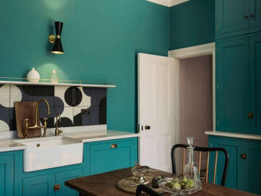
Above: The base and wall cabinets are from deVol’s Shaker catalogue. Grays, creams, and wood tones are the deVol norm; van Winden and Emmanuelle, however, struck out on their own and settled on a Fired Earth blue-green called South Bank for not only the cabinets but the walls.
“Emmanuelle loves color and pattern and is not afraid to be bold,” says her designer. “The color had to work with the existing pink in the adjoining hall and the garden, which is very green,” explains Emmanuelle. As for the range and sink backsplashes, after much searching—and considering aged copper—van Winden proposed Barber & Osgerby’s Puzzle Tiles, a practical solution that doubles as art—and tips the space into the modern era. “My house is traditional and I like antiques, but I don’t like the idea of my rooms looking old, so the tiles were perfect,” says Emmanuelle.

The Aged Brass Faucet is from deVol as is the brass cabinet hardware.

the couple&#8\2\17;s old english refectory table is surrounded by midcentur 19
Above: The couple’s old English refectory table is surrounded by midcentury Paolo Buffa chairs purchased from the Peanut Vendor in East London.

The range is a Lacanche in a celery green called Silice, and the counter and overhead shelving are polished Lagoon from Silestone, an engineered quartz supplied by deVol. The vintage-style polished brass sconces are Cairo Wall Lights by Mullan Lighting; $286.35.

original french doors open to a conservatory overlooking the terrace and garden. 20
Above: Original French doors open to a conservatory overlooking the terrace and garden.
fitted cabinets on the back wall contain a full size refrigerator and freezer o 21
Above: Fitted cabinets on the back wall contain a full-size refrigerator and freezer on either side of a double-door larder.

The Existing Kitchen

tucked into a side addition of the house, the galley kitchen—installed d 22
Above: Tucked into a side addition of the house, the galley kitchen—installed decades ago as a replacement for the original kitchen—is now used as a utility room.

Here are some more kitchens on the colorful side:

(Visited 521 times, 1 visits today)
You need to login or register to view and manage your bookmarks.

Product summary  

Have a Question or Comment About This Post?

Join the conversation

v5.0