Icon - Arrow LeftAn icon we use to indicate a rightwards action. Icon - Arrow RightAn icon we use to indicate a leftwards action. Icon - External LinkAn icon we use to indicate a button link is external. Icon - MessageThe icon we use to represent an email action. Icon - Down ChevronUsed to indicate a dropdown. Icon - CloseUsed to indicate a close action. Icon - Dropdown ArrowUsed to indicate a dropdown. Icon - Location PinUsed to showcase a location on a map. Icon - Zoom OutUsed to indicate a zoom out action on a map. Icon - Zoom InUsed to indicate a zoom in action on a map. Icon - SearchUsed to indicate a search action. Icon - EmailUsed to indicate an emai action. Icon - FacebookFacebooks brand mark for use in social sharing icons. flipboard Icon - InstagramInstagrams brand mark for use in social sharing icons. Icon - PinterestPinterests brand mark for use in social sharing icons. Icon - TwitterTwitters brand mark for use in social sharing icons. Icon - Check MarkA check mark for checkbox buttons.
You are reading

Mjölk Made: A Canadian Cafe Gets a Scandi Revamp from Toronto’s Cult Design Couple

Search

Mjölk Made: A Canadian Cafe Gets a Scandi Revamp from Toronto’s Cult Design Couple

March 29, 2018

We’ve been followers of Toronto-based John Baker and Juli Daoust Baker since 2010, when we first featured their design shop, Mjölk (see our original, now pretty low-fi Shopper’s Diary post). Since then, we’ve kept a close eye as they built out their Scandi meets-Japanese apartment above the shop (including one of our favorite all-time kitchens) and overhauled a whitewashed cabin on the shores of Lake Huron; and we’ve sought their expert advice on getting Scandi-style floors.

So when John emailed to say that he and Juli had designed their first cafe, we were intrigued. “It’s a redesign of one of the most beloved cafes in Ontario, and a cultural hub for the city of Dundas, a lovely little historic town that’s a little over an hour’s drive from Toronto,” he wrote. The space is a reopening of Detour Café in tandem with the launch of its new bakery component, Dear Grain, and a new line of preserves, Preservation Society. For the redesign, “We’ve attempted to create a soft, mature space,” John says, “with moldings, clean paneling, fresco limewashed walls, vintage Josef Hoffman chairs, antiques, plants, and even a handful of objects from Svenskt Tenn.” Turns out, the new space is also a spinoff of another of our Trends of the Year, the “shoppable” restaurant: Many of the design details—small brass candleholders by Frama, a glass ikebana vase, and soft green and milky glass pendant lights—are available to buy directly from Mjölk. Take a look inside the newly reopened cafe.

Photography by Juli Daoust Baker, courtesy of Mjölk.

the \2.0 version of detour café is in the one room cafe&#8\2\17;s orig 17
Above: The 2.0 version of Detour Café is in the one-room cafe’s original space, a “picturesque historical building,” as John and Juli describe it, in the off-the-beaten-path town of Dundas (often used by Hollywood as a filming location for its old-school charm). “It just so happens that one of the owners of Detour was a really good customer of ours, and when the idea sparked to expand the Detour Café to include a bakery they asked us if we would consider doing the re-design,” the duo writes.

John and Juli took a twofold approach: first, updating the somewhat tired design elements of the original cafe, then introducing some of their favorite Scandi and Japanese products in little ways throughout. The original cafe “was absolutely a cultural beacon for the city and thriving—full of people every day and packed to the brim on weekends,” John and Juli say. They built off of the space’s “very good foundation,” taking cues from the history of the town and of the building. “We wanted to bring in some more traditional appointments, like the tall paneled bench, and also introduce the texture of an old-world plaster wall. Essentially, the feeling that the cafe is original to the building, but just lovingly maintained and updated.”

the primary design updates in the dining area: wood paneling by sandy todd 18
Above: The primary design updates in the dining area: wood paneling by Sandy Todd from Dundas-based Subfield Renovation, painted in a pale green (Farrow & Ball’s Vert De Terre), along both walls; textured white walls painted in Fresco Lime Paint in Bone by Pure & Original Paint, and a new floor in wide-plank white oak.

the paneling reads like a high back bench; on the top shelf are mix and match a 19
Above: The paneling reads like a high-back bench; on the top shelf are mix-and-match antiques, “all sourced in the many antique shops within a couple blocks of our shop [Mjölk],” the couple says, including Smash, The Art of Demolition, and Post & Beam Architectural Reclamation.
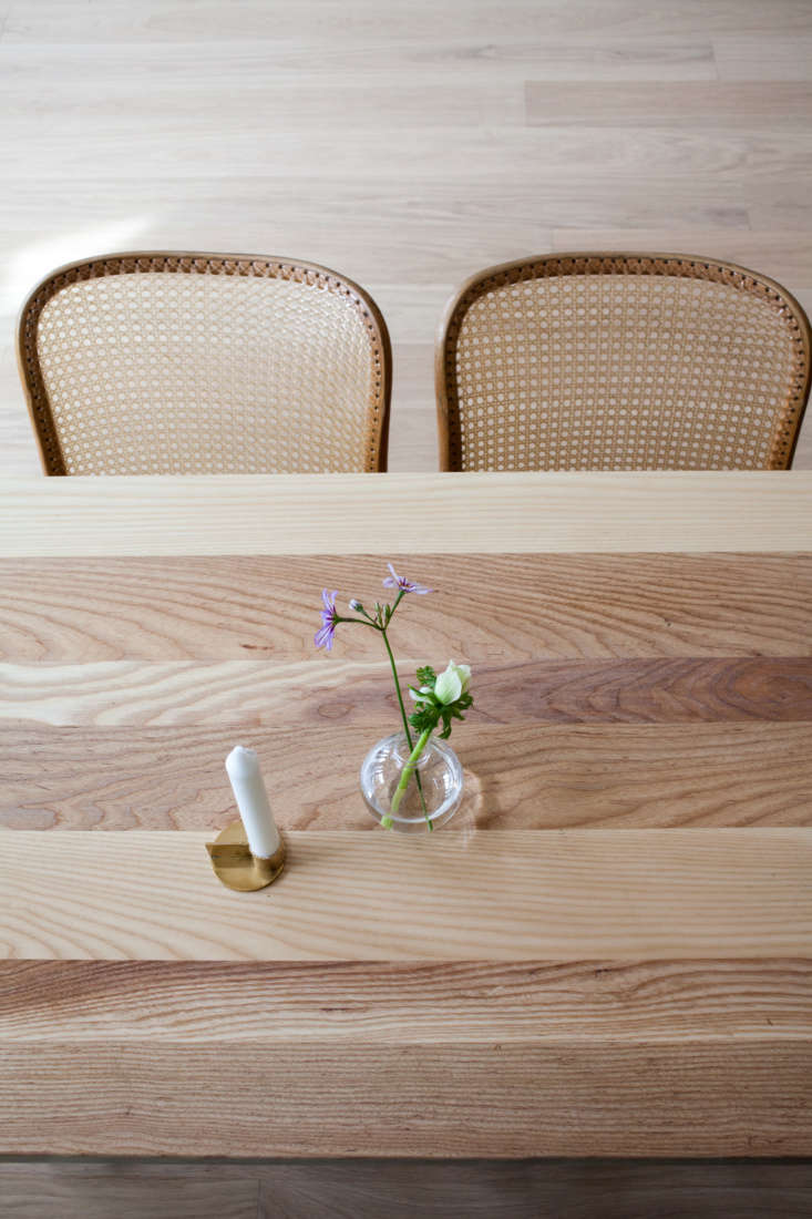
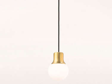
The vintage Josef Hofmann cane-seat chairs were another reclaimed find: they were originally from the Toronto Public Reference Library, but John and Juli bought them from Williams just down the street from Mjölk. The maple tables were repurposed from the original space: the tops were sanded and finished with white pigmented oil by Woca. The lights are the Mass Pendant Lights by Norm Architects (available from Mjölk for $450 CAD).

&#8\2\20;we brought in some special objects that you won&#8\2\17;t see  20
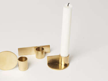
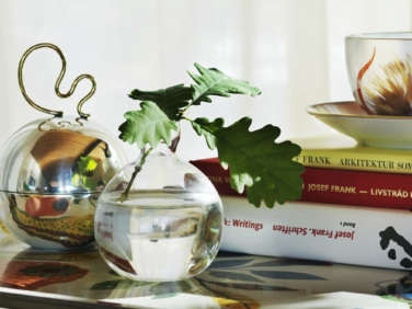
Above: “We brought in some special objects that you won’t see in any North American café (as far as I know),” John writes. Among the little details they added: glass Acorn Vases from Svenskt Tenn and the Fundament Candle Holders by Frama that sit on each table. (The candleholders are available from Mjölk for 260 CAD.)
looking toward the back of the café. the coffee counter is an antique wood 21
Above: Looking toward the back of the café. The coffee counter is an antique wooden counter from the late 1800s that was original to the space; the team moved it to the back and topped with marble. “It was important for everyone to keep. It adds so much history and texture to the cafe,” John and Juli say. Behind the bar area is wide-plank oak (usually used for flooring) from Toronto- and New York–based Relative Space, mounted on the wall.
to the right of the coffee counter, custom shelves painted in hay by farrow &am 22
Above: To the right of the coffee counter, custom shelves painted in Hay by Farrow & Ball topped with marble slabs stock provisions for sale.
weck jars, aligned on a windowsill, house the café&#8\2\17;s &#8\2 23
Above: Weck jars, aligned on a windowsill, house the café’s “grain library.” “We hope to expand on this in the future to show the many beautiful variations of grain,” John and Juli say. (For more on artful ways to decanting at home, see The Organized Pantry: 8 Rules for Decanting Dried Goods.)

behind the sink are shelves with a few mjölk finds (like the brass land&am 24
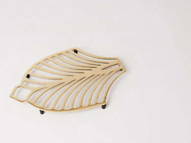
Above: Behind the sink are shelves with a few Mjölk finds (like the brass Land’s End Trivet by Swedish company Skultuna), plus the café’s own selection of Japanese coffee goods like ceramic grinders by Hario. “They have a nice selection of coffee implements which will be expanded on,” the duo says. John and Juli preserved the restaurant doors that lead to the kitchen from the original space—”they just had a coat of beige paint and the brass polished up again,” they say. Note also the two petite sinks, one in white, for food and drink prep.
the view from behind the counter, looking toward the other side of the cafe, a  25
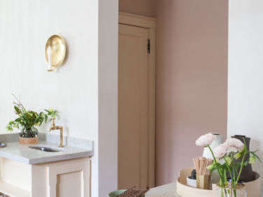
Above: The view from behind the counter, looking toward the other side of the cafe, a self-serve water station, and the hallway, painted in Setting Plaster by Farrow & Ball, that leads to the bathroom. (“The bathrooms are also pink with beige paneling and a nice sage green ceiling,” John and Juli say.)
the corner of the counter has a few simple essentials: napkins held in place wi 26
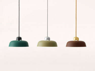
Above: The corner of the counter has a few simple essentials: napkins held in place with an Oji Masanori weight, a Small Ikebana Vase (available from Mjölk for $150 CAD), and a cutout in the counter that leads to a waste bin. Hanging above, a w162 Dalston Pendant in a moss color (available from Mjölk for $550 CAD).
a stack tray by wednesday architects for fritz hansen (and inspired b 27
Above: A Stack Tray by Wednesday Architects for Fritz Hansen (and inspired by Nordic bentwood boxes and Shaker boxes) corrals milk and cream. Note also: the Oji Masanori Small Brass Tool Holder (which also finds a place in John and Juli’s kitchen) is put to work as a holder for coffee stirrers.
john and juli designed a self serve water station &#8\2\20;inspired by the  28
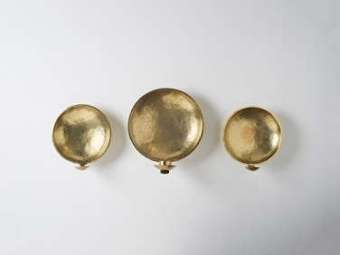
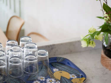
Above: John and Juli designed a self-serve water station “inspired by the spindles used in the Companions Bed by Ilse Crawford.” Glasses and glass water jugs are stored on shelves below; a small sink with an antique brass faucet that John and Juli found in the UK provides a convenient hand-washing place. Also on display: a green-glass Low Vase (available from Mjölk for $190 CAD). A Brass Sconce (also available from Mjölk; $700 CAD)—one of our 5 Favorite Scandi Circular Candleholders—hangs above.
a tray notturno by josef frank for svenskt tenn corrals the water glasses. 29
Above: A Tray Notturno by Josef Frank for Svenskt Tenn corrals the water glasses.

on the other wall, the team designed a wide recessed archway to offset the pain 30
Above: On the other wall, the team designed a wide recessed archway to offset the painted bench and add to the historic feel. “The arch was a really romantic addition,” John and Juli say.

a geometric fundament brass candle holder and a long brass candle snu 31
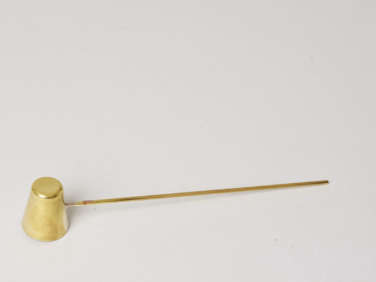
Above: A geometric Fundament Brass Candle Holder and a Long Brass Candle Snuffer (available for $80 CAD from Mjölk) mix with a vintage painted mirror on the high shelf.

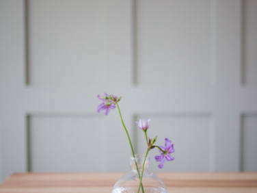
Above: Little vignettes on each table include simple flowers and Kin Tealights in dusty pink by Claesson Koivisto Rune. (A set of three is $85 CAD from Mjölk.)
a new sign in the window touts dear grain, the café&#8\2\17;s new bake 34
Above: A new sign in the window touts Dear Grain, the café’s new bakery and heirloom breads offering.
no changes were made to the dark storefront; &#8\2\20;it was already perfec 35
Above: No changes were made to the dark storefront; “it was already perfect,” John and Juli say.

For many more of the Mjölk duo’s artful projects (and to get the look), see:

(Visited 1,481 times, 4 visits today)
You need to login or register to view and manage your bookmarks.

Product summary  Item 6 186Item 7 187

Have a Question or Comment About This Post?

Join the conversation

v5.0