Icon - Arrow LeftAn icon we use to indicate a rightwards action. Icon - Arrow RightAn icon we use to indicate a leftwards action. Icon - External LinkAn icon we use to indicate a button link is external. Icon - MessageThe icon we use to represent an email action. Icon - Down ChevronUsed to indicate a dropdown. Icon - CloseUsed to indicate a close action. Icon - Dropdown ArrowUsed to indicate a dropdown. Icon - Location PinUsed to showcase a location on a map. Icon - Zoom OutUsed to indicate a zoom out action on a map. Icon - Zoom InUsed to indicate a zoom in action on a map. Icon - SearchUsed to indicate a search action. Icon - EmailUsed to indicate an emai action. Icon - FacebookFacebooks brand mark for use in social sharing icons. flipboard Icon - InstagramInstagrams brand mark for use in social sharing icons. Icon - PinterestPinterests brand mark for use in social sharing icons. Icon - TwitterTwitters brand mark for use in social sharing icons. Icon - Check MarkA check mark for checkbox buttons.
You are reading

Dear Breakfast: A Whitewashed, Architectural Cafe in Lisbon, High/Low Edition

Search

Dear Breakfast: A Whitewashed, Architectural Cafe in Lisbon, High/Low Edition

April 18, 2018

Our tip-off for the latest design-forward restaurant in Lisbon came, of all places, from Portland, Maine, photographer Erin Little, who happened into it recently while on holiday in Portugal. “This is a sweet little breakfast spot in Lisbon I thought you guys might be interested in,” she reported, “and the story behind the renovation is really cool.”

Dear Breakfast—a self-proclaimed “ode to morning foods”—is situated in a former warehouse of “a very old palacio in the center of Lisbon,” French-born owner Julien Garrec says, in an up-and-coming area of Lisbon known as The Triangle. Garrec and architects Carlos Aragao and João Pombeiro Machado were inspired by “cities and travels in Santorini, Comporta, Marrakech, Paros,” and stripped the space to architectural simplicity, with whitewashed archways, DIY terrazzo floors, and Portuguese marble, softened by velvet. “You won’t find any Mason jars or refurbished whimsical objects atop your table,” Garrec promises: “We have respected the existing volumes and played with them.” Join us for a look.

Photography by Erin Little for Remodelista.
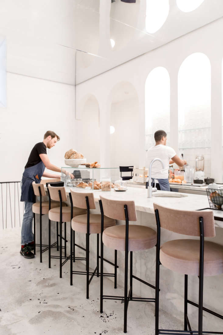
the interiors are sparse, with striking architectural bones, including cement f 17
Above: The interiors are sparse, with striking architectural bones, including cement floors and soaring archways that Aragao and Machado added throughout. “We did something very experimental regarding the floor: It’s a white concrete with fragments of stones we placed by ourselves before it dried,” Garrec says. “It was complicated to find a Portuguese company available for making terrazzo on time and with our budget. So, at the end, we have something very handmade/homemade. And we are happy with this: it works.” The archways are wooden, inspired by the work of Catalan sculptor Xavier Corberó. “Their lines fit perfectly with the global organic feeling we have inside Dear Breakfast,” Garrec adds.

In the room with the pastry counter, the archways behind the Portuguese stone bar are fitted with glass shelves that store cups and glasses. The room appears even taller than it is thanks to a cleverly mirrored ceiling (which also gives the impression that the archways are doubled).

a glass case displays the day&#8\2\17;s pastries. 18
Above: A glass case displays the day’s pastries.
Above: Though sparse, the space is sumptuous in its details: blush-colored velvet stools, designed by the architects, and the handmade terrazzo-like concrete floors.
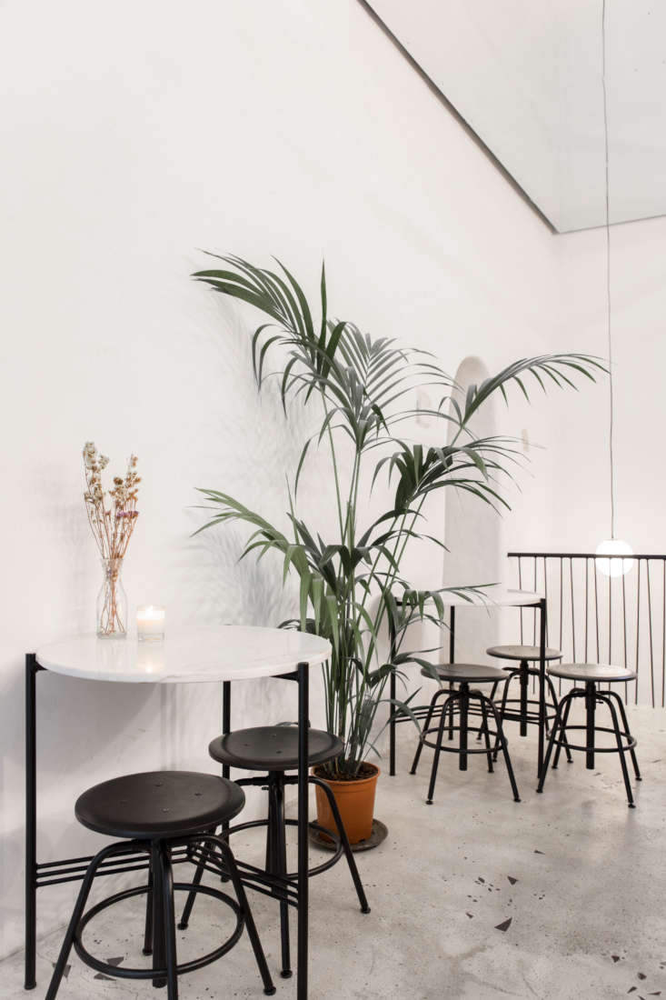
a high/low mix: tables with portuguese marble tops are paired with low black st 21
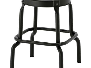
Above: A high/low mix: Tables with Portuguese marble tops are paired with low black stools from Ikea. “They are discrete, just here to help,” Garrec says. (For something similar in the US, try the Raskog Stool.)
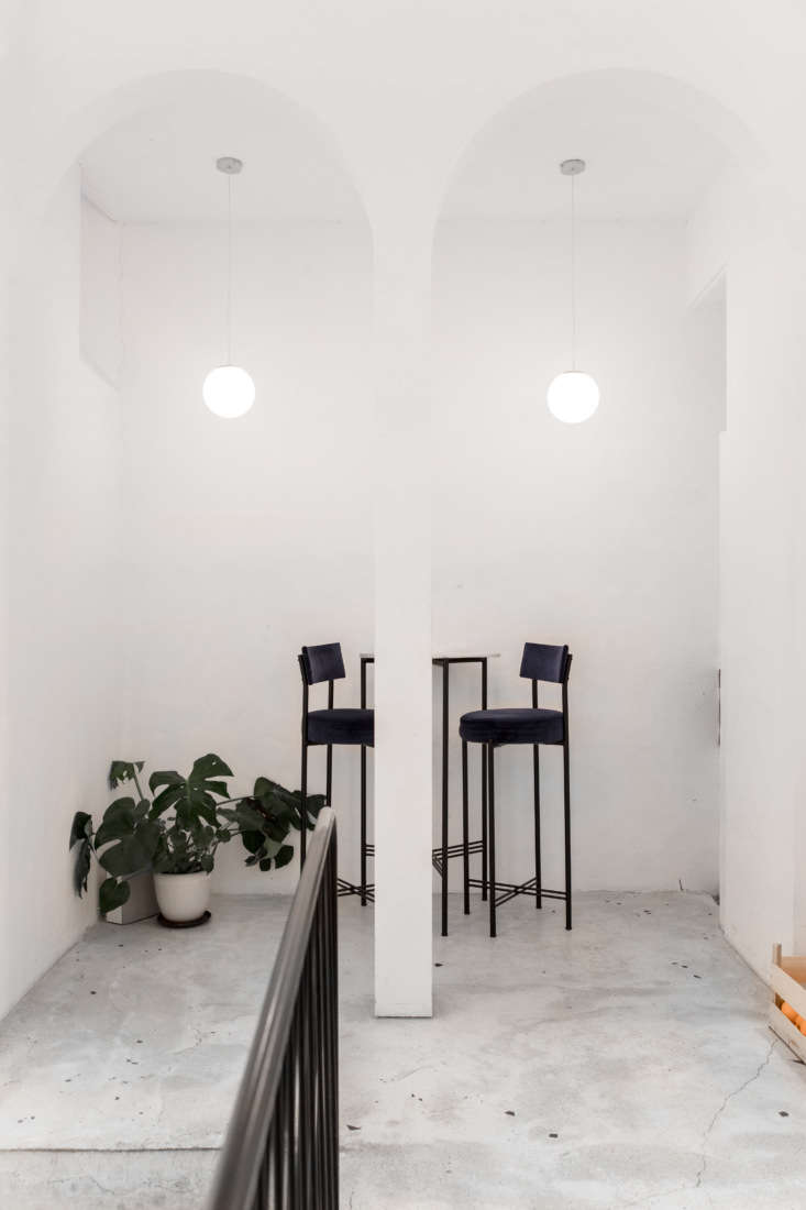
the tall archways and long pendant lamps mirror the high top tables and stools. 22
Above: The tall archways and long pendant lamps mirror the high-top tables and stools. Note the crate of oranges behind the bar, at right.
the architects designed uniform chairs in shades of pink and deep blue througho 23
Above: The architects designed uniform chairs in shades of pink and deep blue throughout.
functional decor: wire racks display design magazines. 24
Above: Functional decor: wire racks display design magazines.
in another room, a built in banquette is lined with cushions upholstered in vel 25
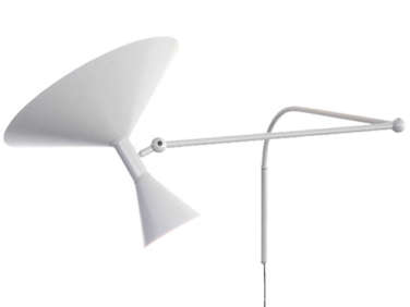
Above: In another room, a built-in banquette is lined with cushions upholstered in velvet sourced in Portugal. The wall lights are the Le Corbusier–designed Lampe de Marseille.
the vaulted brick ceilings are original to the space, newly &#8\2\20;smooth 26
Above: The vaulted brick ceilings are original to the space, newly “smoothed out” by the architects.
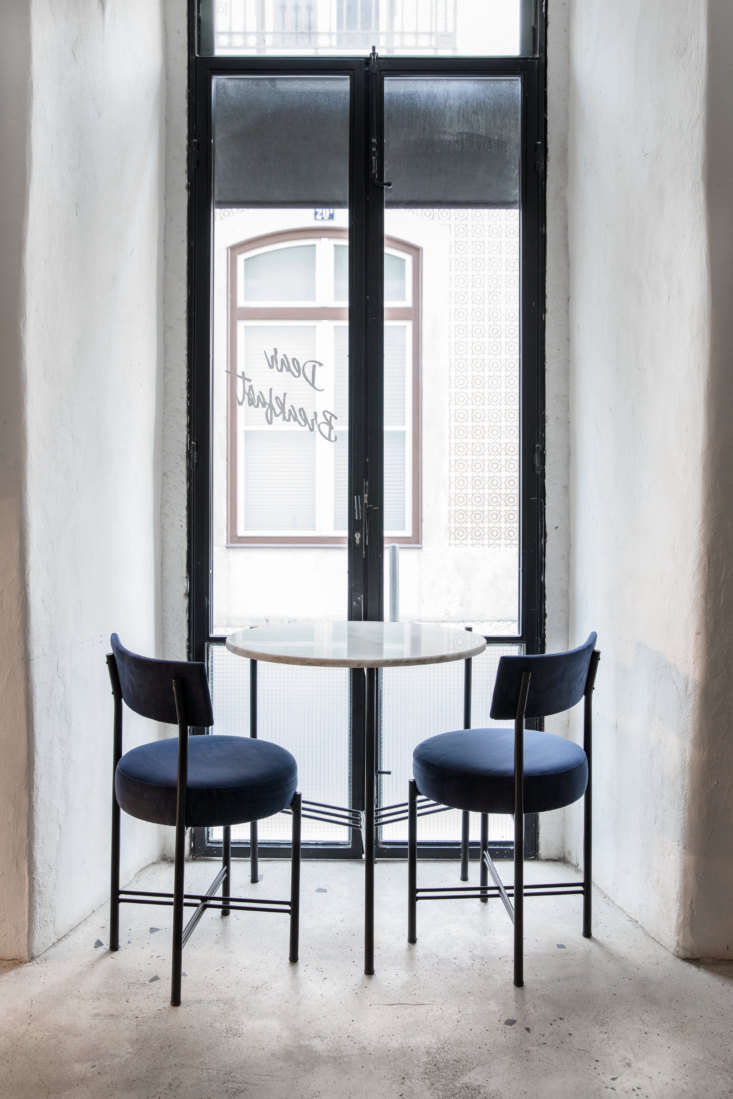
a quiet niche for breakfast, looking out at the rua das gaivotas. 27
Above: A quiet niche for breakfast, looking out at the Rua das Gaivotas.
dear breakfast lisbon julien erin little
Above: Garrec, who recently moved from New York to Lisbon, in the restaurant’s narrow entryway.

N.B.: If you go, look for the “secret room” downstairs, all in pink, that “hosts the most intimate breakfast of the city,” Garrec says.

Heading to Portugal? Consult our Portugal Travel Guide, and check out a few of our favorite spots:

(Visited 788 times, 1 visits today)
You need to login or register to view and manage your bookmarks.

Product summary  

Have a Question or Comment About This Post?

Join the conversation

v5.0