Icon - Arrow LeftAn icon we use to indicate a rightwards action. Icon - Arrow RightAn icon we use to indicate a leftwards action. Icon - External LinkAn icon we use to indicate a button link is external. Icon - MessageThe icon we use to represent an email action. Icon - Down ChevronUsed to indicate a dropdown. Icon - CloseUsed to indicate a close action. Icon - Dropdown ArrowUsed to indicate a dropdown. Icon - Location PinUsed to showcase a location on a map. Icon - Zoom OutUsed to indicate a zoom out action on a map. Icon - Zoom InUsed to indicate a zoom in action on a map. Icon - SearchUsed to indicate a search action. Icon - EmailUsed to indicate an emai action. Icon - FacebookFacebooks brand mark for use in social sharing icons. flipboard Icon - InstagramInstagrams brand mark for use in social sharing icons. Icon - PinterestPinterests brand mark for use in social sharing icons. Icon - TwitterTwitters brand mark for use in social sharing icons. Icon - Check MarkA check mark for checkbox buttons.
You are reading

Kitchen of the Week: A Cubist Approach for an Apartment Makeover

Search

Kitchen of the Week: A Cubist Approach for an Apartment Makeover

February 2, 2023

Architect Idan Naor didn’t set out to design a kitchen that calls to mind a Cubist painting. His clients—a couple who both work in tech and have what Naor admiringly describes as “details-oriented mindsets”—requested a carefully crafted, open-plan design for the center of their Brooklyn duplex. “What was there was terribly laid out and nothing felt well designed or chosen,” report the owners, avid cooks and mixologists who also happen to be semi-pro swing dancers. “We wanted a space we’d love to just sit and take in.” Translation: bold moves welcome.

Naor, who studied architecture at Columbia University and runs his own boutique firm, INworkshop, was tasked with not only replacing the existing kitchen, but transforming the staircase that was awkwardly intruding at one end. He and his clients weren’t the only ones who objected to it: Opi, the couple’s three-legged rescue dog, “vehemently refused to travel down the open risers—they were intimidating at his eye level,” says Naor.

The hitch: the stair location and dimensions were locked in place thanks to concrete slab floors. During the problem-solving process, Naor took inspiration from art history, including Richard Serra’s steel sculptures, and began considering a planar look for the updated design—and that fragmented, geometric approach ended up extending to the ceiling and walls, the counters and the kitchen island. Picasso, Braque, Malevich, and countless others would approve. So does Opi.

Photography by Haley Day, unless noted, courtesy of INworkshop.

the overall design of the kitchen evolved as naor came up with the solution for 17
Above: The overall design of the kitchen evolved as Naor came up with the solution for the staircase: “the planar look was our sculptural answer to a tight spatial problem rather than a pre-conceived aesthetic agenda.” The equally surprising island, which doubles as the owners’ cocktail bar, is finished in fluting milled from solid walnut.
naor—on the left with his client—gave the island a &#8\2\20;p 18
Above: Naor—on the left with his client—gave the island a “pizza pie plan”: two slices are stools and two offer under-the-sink storage; a narrow “fifth slice” between the stools offers concealed shelving for small objects. Needless to say, these “curved assemblies” all had to line up precisely—architecture and fabrication studio Kyle May, Architect was responsible for all of the millwork, and M&E Construction served as general contractor.

Previously painted white and in bad shape, the existing wood floor was stripped and refinished with Bona Nordic Seal for a matte finish.

naor designed the island to &#8\2\20;serve as a liminal threshold between t 19
Above: Naor designed the island to “serve as a liminal threshold between the kitchen and the living area.” The counters, and backsplash are all Richlite, a paper pulp material often used in laboratories and a longstanding Remodelista favorite (see Remodeling 101: Paper Composite Countertops). “We searched for an eco-friendly option that is strong, thin, and resilient,” says Naor. “Though I have a weakness for natural stone, we made a conscious decision to avoid it because it’s a non-renewable resource with a large carbon footprint.”

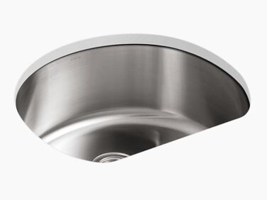
The sink is full size—it’s the Kohler Undertone—and the faucet is the Brizo Litze. “My clients wanted the sink facing outwards for when they entertain,” says Naor. “When you’re washing dishes, you look out through-double height windows at the vegetable garden that they tend so carefully.”

the lower cabinet boxes are made of plywood, edge banded and veneered with ash. 20
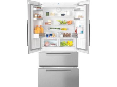
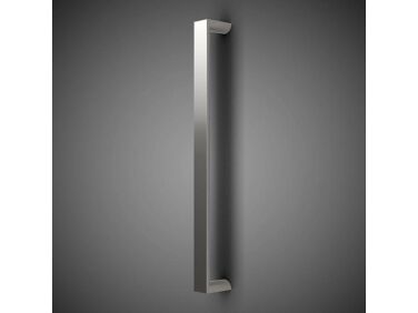
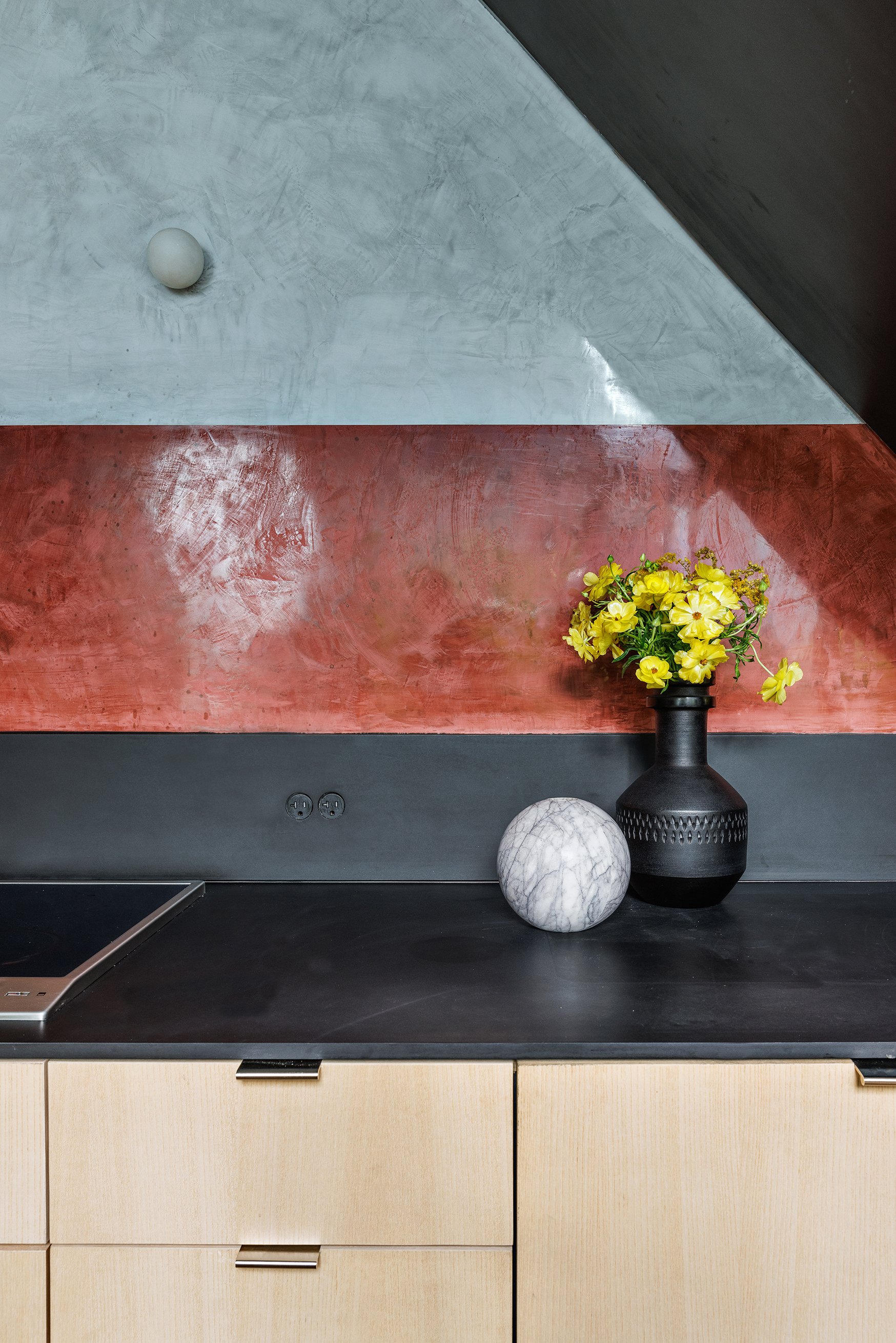
Above: The lower cabinet boxes are made of plywood, edge-banded and veneered with ash. The painted wood upper cabinets are framed in walnut. The fridge is Miehle’s 36-inch French Door panel-ready model with door pulls from Hamilton Sinkler. Photograph by Idan Naor.
cubist kitchen inworkshop idan naor brooklyn 5a
Above: The walls are finished with waterproof Venetian lime plaster, a green choice that, Naor notes, “magnifies the dynamism of hue, saturation, reflectivity, and depth in varying natural light.” The round electrical outlets are by Bocci: see The Surprising Appeal of Flush Electrical Outlets  and DIY Flush Outlets Courtesy of a Budget-Minded Young Architect. The drawer and cabinet edge pulls are from Gruppo Romi.
the upper cabinets, with tilt up openings, hold plates, glasses, and serving bo 22
Above: The upper cabinets, with tilt-up openings, hold plates, glasses, and serving bowls. They have notched knobs from Omnia. Of the palette choice, Naor says, “We locked in the Richlite counters first and then selected one dominant color by observing side-by-side samples and how they interact.” Photograph by Idan Naor.
&#8\2\20;our clients have remarked that the completed space is calming and  23
Above: “Our clients have remarked that the completed space is calming and engaging at the same time,” say Naor. “I think the engagement comes from the fact that your eye follows the three-dimensional thread between materials, planes, solid volumes, and voids. It creates a silent dialogue between the space and the occupant.”

Admiring the scalloping on the island ? See our Trend Alert: Kitchens with Fluted Detailing.

For more about plaster finishes, take a look at Remodeling 101: Modern Plaster Walls, Six Ways.

Find many more kitchens in the Remodelista Kitchen of the Week archive.
(Visited 721 times, 1 visits today)
You need to login or register to view and manage your bookmarks.

Product summary  

gbh sqtemplate
Kitchen Sinks

Undertone

More Info from Kohler

Have a Question or Comment About This Post?

Join the conversation

v5.0