Icon - Arrow LeftAn icon we use to indicate a rightwards action. Icon - Arrow RightAn icon we use to indicate a leftwards action. Icon - External LinkAn icon we use to indicate a button link is external. Icon - MessageThe icon we use to represent an email action. Icon - Down ChevronUsed to indicate a dropdown. Icon - CloseUsed to indicate a close action. Icon - Dropdown ArrowUsed to indicate a dropdown. Icon - Location PinUsed to showcase a location on a map. Icon - Zoom OutUsed to indicate a zoom out action on a map. Icon - Zoom InUsed to indicate a zoom in action on a map. Icon - SearchUsed to indicate a search action. Icon - EmailUsed to indicate an emai action. Icon - FacebookFacebooks brand mark for use in social sharing icons. flipboard Icon - InstagramInstagrams brand mark for use in social sharing icons. Icon - PinterestPinterests brand mark for use in social sharing icons. Icon - TwitterTwitters brand mark for use in social sharing icons. Icon - Check MarkA check mark for checkbox buttons.
You are reading

10 Design Ideas to Steal from Cowley Manor Experimental in the Cotswolds

Search

10 Design Ideas to Steal from Cowley Manor Experimental in the Cotswolds

This week, in the spirit of savoring every last bit of the season, we’re revisiting some of our favorite summery stories, like this one:

Dorothée Meilichzon is renowned for designing playful hotels throughout Europe, from city spots like Grand Pigalle Hotel in Paris to seaside resorts like Montesol Experimental in Ibiza, but she had never tackled a rural property until she overhauled a 1695 estate in the Cotswolds. Reminted as Cowley Manor Experimental, the newly-updated hotel is her take on an English countryside getaway—complete with modern influences.

“I want to do projects that are contemporary,” says Dorothée, who founded France-based studio Chzon in 2009. “Even if they’re in classical buildings, they have to talk about the period we’re living in.” That’s why she leaned into graphic patterns (most notably checkerboard), groovy silhouettes reminiscent of the ’60s and ’70s, and a whimsical color palette of blues, greens, and reds.

But that doesn’t mean Dorothée ignored 300 years of history. She incorporated the estate’s many past lives, including its role as the inspiration for Alice’s Adventures in Wonderland, into the aesthetic. And, of course, she maintained the government-protected architectural details like original wood paneling and an ornate staircase. The mix of eras and styles is what Dorothée refers to as “joyeux bordel,” or a happy mess.

With that, here are 10 design ideas worth borrowing.

Photography by Mr. Tripper.

1. Pay homage to history.

the key to cowley manor&#8\2\17;s enchanting interiors is the centuries old 17
Above: The key to Cowley Manor’s enchanting interiors is the centuries-old structure itself, which provided Dorothée with a character-filled canvas on which to layer her modern finishes and decor. “Sometimes we have to cheat because the historic buildings are in poor condition or the space is not the best, but this one was very, very charming already, so we had to do no magic, just interior design, and bring the building into 2023,” she explains.

2. Riff on a well-known trope.

instead of the overdone circular hotel lobby sofa, dorothée created an inv 18
Above: Instead of the overdone circular hotel lobby sofa, Dorothée created an inviting seating area by arranging upholstered club chairs back to back.

3. Embrace checkerboard.

dorothée used an abundance of checkerboard for two reasons: it&#8\2\17 19
Above: Dorothée used an abundance of checkerboard for two reasons: It’s more graphic (and French) than the traditional U.K. tartan—and it subtly nods to Alice’s Adventures in Wonderland. “We checked the original illustrations and there were playing cards with checkerboards on them,” she says. “We knew we could play with that. We could use it on the carpet; we could hand-paint it. It’s not obvious when you enter, but if you look closely, it’s everywhere.”

(We’re noting checks popping up everywhere lately; for more, see Margot’s Trend Alert: Checkerboard Tiles.)

4. Go all in on warm tones.
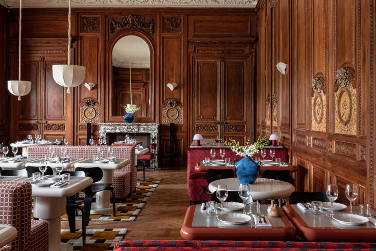
though dorothée employed blues and greens in most spaces, she avoided such 20
Above: Though Dorothée employed blues and greens in most spaces, she avoided such cool colors in the restaurant, since they’re known to suppress the appetite. She applied a warm brown stain to the elaborate wood-paneled walls and utilized shades of red and pink for a welcoming, food-friendly atmosphere. “It will work great during winter because it is a bit of a chilly region,” she says. “It’s very, very comforting.”

5. Consider cobalt.

elsewhere, the cocktail bar, with its rust runner and smooth wood paneling, wou 21
Above: Elsewhere, the cocktail bar, with its rust runner and smooth wood paneling, would be entirely mid-century in style if not for the cobalt enamel side tables that add Dorothée’s signature bold modernity.

6. Up-cycle existing furniture.

each of the 36 guest rooms has its own look, but many of them include old wardr 22
Above: Each of the 36 guest rooms has its own look, but many of them include old wardrobes from the hotel’s previous iteration that Dorothée upcycled to suit her taste. She fronted the cabinets in burled maple, wrapped the doors in fabric with hand-painted checkerboards, and added pitched or domed roofs. “They were in very good condition, so I thought it was a pity to throw them away,” she says.

7. Bring back canopy beds.

to offset the high ceilings and excess square footage in the more cavernous gue 23
Above: To offset the high ceilings and excess square footage in the more cavernous guest rooms, Dorothée designed canopy—or baldaquin—beds with flowy curtains. “We thought we needed to create a structure so the room feels less big,” she explains. “It seems a little bit weird to say that, but when the room is too big, it’s not too nice either. We used the baldaquins so when you’re in your bed, you feel very comfortable, very safe.”

8. Add a statement headboard (even in small spaces).

the more compact guest rooms are outfitted with statement headboards—a c 24
Above: The more compact guest rooms are outfitted with statement headboards—a calling card of Dorothée’s—which allow them to feel fully designed despite a lack of space for additional furniture. “We’re always investing a lot of energy in the bedhead,” she says. “We’ve played with the graphic pattern on the upholstery, and you have this scallop shape on top of it for a little color.”

9. Check out a nonfuctioning fireplace.

just because a fireplace no longer functions as a heat source doesn&#8\2\17 25
Above: Just because a fireplace no longer functions as a heat source doesn’t mean it can’t serve a purpose. Dorothée gave the existing mantels a monochromatic paint job, then adorned them with red and white square tiles for more checkerboard moments.

10. Try enameled lava stone.

to infuse the bathrooms with color, dorothée specified countertops made of 26
Above: To infuse the bathrooms with color, Dorothée specified countertops made of enameled lava stone from French volcanoes. “It’s very, very resistant and you can do whatever color you want, which I thought was amazing because I really wanted to do something colorful,” she says. “We’ve carved it to create the sinks. The vanity is important because it’s where you’re going to make up and brush your teeth. So we’re always trying to create something quite surprising there.”
the bath in green lava stone. 27
Above: The bath in green lava stone.
a bathroom in butter yellow. 28
Above: A bathroom in butter yellow.

For more by Dorothée, head to her site; and for more on the hotel, head to Cowley Manor Experimental.

We’re longtime fans of Dorothée’s playful, statement-making designs. Case in point:

N.B.: This story originally ran on September 27, 2023, and has been updated with new images.
(Visited 16,759 times, 1 visits today)
You need to login or register to view and manage your bookmarks.

Have a Question or Comment About This Post?

Join the conversation

v5.0