Icon - Arrow LeftAn icon we use to indicate a rightwards action. Icon - Arrow RightAn icon we use to indicate a leftwards action. Icon - External LinkAn icon we use to indicate a button link is external. Icon - MessageThe icon we use to represent an email action. Icon - Down ChevronUsed to indicate a dropdown. Icon - CloseUsed to indicate a close action. Icon - Dropdown ArrowUsed to indicate a dropdown. Icon - Location PinUsed to showcase a location on a map. Icon - Zoom OutUsed to indicate a zoom out action on a map. Icon - Zoom InUsed to indicate a zoom in action on a map. Icon - SearchUsed to indicate a search action. Icon - EmailUsed to indicate an emai action. Icon - FacebookFacebooks brand mark for use in social sharing icons. flipboard Icon - InstagramInstagrams brand mark for use in social sharing icons. Icon - PinterestPinterests brand mark for use in social sharing icons. Icon - TwitterTwitters brand mark for use in social sharing icons. Icon - Check MarkA check mark for checkbox buttons.
You are reading

Vertical Alley: A Live/Work Tower for Two in Tokyo

Search

Vertical Alley: A Live/Work Tower for Two in Tokyo

March 29, 2019

House-hunter news: in a city famous for its minuscule living quarters, a young creative couple managed to acquire a corner parcel of land. Located in Tokyo’s historic, densely populated Asakusa district, the plot had been cleared of an existing structure and was just big enough for its new owners, confectioner Mio Tsuchiya and graphic designer Moe Furuya, to construct their own mini tower with two floors devoted to work and two to home.

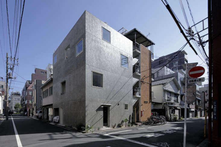
Faced in concrete panels, the streamlined structure is punctuated with a series of square windows, some glazed and some left wide open to reveal a factory-style pierced metal stair that winds through a central light court. The design is the work of Remodelista favorite No. 555, a team of architects known for their inventive, barebones use of industrial materials, and for infusing their work with a hipster nonchalance. The architects say they took inspiration from the surrounding “nostalgic streetscape,” and thanks to its exposed skeleton dubbed the design the Vertical Alley. Come see.

Photography by Torimura Goichi Photography Office, courtesy of No. 555.

the west facing structure occupies a 675 square foot corner in a residential ar 17
Above: The west-facing structure occupies a 675-square-foot corner in a residential area blocks from Asakusa’s most famous landmark, the Sensō-ji Buddhist temple.

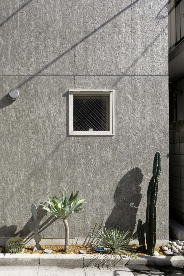
Mio and Moe, both 35 and from Tokyo—Mio grew up right in the neighborhood—met at the city’s esteemed Tama Art University. Friends of theirs had collaborated with No. 555 on a live/work space that they admired, and the couple came to the firm with their own rough sketches. Takuya Tsuchida, the project’s main architect, and his crew had to do a lot of experimenting to deliver the requested concrete finish on the exterior. They used oriented strand board or OSB, a particle-board-like material, as a “mold,”and came up with the final approach by making many prototypes “including switching from the front to the back of the board, and experimenting with a peeling agent.” (Scroll to the end to see a closeup of the textured surface and floor plans).

a garage and side entrance are neatly integrated into the northern side of the  18
Above: A garage and side entrance are neatly integrated into the northern side of the building. The two unglazed windows expose the structure’s inner light court and there’s a roof terrace on top.
the entrance next to the garage opens to a pocket size succulent garden next to 19
Above: The entrance next to the garage opens to a pocket-size succulent garden next to the steel mesh stair. The ground floor houses a commercial kitchen and showroom for Cineca, Mio’s line of rarefied sweets inspired by “scenes, characters, and events in some of the world’s greatest movies.”
the cineca atelier is set up as a chapel of sorts with mio&#8\2\17;s concep 20
Above: The Cineca atelier is set up as a chapel of sorts with Mio’s conceptual confections displayed in niches that were designed by her friend Teppei Nomoto. “Each of my creations has a story, so every sweet has its own world,” she says. The display shelves, she notes, are like windows: “they act as a bridge between the customer and the story.”

The shop is open on an irregular basis, and the candies are also sold at the Tokyo Metropolitan Art Museum, among other places, and Mio accepts commissions. (Follow her news @cineca.)

an urban take on indoor outdoor living. the architects designed the semi outdoo 21
Above: An urban take on indoor-outdoor living. The architects designed the semi-outdoor staircase to “resemble an alleyway.”

Their hope, they say is that “this finely partitioned and vertically integrated building will continue to the rooftops like an extension of the alleyways of Asakusa, in kinship with the old houses of the surrounding area, discretely becoming a part of the fabric of the street.”

moe&#8\2\17;s graphic design studio, study and design, occupies the second  22
Above: Moe’s graphic design studio, Study and Design, occupies the second floor. The desk chairs are classics from the Eames Aluminum Group. As with all of No. 555 designs, open shelves leave the stuff of life fully exposed. Hung from a pipe, bundles of eucalyptus and other dried bouquets perfume the air.
the light court divides the space in two: a work area and meeting room. 23
Above: The light court divides the space in two: a work area and meeting room.
&#8\2\20;while the staircase is minimal, its trapezoidal shape fosters a se 24
Above: “While the staircase is minimal, its trapezoidal shape fosters a sense of daylight, ventilation, and sensory openness,” write the architects.
the loft like third story houses the kitchen and living quarters. 25
Above: The loft-like third story houses the kitchen and living quarters.
the cabinets are faced with lauan plywood finished with a translucent white osm 26
Above: The cabinets are faced with lauan plywood finished with a translucent white Osmo Wood Wax, and the counters are a combination of thin stainless steel and plywood.

Note the dishwasher’s custom plywood door panel. The architects also designed the combination shelving and range vent cover (where the couple’s cat has discovered a place to perch). The appliances are by AEG.
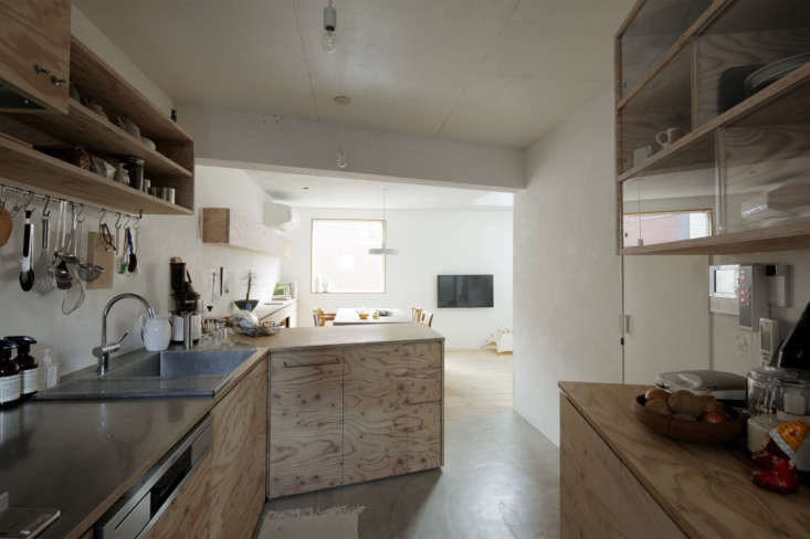
mio requested a lot of kitchen storage, so the designers added a second bank of 27
Above: Mio requested a lot of kitchen storage, so the designers added a second bank of cabinets in the entry.
sliding glass fronts keep the contents of the compartments clean. 28
Above: Sliding glass fronts keep the contents of the compartments clean.
the kitchen—with two long counters that extends out from the sink— 29
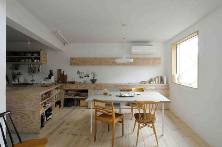
Above: The kitchen—with two long counters that extends out from the sink—opens to a combination eating area and living room set off by wide-board pine flooring. No. 555 designed the concrete-topped table and surrounded it with an odd lot vintage chairs. The narrow cabinet on the back wall contains Mio’s vast collection of movie DVDs.
an open stair leads to the master bedroom and guest room. 30
Above: An open stair leads to the master bedroom and guest room.
the floating design has pine topped steel treads and a minimalist steel railing 31
Above: The floating design has pine-topped steel treads and a minimalist steel railing. Suffice it to say building codes are far less strict in Japan than they are in the US.
edged by only a hint of railing, the master bedroom has open closets and a sink 32
Above: Edged by only a hint of railing, the master bedroom has open closets and a sink. It’s lit by a skylight and the glass door leads to the terrace.
the master bath is a study in concrete. 33
Above: The master bath is a study in concrete.
the whitewashed roof deck features a concrete bench and a framed view. mia told 34
Above: The whitewashed roof deck features a concrete bench and a framed view. Mia told us friends have commented that it reminds them of the roof terrace in the Luis Barragán house in Mexico City.
the neighborhood is a tightly packed patchwork of new and old. 35
Above: The neighborhood is a tightly packed patchwork of new and old.
viewed closeup, the oriented strand board adds texture and pattern to the exter 36
Above: Viewed closeup, the oriented strand board adds texture and pattern to the exterior.

Floor Plans

the architect describe their approach as &#8\2\20;vertically stacked elemen 37
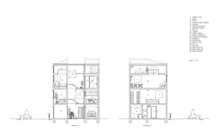
Above: The architect describe their approach as “vertically stacked elements linked by a centrally positioned stair.”
the floor plans. 38
Above: The floor plans.

We’ve been following No. 555 for a good while; here are three more of their projects:

(Visited 1,109 times, 1 visits today)
You need to login or register to view and manage your bookmarks.

Have a Question or Comment About This Post?

Join the conversation

v5.0