You are reading

Bespoke Color from an Accidental Decorator

SearchJoinLogin
Icon - Arrow LeftAn icon we use to indicate a rightwards action. Icon - Arrow RightAn icon we use to indicate a leftwards action. Icon - External LinkAn icon we use to indicate a button link is external. Icon - MessageThe icon we use to represent an email action. Icon - Down ChevronUsed to indicate a dropdown. Icon - CloseUsed to indicate a close action. Icon - Dropdown ArrowUsed to indicate a dropdown. Icon - Location PinUsed to showcase a location on a map. Icon - Zoom OutUsed to indicate a zoom out action on a map. Icon - Zoom InUsed to indicate a zoom in action on a map. Icon - SearchUsed to indicate a search action. Icon - EmailUsed to indicate an emai action. Icon - FacebookFacebooks brand mark for use in social sharing icons. flipboard Icon - InstagramInstagrams brand mark for use in social sharing icons. Icon - PinterestPinterests brand mark for use in social sharing icons. Icon - TwitterTwitters brand mark for use in social sharing icons. Icon - Check MarkA check mark for checkbox buttons.
You are reading

Bespoke Color from an Accidental Decorator

SearchJoinLogin
Advertisement

Bespoke Color from an Accidental Decorator

by Published: May 24, 2013

One of our favorite kitchen outfitters, Plain English, has teamed up with Accidental Decorator Adam Bray to develop a collection of “colors for cupboards,” which are bolder and a departure from the muted colors we have come to associate with the company’s understated Georgian-inspired designs. “This is a palette of 12 diverse but inherently English colors, taking inspiration from the now almost forgotten, everyday shades of the 20th century,” says Katie Fontanta, the creative director and founder of Plain English. For more information, contact Plain English.

Plain English Adam Bray 01

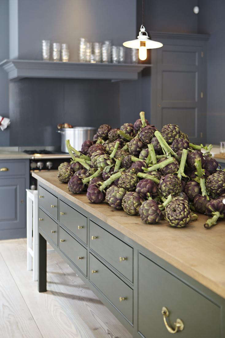
Above: The island is painted in “Dripping Tap.”

Plain English Adam Bray 02

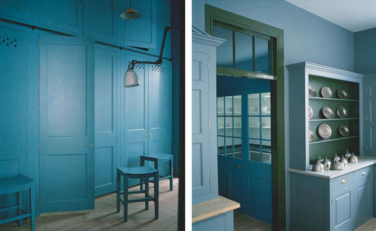
Above: “Draughty Passage” is used as a background color on the cabinets and on the walls.

Plain English Adam Bray 04

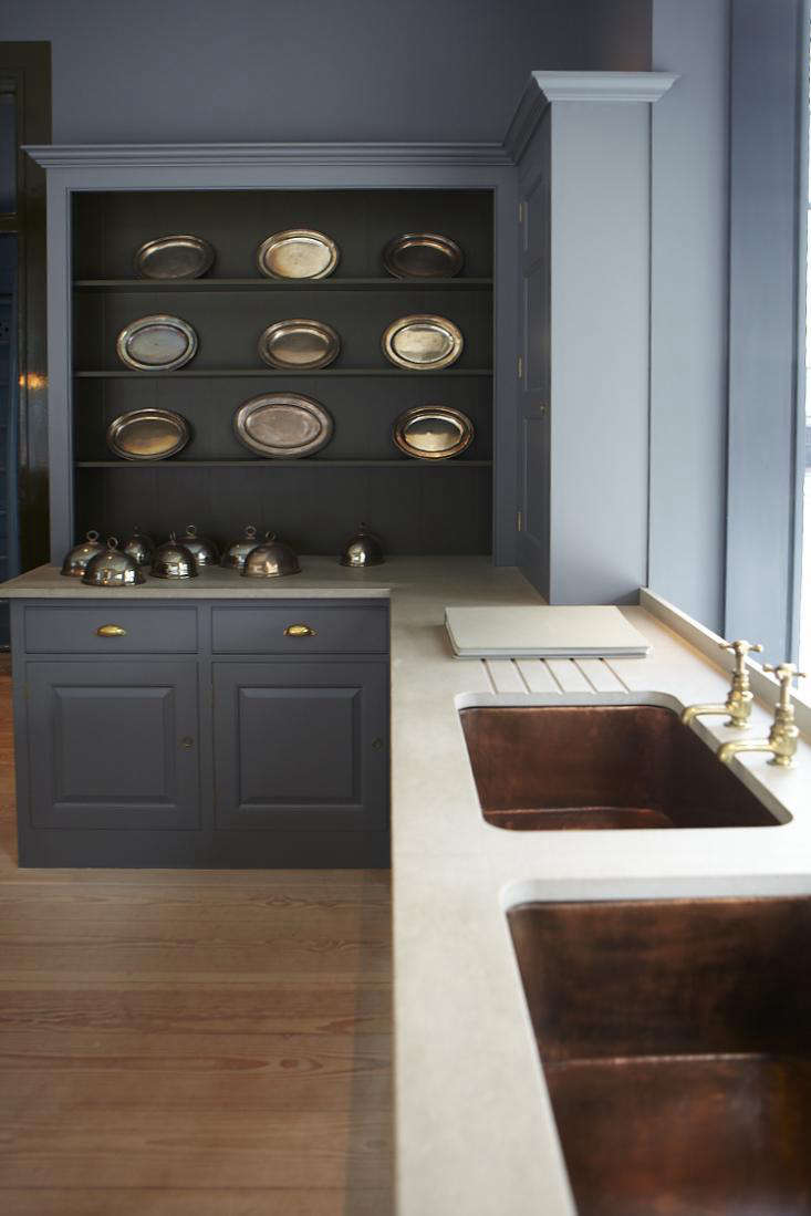
Above: “Pretty Pickle” is used on the trim to contrast with “Scullery Latch.”

Plain English Adam Bray 05

Above: The palette of 12 colors on display in the Marylebone showroom.

Plain English Adam Bray Aprons

Above: Brightly colored aprons hang against a background of “Scullery Latch.”

N.B. if you enjoyed these colors, see House Call: London’s Accidental Decorator to see how Adam Bray uses color in his own home.

Selecting colors is never easy, but doing research is part of the fun. See Palette & Paints for many more options.

(Visited 1,394 times, 1 visits today)
You need to login or register to view and manage your bookmarks.

Have a Question or Comment About This Post?

Join the conversation (6)