Icon - Arrow LeftAn icon we use to indicate a rightwards action. Icon - Arrow RightAn icon we use to indicate a leftwards action. Icon - External LinkAn icon we use to indicate a button link is external. Icon - MessageThe icon we use to represent an email action. Icon - Down ChevronUsed to indicate a dropdown. Icon - CloseUsed to indicate a close action. Icon - Dropdown ArrowUsed to indicate a dropdown. Icon - Location PinUsed to showcase a location on a map. Icon - Zoom OutUsed to indicate a zoom out action on a map. Icon - Zoom InUsed to indicate a zoom in action on a map. Icon - SearchUsed to indicate a search action. Icon - EmailUsed to indicate an emai action. Icon - FacebookFacebooks brand mark for use in social sharing icons. flipboard Icon - InstagramInstagrams brand mark for use in social sharing icons. Icon - PinterestPinterests brand mark for use in social sharing icons. Icon - TwitterTwitters brand mark for use in social sharing icons. Icon - Check MarkA check mark for checkbox buttons.
You are reading

A London Victorian Terrace House Recast in Living Color

Search

A London Victorian Terrace House Recast in Living Color

April 4, 2022

It was either time to jump ship or to reinvent their north London townhouse. After nearly 40 years of living under the same leaky roof, Russell Vandyk and Alan Martin Day, both retired, daringly chose the latter. The couple hired Studio Ben Allen to add a two-story extension onto the back of their terraced Victorian. The ask came with a bonus every design team longs for: they were encouraged, says Allen, to “use the project as a testbed for ideas.”

In response, the architects, led by Allen and Omar Ghazal, took the opportunity to “push the boundaries of off-site fabrication, something we felt was lacking in small-scale residential projects.” Specifically, they used prefabricated pigmented concrete on both the exterior and interior, as structural elements that are also decorative thanks to Studio Allen’s bold use of color and curves. The addition now houses a double-height new skylit kitchen with a mezzanine that connects to the existing main stair and leads to a very memorable new bath. And there’s more: Vandyk and Day essentially gained an entirely new house that still retains highlights of the original—and has earned a lot of appreciation from the UK design community. Dubbed The House Recast, the remodel was named “best new home improvement project” of 2021 in the NLA’s annual “Don’t Move, Improve!” contest. Join us for a tour.

Photography by French + Tye, courtesy of Studio Ben Allen.

the \189\2 house has a traditional façade and an eye opening back exterior 17
Above: The 1892 house has a traditional façade and an eye-opening back exterior of cast concrete: scalloped columns and beams the color of verdigris frame salmon wall panels that front the new upstairs bathroom. “We chose these colors because they’re similar to the copper and terracotta used on some of the local Victorian buildings of note,” says Allen.
the concrete colors were created using earth pigments. adds allen: &#8\2\20 18
Above: The concrete colors were created using earth pigments. Adds Allen: “We were not only inspired by the color but the honesty of Victorian architecture: the brickwork is decorative but it’s also load-bearing.” The new exterior and interior elements were produced off site and efficiently installed in a matter of days. The extension is 142 square meters (approximately 1,500 square feet).
the architects introduced a dramatic double height kitchen with a vaulted louve 19
Above: The architects introduced a dramatic double-height kitchen with a vaulted louvered ceiling and a mezzanine that “allow light to penetrate deep into the house,” says Allen. The supports, island, and counter are all cast concrete; the exterior and structural elements are the work of Cornish Concrete Products and the interior designs are by Concreations. The kitchen cabinets are made of oak triply composed of three layers of solid wood.

“There used to be a small galley kitchen with only one window and a dining table squidged up against it, and the garden was just a scrappy bit of land,” Vandyk told The Modern House. “It’s not as if we were indifferent or sloppy,” added Day. “The house just wasn’t really at the center of our universe. When we were young, we had different priorities. A lot of our life was outdoors. Now, it’s about home comforts.”

the sink has an integrated drainboard of pigmented concrete and a faucet from d 20
Above: The sink has an integrated drainboard of pigmented concrete and a faucet from Dornbracht’s Tara range. Note the handy built-in towel bar.

Of late, there’s been a lot of concern in the design world about the high-carbon cost of producing concrete. Eco-friendlier versions—aka “green concrete”—are now surfacing, but Allen says that this project sadly predated the current discussion.
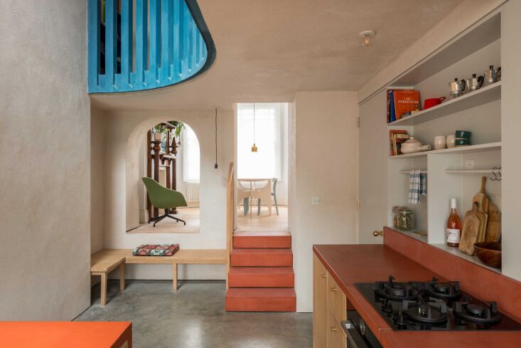
an arched opening and concrete steps link the kitchen to the dining room. 21
Above: An arched opening and concrete steps link the kitchen to the dining room.
one of the redesign themes was &#8\2\20;trying to create connection points  22
Above: One of the redesign themes was “trying to create connection points throughout the house,” Allen told the NLA (New London Architecture) forum. The textured walls are lime plaster.
vandyk and day owned a prop making business before embarking on their remodel.  23
Above: Vandyk and Day owned a prop making business before embarking on their remodel. “As you get older you appreciate having a more aesthetic dimension to your life,” Day told The Guardian in a spotlight on the house. “Luxury isn’t about cruises or expensive sofas; it’s about beauty.”
the room retains its original mantel and wide plank flooring. the d ended dinin 24
Above: The room retains its original mantel and wide-plank flooring. The D-ended dining table is a Studio Ben Allen design. the room retains its original mantel and wide plank flooring. the d ended dinin 25Above: Another archway connects the dining room to the entrance hall. The door in the background leads to the living room. Don’t Move, Improve! judge Tom Foxall commented on the project: “It isn’t just an extension; it’s a route through the building and spatially very interesting. It works incredibly well architecturally,”
next to the living room fireplace, a hatch opens to the kitchen enabling the pe 26
Above: Next to the living room fireplace, a hatch opens to the kitchen enabling the person at the sink to take part in the conversation and pass food back and forth. “These connections have made the house feel so much more sociable,” Vandyk told The Guardian.
the architects made the mezzanine&#8\2\17;s blue balustrade themselves: it& 27
Above: The architects made the mezzanine’s blue balustrade themselves: it’s composed of Valchromat, a through-color high-density fiberboard that they cut out with a CNC router and delivered as a kit of parts. The small corner is used as a “reading nook.”
the main bath is a hamman style wet room entirely composed of pre fabricated pi 28
Above: The main bath is a hamman-style wet room entirely composed of pre-fabricated pigmented concrete. Like the kitchen, it has a vaulted louvered ceiling. The overhead tubular brass element is a custom shower head.

The design was inspired by architect Omar Ghazal’s Jordanian heritage, and by Middle Eastern references in Victorian architecture, such as at Leighton House, the Holland Park residence of painter Sir Frederic Leighton.

the architects had the fixtures made for the space. the window screen is tricoy 29
Above: The architects had the fixtures made for the space. The window screen is Tricoya, a waterproof MDF that was CNC cut and then painted to match the rosy salmon that appears elsewhere. There’s a mirror tucked inside the cabinet door over the sink.

“Alan’s argument was, if we restrict them, we’re not going to end up with anything very interesting,” Vandyk commented to The Modern House. Added Day: “There was a very close collaboration in the consultations, but we never challenged anything…We’re so happy that we didn’t start tutting and saying no…We have the feeling of rootedness because we’ve been here since 1980, and yet something so imaginative has been done.” For more, watch the NLA’s Don’t Move, Improve! video on the project.

Three more inspired townhouse makeovers:

(Visited 1,760 times, 1 visits today)
You need to login or register to view and manage your bookmarks.

Frequently asked questions

What is the material used in this remodel?

Cast concrete is used in this remodel.

What is the location of this remodel?

This remodel is located in a London Victorian terrace house.

Who is the designer of this remodel?

Studio Ben Allen is the designer of this remodel.

What unique element did the designer introduce in this remodel?

The designer introduced a colorful element in this remodel through the use of cast concrete.

What is the inspiration behind the colorful cast concrete in this remodel?

The inspiration behind the colorful cast concrete is the vibrant hues found in Moroccan architecture.

What areas in the house were renovated using the colorful cast concrete?

The floors and kitchen countertops were renovated using the colorful cast concrete.

What other materials were used in this remodel?

Wood, glass, and steel were used in this remodel.

What is the overall aesthetic of this remodel?

The overall aesthetic of this remodel is contemporary with a nod to industrial design.

What is the outcome of this remodel?

The outcome of this remodel is a unique and colorful living space that seamlessly combines industrial and contemporary design elements.

Have a Question or Comment About This Post?

Join the conversation

v5.0