Icon - Arrow LeftAn icon we use to indicate a rightwards action. Icon - Arrow RightAn icon we use to indicate a leftwards action. Icon - External LinkAn icon we use to indicate a button link is external. Icon - MessageThe icon we use to represent an email action. Icon - Down ChevronUsed to indicate a dropdown. Icon - CloseUsed to indicate a close action. Icon - Dropdown ArrowUsed to indicate a dropdown. Icon - Location PinUsed to showcase a location on a map. Icon - Zoom OutUsed to indicate a zoom out action on a map. Icon - Zoom InUsed to indicate a zoom in action on a map. Icon - SearchUsed to indicate a search action. Icon - EmailUsed to indicate an emai action. Icon - FacebookFacebooks brand mark for use in social sharing icons. flipboard Icon - InstagramInstagrams brand mark for use in social sharing icons. Icon - PinterestPinterests brand mark for use in social sharing icons. Icon - TwitterTwitters brand mark for use in social sharing icons. Icon - Check MarkA check mark for checkbox buttons.
You are reading

A Rising-Star Architect Casts Her Own Brooklyn Townhouse in Pinks, Greens, and Grays

Search

A Rising-Star Architect Casts Her Own Brooklyn Townhouse in Pinks, Greens, and Grays

February 11, 2020

What happens when two young architects get to be their own clients? Budget constraints are, of course, a given—so things like learning how to hang wallpaper come into play. So does treating the house as a treasure hunt, and finding out what’s hiding under the carpets and painted mantels. And, of course, experimenting with the transformative power of paint.

That’s but a sampling of what took place when, after a year of real estate hunting, Andrea Fisk and her partner, James Klauder, got to overhaul their own late-19th century townhouse in Brooklyn’s Bushwick. “The structure had been barely altered since it was built, which was very appealing to us,” says Andrea, pointing out its original plaster crown moldings, Eastlake-style door and window frames, and lavishly carved stair. But there was also much to do, including flipping the arrangement of the floors: to help pay their mortgage, the couple turned the garden level into a rental apartment. They restored the parlor floor as a living space—it had previously been divided into bedrooms—and reinstated bedrooms on the top floor.

Andrea is co-founder with Jess Thomas of Shapeless Studio, a rising Brooklyn architecture firm with a focus on residential work, and James specializes in transportation and aviation designs at Gensler. Andrea took the lead on the project, and, as with Jess’s own place—see The Sentimental Minimalist—the results serve as a showcase for the work they can do. Come see.

Photography by Hagan Hinshaw of Blurry Hinge, courtesy of Shapeless Studio.

Above L: The couple tiled the entry in a pattern called Agadir from the Cement Tile Shop and painted the walls and door in Benjamin Moore Arctic Seal: “lighter colors make boundaries more visible, so going with a dark color in a small space can have the effect of dematerializing the volume of the room,” explains James. Above R: A glimpse of the living room.”During the construction, we found a funny foundation block signed ‘Sam, Mike, Mickey, 1891,’ so we think they were the builders,” says Andrea, adding “1891 makes sense because we have Eastlake Victorian details and also some touches of Arts & Crafts, and that year was right on the verge between those styles.”

“We were first-time homeowners and right after our closing, I went down a rabbit hole of trying to learn everything I could about our house’s history. It’s so much older than we are and has seen several generations of New Yorkers come and go; I felt as if we had to respect that. In the 1900 census, the house was owned by a husband and wife who had been born in Ireland; they had five adult daughters and a son living with them, all of whom worked as bookkeepers and dressmakers. By 1940, there was a different family of six, and the father was a watchman for WPA projects. We’re excited to be part of the house’s story.”

  for andrea the most magical moment of the renovation was &#8\2\20;ea 19
Above:  For Andrea the most magical moment of the renovation was “early on, when we stripped dozens of layers of paint from the three original fireplace mantels and a gorgeous green and pink slate emerged. This uncovered stone became the inspiration for our color palette: deep greens, dusty pinks, and cool grays.”

The room is painted Benjamin Moore Lost Locket—and note that that includes the ceiling and crown moldings for an immersive effect. For cohesion throughout, the window and door frames are called out in white. All of the house’s paints are from Benjamin Moore’s Color Stories collection from its Aura line

the room is flooded with natural light thanks to its 7.6 foot tall, 6 foot wide 20
Above: The room is flooded with natural light thanks to its 7.6-foot-tall, 6-foot-wide window. “We wanted our furniture to have a very casual feeling; it gets constantly moved around depending on what we’re doing,” says Andrea. The Large Gray Round Pouf is by Ferm Living, and the Dune Sofa is from Industry West. The shelving is CB2’s Stairway Bookcase.
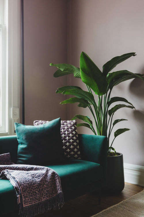
Above L: The nuanced color of the slate mantels and their plant motifs served as inspiration for the whole remodel. Above R: The sofa is upholstered in green velvet.
the aforementioned crash course in wallpapering was for the powder room, now cl 23
Above: The aforementioned crash course in wallpapering was for the powder room, now cloaked in Cole & Son’s exuberant Singita pattern, one of the first elements selected for the house and an encapsulation of the colors used throughout. “Wallpapering is hard work,” says Andrea. “We would hang two panels and then stop for the day; I think it took us six weeks to finish.”

The “self-rimming” sink is the Yeni Klasik from Nameek’s, and the print is by Brooklyn street artist Pixote.

each room is painted a different color—&#8\2\2\1;the palette all goe 24
Above: Each room is painted a different color—”the palette all goes together, but each space has its own character,” explains Andrea. The dusky purple TV room, shown here, is in Benjamin Moore Soho Loft. Hanging above the made-for-lounging Gray Sofa is a screen print called Ellipsis by British artist Dan Hillier. The rug is the Walkabout by Lori Weitzner, a discontinued West Elm design.
there&#8\2\17;s also a proper dining room divided from the living rooms by  25
Above: There’s also a proper dining room divided from the living rooms by pocket doors. “I’m a big fan of separating the dining area from the kitchen when possible,” says Andrea. “I don’t enjoy doing dishes, and I don’t want to look at them while I’m eating.”

This room is in Benjamin Moore Lilac Hush, “which seems to change from blue to pink depending on the lighting,” says Andrea. The rug is an over-dyed vintage Turkish design from Revival Rug in a dark green selected to”help the slate mantel pop, and to also tie the room to the living room’s emerald sofa,” explains Andrea. Ferm Living’s Mingle Table in charcoal linoleum—”we love linoleum”—and DWR’s Note Chairs were selected to ground the space.

the couple added a kitchen to the parlor floor, framed here by moldings painted 26
Above: The couple added a kitchen to the parlor floor, framed here by moldings painted Benjamin Moore’s Vanilla Milkshake, the color used throughout. They uncovered the pine subfloor by removing layers of vinyl, tile, and carpeting.
shapeless studio&#8\2\17;s go to millworker, james harmon of workshop brook 27
Above: Shapeless Studio’s go-to millworker, James Harmon of Workshop Brooklyn, built the cabinets, which are painted Benjamin Moore Blacktop and have a soapstone counter and integrated soapstone sink. Andrea says she’s learned to leave the soapstone as is and allow it  to develop a patina—”but it’s taking some patience” (see our post Soapstone Counters: Are They Worth It?)

The pull-down faucet is the Delta Trinsic. The backsplash is Daltile’s Keystone Mosaics, a 2-by-4-inch porcelain tile with a slight texture that gets picked out in the light.

 the couple saved by supplying harmon with a detailed set of cabinet drawi 28
Above: The couple saved by supplying Harmon with a detailed set of cabinet drawings, something he’d ordinarily do himself. “But it was risky because if we got a dimension wrong, it would have been our fault,” they say. “James installed them and then we took all of the doors off and painted them.”

The range is the Blomberg 30-inch Pro Style, and the vent, the Prestige Compact Insert, is built into the shelf that runs the length of the room.

&#8\2\20;the woodwork on the staircase was one of the reasons we fell in lo 29
Above: “The woodwork on the staircase was one of the reasons we fell in love with the house,” says Andrea. “I hadn’t ever seen a railing like this with all the horizontal pieces.” To highlight its detailing, they painted the walls, as they did the entry, in Benjamin Moore Arctic Seal.
the palette shifts to paler shades upstairs. the master bedroom, shown here, is 30
Above: The palette shifts to paler shades upstairs. The master bedroom, shown here, is  in Benjamin Moore Picket Fence. Says Andrea: “Benjamin Moore’s Aura colors have more pigment—they don’t use any straight white or black to lighten or darken, it’s all pigment, so there are really interesting undertones, especially in the lighter shades.”

Andrea’s father built the bedside tables. The Linen Duvet Cover is from Two Dawson.

  the mantel is one of the three that they stripped of many layers of pain 31
Above:  The mantel is one of the three that they stripped of many layers of paint”using a horrible, noxious goo.” The pendant light was a Craigslist find.

The room is in the back of the house and overlooks the giant hemlock tree in the yard.

the dresser is west elm&#8\2\17;s modernist wood and lacquer three drawer&# 32
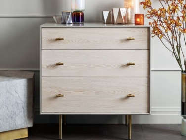
Above: The dresser is West Elm’s Modernist Wood and Lacquer Three-Drawer design, currently available only in a pale wood.
like the entry, the bathroom has a black and white floor of agadir cement tile: 33
Above: Like the entry, the bathroom has a black-and-white floor of Agadir Cement Tile: “If I could change one thing, I would instead go with large-honed slate tile,” Andrea tells us. “After finishing our project, I discovered a few slate companies in Upstate NY and Vermont that sell the exact same green splotchy slate that our fireplaces are made of.  That would have been so lovely, especially with the mix of white wall tiles. Sometimes it’s hard being an architect; I am constantly redesigning my surroundings in my mind.”
the walls are tiled in daltile&#8\2\17;s metro collection squares in a mix  34
Above: The walls are tiled in Daltile’s Metro Collection squares in a mix of glossy whites. James Harmon fabricated the vanity to the couples’ design; it has a Corian sink by Grifform; all of the black plumbing fixtures are from California Faucets’ Tiburon collection.
the west facing guest room initially served as shapeless studio&#8\2\17;s o 35
Above: The west-facing guest room initially served as Shapeless Studio’s office during the firm’s first year. The bed is the Nesttun frame and the shelf is the Fjalkinge, both from Ikea.
the small space off the bedroom—where benjamin moore arctic seal puts in 36
Above: The small space off the bedroom—where Benjamin Moore Arctic Seal puts in another appearance—is now Andrea’s painting studio. The bedroom’s pale walls are in Benjamin Moore’s Grandma’s China, which, Andrea says, “really glows with orange undertones when the sun sets. On dark and rainy days, it looks a lot more greenish. I love living in a house that seems to experience the same moodiness I do.”

We recently featured a Shapeless Studio Kitchen Designed Around the Keywords ‘Socal’ and ‘Minimal but Warm.’

Here are more architects’ own quarters:

(Visited 6,506 times, 1 visits today)
You need to login or register to view and manage your bookmarks.

Product summary  Item 6 178Item 7 179

note chair
Note Design Studio

Note Chair

$165.75 USD from Design Within Reach

Have a Question or Comment About This Post?

Join the conversation

v5.0