It’s no secret that here at Remodelista, we’re obsessed with the way paint can completely transform a room—for relatively little time and commitment. And though we think that it’s always a good time to take up a paint project, spring is a particularly apt time to experiment with color.
We often look to UK-based Little Greene, makers of paints and wallpapers, for fresh, trend-setting ways to use color (more on that in a minute). But the company’s traditional background also plays an important part in its ethos. Little Greene’s headquarters in Manchester are near the original site of The Little Greene Dye Works, a small textile dye company founded in 1773 from which the current company draws its name. Little Greene is now the largest family-owned independent British paint maker (and, as of 2023, has a US outpost, too, in Greenwich, Connecticut), but the company is still dedicated to a small-batch approach, creating a curated range of top-quality, pigment-rich paints for all over the house.
We recently caught up with creative director Ruth Mottershead to talk about her favorite ways to experiment with color, the paint trends she has her eye on, how to (finally) settle on a shade and finish, and more. Read on:
Remodelista: How did Little Greene get its start?
Ruth Mottershead: Little Greene was founded by my father, David, who spent his early career working as a chemist in the paint and inks industry, when my brother, Ben, and I were children. The name “Little Greene” refers to a tiny 18th-century hamlet where The Little Greene Dye Works was located, just outside of Manchester in the UK. Our head office is now located just down the road from the original site—and the fundamentals of formulating and manufacturing Little Greene paints have not changed much. Our process is still undertaken by the hands of time-served craftspeople rather than automated machines, right down to our sample pots, which are all filled by hand.
We insist on using only the finest natural, organic and safe synthetic pigments, and our paints contain 40 percent more pigment than many ordinary paints, giving unrivalled depth of color and meaning they often require fewer coats to achieve full coverage. All our paints and wallpapers are proudly manufactured in the UK, and we actively source from suppliers who can match our commitment to local industries.
R: Where does the inspiration for Little Greene’s 196 colors come from?
RM: Choosing colors for our color cards is a highly creative and deeply inspiring process. I’m always looking at how we all live with color and pattern and how we can assist people in decision making, and I love to identify emerging color trends and see how we can incorporate these into our palette.
As proud custodians of historic decoration, we undertake an ongoing program of research in which we discover, reformulate, and publish original paint colors and bygone recipes. With unrivaled access to some of Britain’s most treasured and best-preserved properties, we regularly visit historic buildings to rediscover original paint colors from the past—some muted and others surprisingly bright, considering their era. We then recreate and revive these colors, giving these historic treasures a place in contemporary interiors. Our color card is the only one in which you will find a genuine 1970s orange alongside an authentic Georgian grey and a true 1930s pale blue.
R: For those suffering from color overwhelm: Where to begin choosing a palette?
RM: Our Little Book of Colour provides expert guidance to help you combine colors with confidence. This handy book guides you through every paint color in our palette and presents a selection of coordinating shades to help you create your scheme. Those wanting to create a calm, harmonious interior can refer to the “related whites” and “related neutrals.” Or for something a little more vibrant, we’ve compiled a list of coordinating colors that are tonally related, bringing depth without being overpowering. For more confident designers, you can explore the “contrasting accents” and “related darks.” Each page also includes a pigment guide, which identifies the key raw ingredients within each shade, so you can combine hues with related pigmentation for harmonious interiors with real ease.
R: What about those who want to go bold?
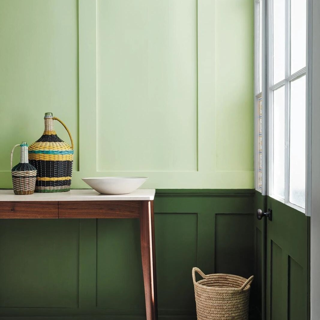
RM: We recently introduced the concept of Double Drenching, which is a fantastic way to confidently embrace and combine colors that might not typically be seen together in a single scheme. A very traditional way of decorating uses tonal variations of a single color to achieve a harmonious look. But with Double Drenching, the variation is in hue rather than strength, so the colors might be as bold as each other and from the same family, but they carry different undertones—for example, three greens at different ends of the spectrum, such as Hopper, Citrine, and Dark Brunswick Green. Double-drenched color pairings like this one allow you to dramatically transform your space and add instant impact.
R: Tell us about Intelligent Finishes.
RM: Intelligent Paints can be painted, direct from the tin, on almost any surface in the home. Intelligent Grip technology underpins our four main Intelligent Paint finishes—Matt, Eggshell, Satin and Gloss—ensuring they grip securely to almost any surface without the need for a separate primer. This means you can prime and paint all common household surfaces using a single tin of paint: walls, woodwork, metal, melamine, and Formica, and even tiles and glass. We’ve removed the headache of using separate primers, and with just a single tin of paint required, there is less wastage, both in packaging and leftover paint.
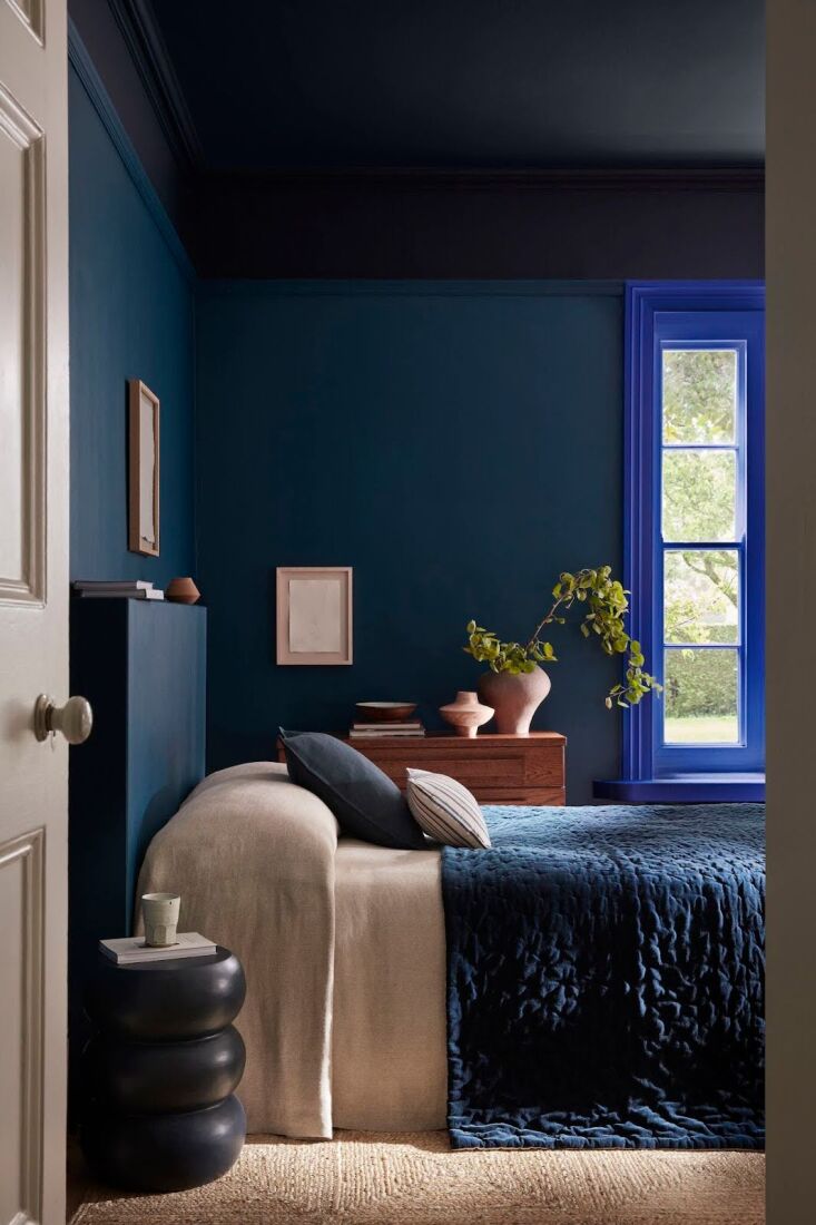
R: What are your go-to colors for the bedroom?
RM: Bedrooms are such a personal space, but they should provide somewhere you enjoy spending time in. I love a natural, muted palette of greens or earthy-toned pairings from our Stone collection. I’d also advise painting the ceiling of your bedroom in the same color as the walls rather than white, as the continuous use of color will make the whole room appear more spacious. This way, your eye won’t be drawn to a block change in color on the ceiling, which can be distracting in a room where you want to rest and unwind.
R: What about the kitchen or bath?
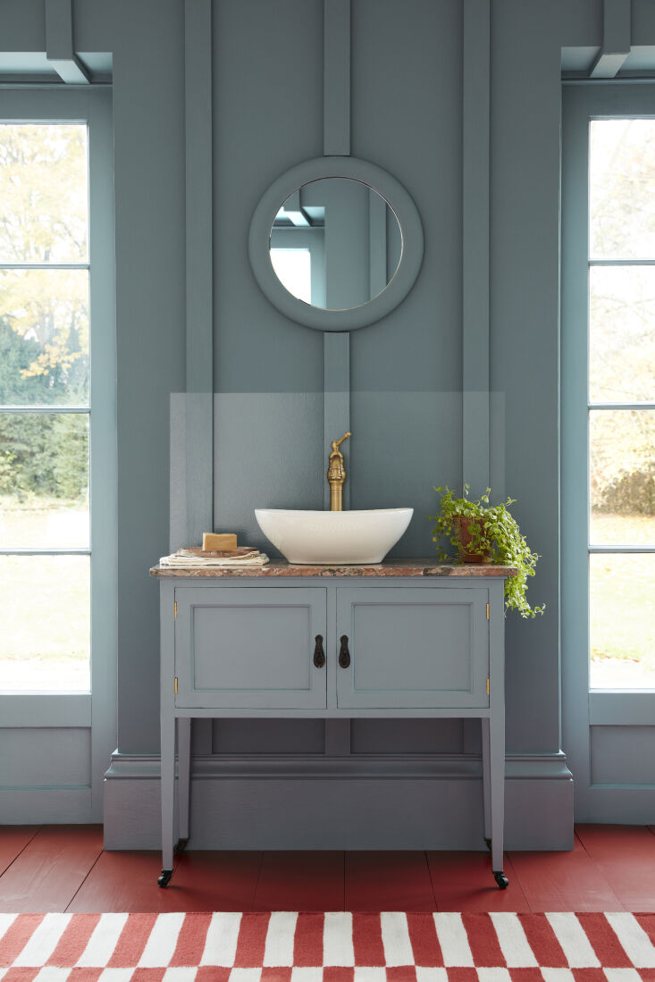
RM: Our Intelligent Paints are the perfect choice for bathrooms and kitchens. Available in all our colors, they are hard-wearing, completely washable, environmentally friendly, and easy to apply. For bathroom walls, use Intelligent Eggshell, which is formulated to resist moisture.
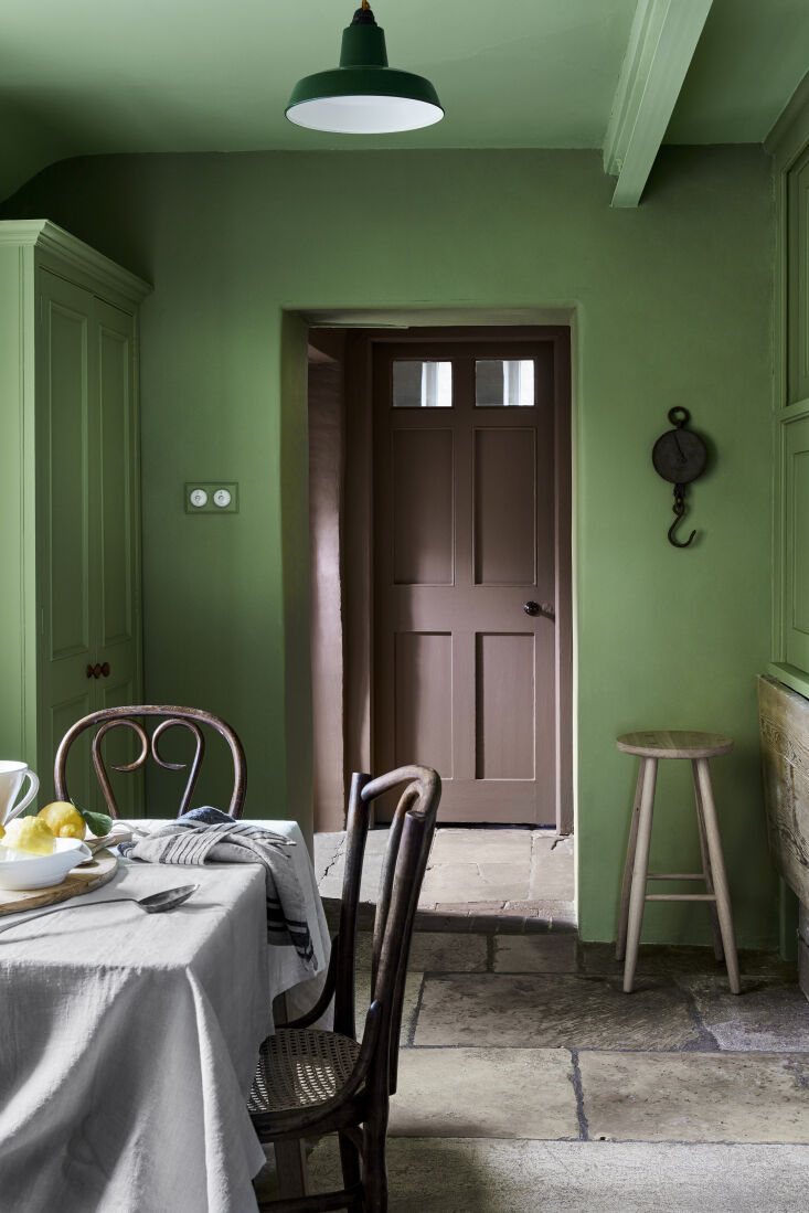
The kitchen is a hive of activity and a social place for entertaining; it’s therefore the ideal place to make an impact with vibrant color choices. Elegant deep, inky blues such as Hicks’ Blue or Juniper Ash will work in almost any kitchen. For cabinets, our hard-wearing, washable Intelligent Satin finish will withstand all the knocks and bumps of a busy family kitchen.
R: What colors are on the rise?
RM: In recent years, we’ve seen a real shift away from the cooler, blue-toned greys that have been so popular. Instead, our customers have been opting for earthier tones that have inherent warmth. Natural colors like Portland Stone, Rolling Fog, and our delicate, powder-like pink, Masquerade, are very popular hues to bring warmth to a space whilst making us feel uplifted and calm.
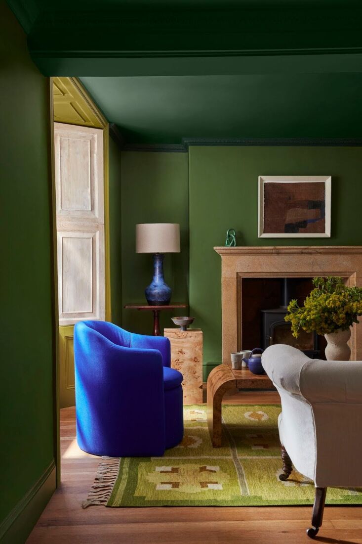
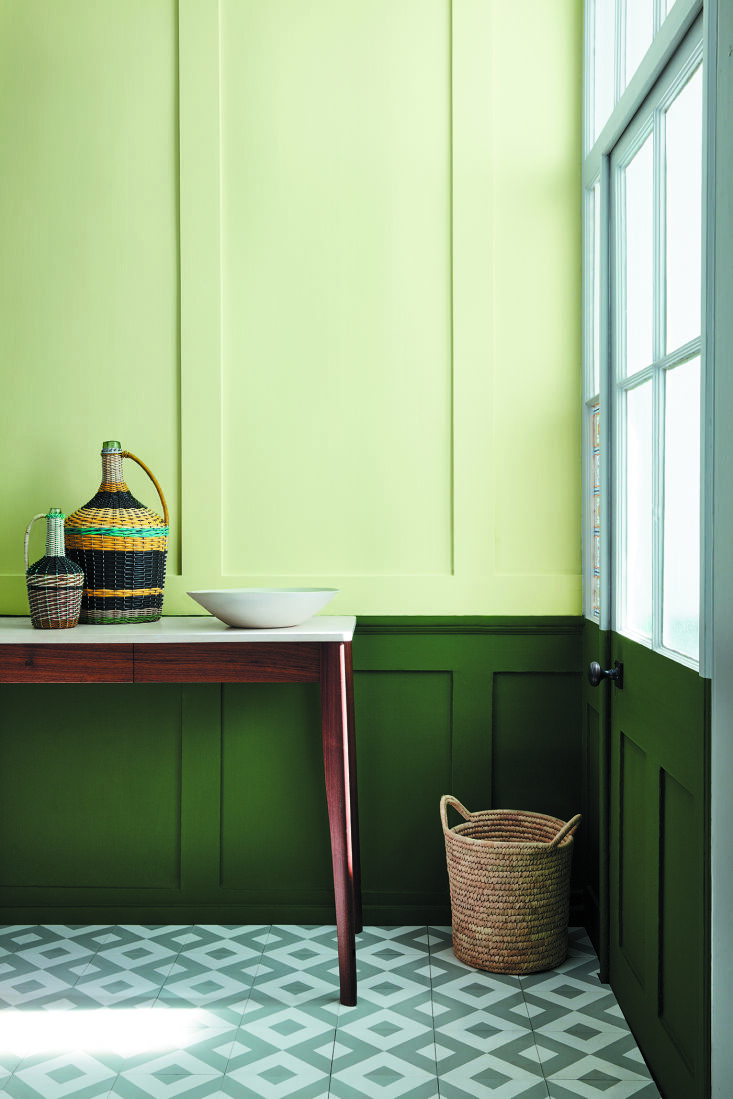
We’re also seeing consumers finding their own sense of color and pattern confidence, embracing bolder and more vibrant hues in their homes. The sense of wellbeing we gain from time outside in the natural world has resulted in a desire to recreate this sense of connection and positivity in our homes, driving a renewed love for greens of all hues. Some of our most-loved greens include Garden, Sage Green, and the moody yet restful Livid.
R: Is there a most popular finish?
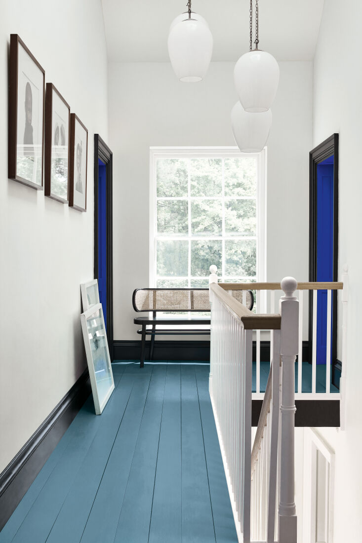
RM: Our most popular paint finish is Intelligent Matt Emulsion, a matte yet completely washable alternative to traditional emulsion paint. The water-based, child-safe formulation is the first choice for walls and ceilings, and it’s especially suited to high-traffic areas of the home including hallways, living spaces, kids’ rooms, and laundry rooms. Any marks can simply be wiped away with warm, soapy water. This self-priming, water-based finish can be used straight from the tin without needing a separate primer. And with a low sheen of just two percent, it combines practicality with beautiful depth of color.
R: Little Greene recently launched a line of exterior paints. What color trends are you predicting for exteriors and hardscaping?
RM: The color confidence we have seen in recent years within interiors is certainly impacting choices in outdoor areas, too. Rather than being treated separately, we are seeing interior design schemes and the use of color being taken outside, extending the color palette within the home to create a sense of flow. Rich, warm, brown-based tones and earthy natural colors are being embraced alongside more traditional coastal blues and sea greens. The use of forest, emerald and leaf greens such as Hopper, Goblin, and Mid Azure Green in exteriors is on the rise too.
R: What’s the next trend on your radar?
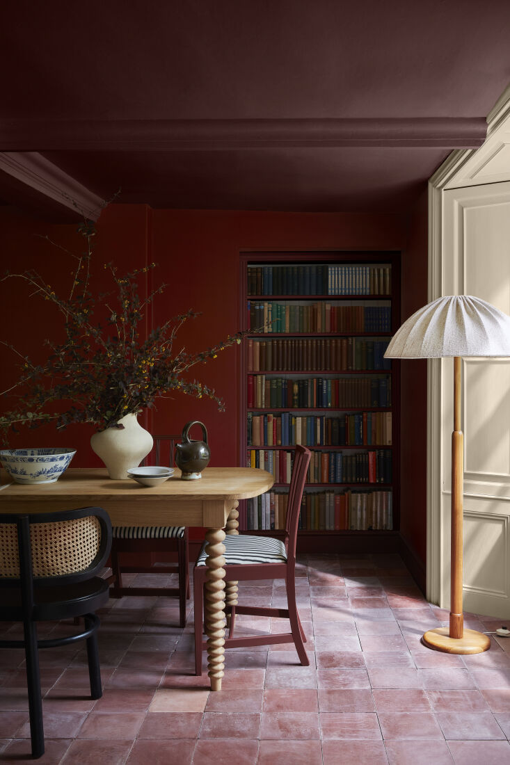
RM: We are definitely seeing a transition to burgundy and red. Muted yet bold reds such as Arras, Adventurer, Cordoba, and Purple Brown are a step ahead of the popular chocolate brown tones. Burgundy looks especially wonderful on cabinetry and woodwork.
For more information on paints, wallpapers, and finishes—and advice on how to use them—head to Little Greene.
Have a Question or Comment About This Post?
Join the conversation (1)