Icon - Arrow LeftAn icon we use to indicate a rightwards action. Icon - Arrow RightAn icon we use to indicate a leftwards action. Icon - External LinkAn icon we use to indicate a button link is external. Icon - MessageThe icon we use to represent an email action. Icon - Down ChevronUsed to indicate a dropdown. Icon - CloseUsed to indicate a close action. Icon - Dropdown ArrowUsed to indicate a dropdown. Icon - Location PinUsed to showcase a location on a map. Icon - Zoom OutUsed to indicate a zoom out action on a map. Icon - Zoom InUsed to indicate a zoom in action on a map. Icon - SearchUsed to indicate a search action. Icon - EmailUsed to indicate an emai action. Icon - FacebookFacebooks brand mark for use in social sharing icons. flipboard Icon - InstagramInstagrams brand mark for use in social sharing icons. Icon - PinterestPinterests brand mark for use in social sharing icons. Icon - TwitterTwitters brand mark for use in social sharing icons. Icon - Check MarkA check mark for checkbox buttons.
You are reading

Architectural Derring-Do in a Paris Duplex By Heju

Search

Architectural Derring-Do in a Paris Duplex By Heju

May 15, 2023

How to introduce a full-size stair that’s both unobtrusive and artful? Presented with two floors in an 1830s Paris building that needed to be knit together, architects Hélène Pinaud and Julien Schwartzmann of Heju came up with the idea of elevating the steps above the kitchen—with a counter that extends out to become the stair landing.

The spaces called for such derring-do: each floor is 50 square meters (538 square feet) and there was a lot to fit in. The downstairs had always been used as living quarters and was last updated in the 1970s; the upstairs remained an unfinished garret, once a carpentry workshop, accessed by the building’s communal stair—scroll to the end for a glimpse of what was.

Heju was tasked with updating both levels for a newly married couple in their fifties. The transformation required “a huge amount of structural work,” say the architects, whose playful take on minimalism we’ve been following just about since they graduated from the National School of Architecture in Strasbourg in 2015 (Heju is a combination of their two names). Join us for a look at the craftsmanship and cohesion they introduced both upstairs and down.

Photography courtesy of Heju.

Lower Level: The Living Quarters

located in a five story building on rue faubourg du saint antoine, the apartmen 17
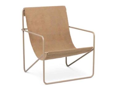
Above: Located in a five-story building on Rue Faubourg du Saint-Antoine, the apartment has an open-plan first floor (see floor plans below). The built-in shelves are composed of plasterboard finished with limewash: “we wanted them to look like a wall, as if they’ve always been there,” says Hélène. The sling chair is Ferm Living’s Desert Lounge and the circular side table is from India Mahdavi’s collection for Monoprix.

The metal-framed windows are new additions that look like the originals but are high performing. The radiator cover is tinted ash, a material that reappears as the stair railing, and the floor is polished concrete.

the archways create niches for displaying art and objects. the lower cabinets a 18
Above: The archways create niches for displaying art and objects. The lower cabinets are made of Baltic birch, which the designers used for storage on both levels. Note the carved recessed handles; they’re applied vertically here and horizontally in the kitchen.

The white limewash on the walls throughout is Papier Washi from the Heju Collection for French paint company Ressource.
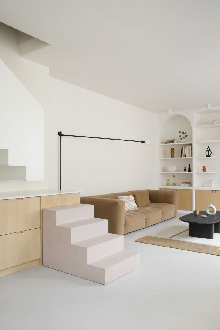
a first look at the ingenious stair solution—the pale pink lower steps a 19
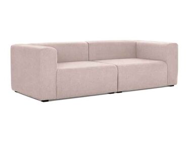
Above: A first look at the ingenious stair solution—the pale pink lower steps are made of wood coated with waxed concrete. The Mags sofa is from Hay and the coffee table is by artist Baptiste Lanne.
the kitchen has an ethnicraft table and vintage danish moderne niels otto molle 20
Above: The kitchen has an Ethnicraft table and vintage Danish moderne Niels Otto Moller Model 75 chairs. The hanging light is from Dutch interiors line HK Living.

The lacquered wood cabinets in the back conceal the fridge and pantry and serve as a divider—behind them is the entryway, closet, and powder room, with room to circulate on both sides.

a brass sink is inset into the aforementioned hardworking counter of quartz: le 21
Above: A brass sink is inset into the aforementioned hardworking counter of quartz: learn about the material in Remodeling 101: 7 Things to Know About Engineered Quartz Countertops.
the elevated staircase has an enclosure of white powder coated steel. &#8\2 22
Above: The elevated staircase has an enclosure of white powder-coated steel. “We tried a lot of organizations, but placing the stair on top of the kitchen was the optimal one in terms of the sense of space,” says Hélène. “It was really hard to execute. We wanted the stairs to look like a folded sheet of paper, so they don’t feel heavy and they appear as a separate element from the kitchen.”
the kitchen counter and cabinets extend all the way to the end finished with an 23
Above: The kitchen counter and cabinets extend all the way to the end finished with an under-the-stair cupboard. “Yes, it’s okay to walk on quartz,” Hélène assures—it’s out of the way of the food prep and not slippery.
the architects had planned to include a railing but the owners of the apartment 24
Above: The architects had planned to include a railing but the owners of the apartment opted to leave the landing open—”there’s plenty of space, so our clients didn’t think it was dangerous. Their children are adults and we can always add a railing if they want.”

The Attic: Bedrooms and Baths

the top floor had previously been used for storage—&#8\2\2\1;there w 25
Above: The top floor had previously been used for storage—”there was nothing in there, not even a real floor,” Hélène tells us. “We just kept the old beams.” The challenge was to fit two bedrooms—one for the couple, the other for the husband’s daughter—plus two bathrooms and a home office on the floor.
the main bedroom has a bank of baltic birch storage cabinets and a multi taskin 26
Above: The main bedroom has a bank of Baltic birch storage cabinets and a multi-tasking fluted headboard.
&#8\2\20;the headboard is the center of the room, so we wanted it to be spe 27
Above: “The headboard is the center of the room, so we wanted it to be special,” says Hélène. “It becomes a chest of drawers on the back and there are niches on the sides for storing phones and books.” The skylight here and elsewhere on the floor took the place of the existing small windows.
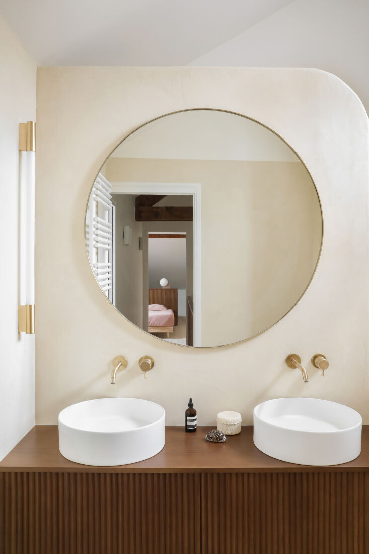
the sink vanity is a companion piece to the headboard. the brass faucets are fr 28
Above: The sink vanity is a companion piece to the headboard. The brass faucets are from Cascade in Paris.
the curved walls are waxed concrete, a material hélène describes as & 29
Above: The curved walls are waxed concrete, a material Hélène describes as “pure and soft, but you have to be really careful when you apply it.” The clients, she explains, wanted a bathroom “like the one you have when you’re on vacation.”
the second bedroom has its own custom headboard—plus an en suite riluxa  30
Above: The second bedroom has its own custom headboard—plus an en suite Riluxa bathtub and Alape sink tucked under an eave.
the architects also managed to include a built in work area. planes of pale woo 31
Above: The architects also managed to include a built-in work area. Planes of pale wood, they point out, “surround the whole room, from the headboard to the desk.” Niels Otto Moller’s Model 75 chair used around the dining table reappears here.

Before

the tiled living area had a brick fireplace built by the previous owner in the  32
Above: The tiled living area had a brick fireplace built by the previous owner in the 1970s.
the apartment had a compact kitchen and a curious shower. 33
Above: The apartment had a compact kitchen and a curious shower.
the unfinished attic was once used as a carpentry workshop. 34
Above: The unfinished attic was once used as a carpentry workshop.
the attic was accessed by the building&#8\2\17;s communal stair and over th 35
Above: The attic was accessed by the building’s communal stair and over the decades had barely been touched.

Floor Plans

the kitchen flows into the living area. 36
Above: The kitchen flows into the living area.
the architects managed to make full use of every inch of the attic. the chambre 37
Above: The architects managed to make full use of every inch of the attic. The chambre secondiare has its own sink and tub, and also has access to the main bathroom.

More projects by Heju:

(Visited 6,121 times, 1 visits today)
You need to login or register to view and manage your bookmarks.

Frequently asked questions

Who designed the Paris duplex renovation featured on Remodelista?

The Paris duplex renovation was designed by Heju Architecture and Design.

What kind of space was renovated?

Heju Architecture and Design renovated a small Parisian duplex apartment.

What were the challenges faced in the remodel?

The biggest challenge was optimizing the small space and maximizing storage.

What are some of the clever design solutions used in the renovation?

Some clever solutions include custom-built furniture, hidden storage, and fold-away features.

What is the design style of the final product?

The design style is modern and minimalist, with a touch of vintage charm.

What materials were used in the renovation?

Natural materials such as wood and marble were used, as well as industrial materials such as metal and black steel.

Is this renovation budget-friendly?

The article does not mention the budget for the renovation, but many of the solutions used were creative and cost-effective.

Is this renovation DIY-friendly?

Some of the design solutions, such as custom-built furniture, may require professional help. However, the ideas could inspire DIY projects.

Product summary  

Have a Question or Comment About This Post?

Join the conversation

v5.0