Icon - Arrow LeftAn icon we use to indicate a rightwards action. Icon - Arrow RightAn icon we use to indicate a leftwards action. Icon - External LinkAn icon we use to indicate a button link is external. Icon - MessageThe icon we use to represent an email action. Icon - Down ChevronUsed to indicate a dropdown. Icon - CloseUsed to indicate a close action. Icon - Dropdown ArrowUsed to indicate a dropdown. Icon - Location PinUsed to showcase a location on a map. Icon - Zoom OutUsed to indicate a zoom out action on a map. Icon - Zoom InUsed to indicate a zoom in action on a map. Icon - SearchUsed to indicate a search action. Icon - EmailUsed to indicate an emai action. Icon - FacebookFacebooks brand mark for use in social sharing icons. flipboard Icon - InstagramInstagrams brand mark for use in social sharing icons. Icon - PinterestPinterests brand mark for use in social sharing icons. Icon - TwitterTwitters brand mark for use in social sharing icons. Icon - Check MarkA check mark for checkbox buttons.
You are reading

Farmhouse Refresh: A Dutchess County, NY, Family Retreat in Black and White

Search

Farmhouse Refresh: A Dutchess County, NY, Family Retreat in Black and White

January 4, 2020

Remember old-fashioned networking? It was through their kids’ NYC elementary school that Jill Porter met Alexandra and Brian Tart. The couple—she’s a social worker, he’s a publishing executive—mentioned that they have a farmhouse in Dutchess County, New York, and on learning that Porter runs her own architecture firm, filled her in on their longstanding hopes and dreams for their place. That’s how Porter ended up with a commission to usher the family’s beloved 200-year-old retreat into the 21st century—and how the Tarts ended up with the ultimate headquarters for riding out the pandemic.

“Although stately and proud,” Porter tells us, “the existing house showed its age: walls sagged, floors sloped, and an ill-conceived addition felt like a disjointed accessory. Perhaps most notably, the structure lacked any relationship to the beautiful property: it cocooned occupants in intimate, dark interiors that were charming on snowy days, but less so on glorious summer evenings.” Porter’s response was three-fold: she designed a new, two-story addition with a wrap-around porch; oriented all of the living spaces outward to the open fields; and fortified the existing structure “to not only stitch it to the addition but give it the structural prowess to last another 200 years.”

Photography by Amanda Kirkpatrick, courtesy of Jill Porter Architect.

the back porch, both screened and open air, serves as the family&#8\2\17;s  17
Above: The back porch, both screened and open-air, serves as the family’s outdoor living quarters during the warm months. The parents’ new bedroom and bath is in the second-story addition. (Scroll to the end for a glimpse of the existing exterior and the house’s Before and After floor plans.)
porter gave the addition &#8\2\20;a modern hue&#8\2\2\1; by using black 18
Above: Porter gave the addition “a modern hue” by using black-framed windows that came pre-finished from Marvin. In place of  the old asphalt roof, she introduced matte-black standing seam metal, the architects’ favorite: see Hardscaping 101.

The newly fixed up tool shed is one of several out buildings on the almost four-acre property.

two ivy covered trellises lead to the family&#8\2\17;s vegetable garden. 19
Above: Two ivy-covered trellises lead to the family’s vegetable garden.
porter injected the house with a clean lined, black and white refresh that, as  20
Above: Porter injected the house with a clean-lined, black-and-white refresh that, as she puts it, “reflects a modern way of living while remaining deferential to the age and grace and layout of the existing home.”

The exterior is painted in White Dove, the doors are Hale Navy, and the trim Black Panther, all from Benjamin Moore. The porch is Douglas fir finished in Arborcoat Natural. The Windsor bench was passed down from Alex Tart’s mother and spray painted matte black.

the mudroom has purpose built storage for every member of the family: the tarts 21
Above: The mudroom has purpose-built storage for every member of the family: the Tarts have twin boys who just finished their junior year of high school from the house. “The closed storage conceals the chaos often found in entries,” says Porter.

The runner is from Homegoods and the basket from H&M Home

porter describes the rooms as &#8\2\20;crisply detailed and furnished with  22
Above: Porter describes the rooms as “crisply detailed and furnished with a light touch to create modern, airy spaces.” The living area has one of two wood-burning Stûv fireplaces that provide enough heat to keep the first floor warm in the winter.
the new setup is designed for open space living—the interior addition is 23
Above: The new setup is designed for open-space living—the interior addition is 1,200 square feet, and the house is 3,200 square feet in total, not including the porch.

The pendants over the table and island are from Restoration Hardware. The interior walls are all painted Benjamin Moore Super White.

porter set off the kitchen with subway tiled walls and a carrara marble topped  24
Above: Porter set off the kitchen with subway-tiled walls and a Carrara marble-topped breakfast counter. In lieu of upper cabinets, five windows frame views of an old maple tree.

The hood and range are by Viking. The black sconces are from Schoolhouse Electric.

the kitchen cabinets are from plain & fancy custom cabinetry in their flush 25
Above: The kitchen cabinets are from Plain & Fancy Custom Cabinetry in their flush-inset Shaker style. The bridge faucet is by Waterworks.

Note the wide pine floorboards and the sloped paneled ceiling. “In both height and width, the addition never outcompetes the existing structure, and the materials selected compliment the feel of the existing home without relying on nostalgia,” says Porter.

the house retains its original stair (with a new railing in place of a sheetroc 26
Above: The house retains its original stair (with a new railing in place of a Sheetrock wall) and extra-wide floorboards.

“There was a stair to the third floor above, so the renovation really opened this space,” says Porter, adding “As we started to peel away walls, siding, and floorboards, problems with the old structure revealed themselves. Our contractor had to reinforce floor joists, install tie rods to support to the roof, and repair the building envelope.” For more, see 7 Things Nobody Tells You About Renovating an Old Farmhouse.
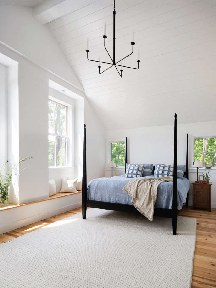
the parents&#8\2\17; bedroom has a tongue and groove cathedral ceiling and  27
Above: The parents’ bedroom has a tongue-and-groove cathedral ceiling and double-hung windows with window seats. The four-poster is from Ethan Allen and the chandelier is O’Lampia’s Neo Gothic design.
the mine and yours washstand is the gramercy from restoration hardware with wat 28
Above: The mine-and-yours washstand is the Gramercy from Restoration Hardware with Waterworks faucets. The hexagonal marble floor tiles are from Nemo Tile.
a double height ceiling and exposed rafters in the boys&#8\2\17; room, whic 29
Above: A double-height ceiling and exposed rafters in the boys’ room, which is open to a loft (a ladder in the closet leads up to it, and to the preserved attic in the 1820 section of the house).
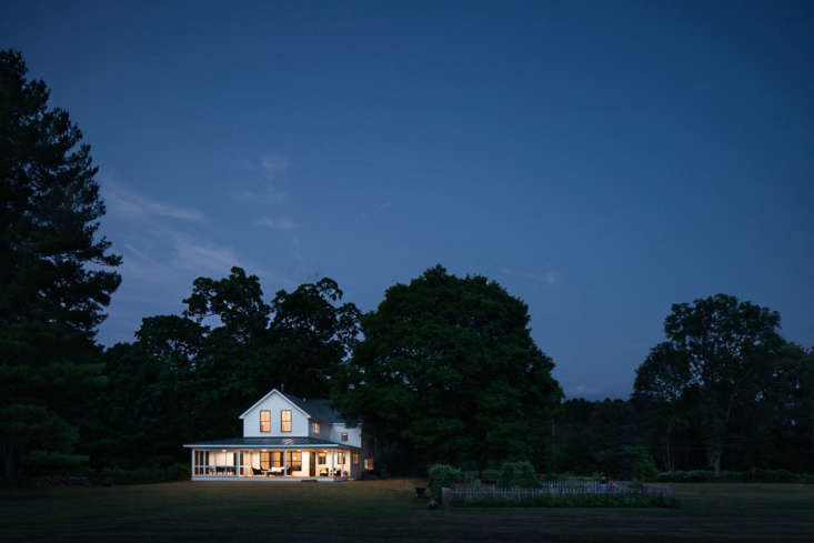
at twilight, the house looks like a maxfield parrish painting. 30
Above: At twilight, the house looks like a Maxfield Parrish painting.

Before

a view from the the side of the house: the one story former addition did nothin 31
Above: A view from the the side of the house: the one-story former addition did nothing to connect the structure to its  surroundings.

After

new fencing and plantings now frame the drive. porter left the windows in the o 32
Above: New fencing and plantings now frame the drive. Porter left the windows in the original house as they were, and went with windows with fewer panes trimmed in black for the addition.

Floor Plans

built in the early \19th century, the house is thought to have originally been  33
Above: Built in the early 19th century, the house is thought to have originally been a Quaker meetinghouse that was converted for living.
porter&#8\2\17;s remodel gained the family \1,\200 square feet in indoor li 34
Above: Porter’s remodel gained the family 1,200 square feet in indoor living space.

Here’s are three more favorite farmhouse remodels:

Saved from Abandonment: A Historic Hudson Valley Farmhouse Receives the Ultimate Makeunder

A Renovated Barn by Berlin Star Architect Thomas Kröger

Kitchen of the Week: A Creative Couples’s Swedish Farmhouse Retreat
(Visited 1,634 times, 1 visits today)
You need to login or register to view and manage your bookmarks.

Have a Question or Comment About This Post?

Join the conversation

v5.0