Icon - Arrow LeftAn icon we use to indicate a rightwards action. Icon - Arrow RightAn icon we use to indicate a leftwards action. Icon - External LinkAn icon we use to indicate a button link is external. Icon - MessageThe icon we use to represent an email action. Icon - Down ChevronUsed to indicate a dropdown. Icon - CloseUsed to indicate a close action. Icon - Dropdown ArrowUsed to indicate a dropdown. Icon - Location PinUsed to showcase a location on a map. Icon - Zoom OutUsed to indicate a zoom out action on a map. Icon - Zoom InUsed to indicate a zoom in action on a map. Icon - SearchUsed to indicate a search action. Icon - EmailUsed to indicate an emai action. Icon - FacebookFacebooks brand mark for use in social sharing icons. flipboard Icon - InstagramInstagrams brand mark for use in social sharing icons. Icon - PinterestPinterests brand mark for use in social sharing icons. Icon - TwitterTwitters brand mark for use in social sharing icons. Icon - Check MarkA check mark for checkbox buttons.
You are reading

Calm and Productive: 100 Square Meters of Live/Work Space

Search

Calm and Productive: 100 Square Meters of Live/Work Space

September 2, 2024

Jack Harries and Alice Aedy have been living in their converted shoe factory for just over a year. The couple—who are climate activists, filmmakers, and founders of the media company, Earthrise Studio—purchased it through The Modern House. “The character of the building really drew us in,” they explain. “We knew that with some attention and repair it would make a perfect live-work studio.”

jack harries and alice aedy in work mode. 17
Above: Jack Harries and Alice Aedy in work mode.

That attention was bestowed upon it by Studio McW. “We found Studio McW online and immediately connected with their projects,” says Jack. “We liked their approach to natural materials and focus on creating functional spaces. We had a challenging brief to create a multidisciplinary space that could be a home, a place to entertain and a functioning film and photography studio, but Studio McW have gone above and beyond to deliver our dream space.”

We take a tour:

part of a historic shoe factory built in \19\24, the buildings’ original 18
Above: Part of a historic shoe factory built in 1924, the buildings’ original features included large steel windows and trusses, exposed concrete beams, and a double-height pitched roof with overhead glazing.

Their brief was simple and the deadline tight (work began in November 2020, and was mostly complete by May 2021). The couple needed a practical layout across both floors— including plentiful storage, a sociable kitchen space and a utility area. “We live and work in the flat, so we wanted a space where we could host our team each week, record podcasts and interviews, spend time with friends and enjoy quiet moments,” Alice explains. “We also wanted to restore the original warehouse character in a very respectful yet modern way, so we incorporated natural and salvaged materials where possible.”

the entrance to the former shoe factory in hackney, east london. 19
Above: The entrance to the former shoe factory in Hackney, East London.
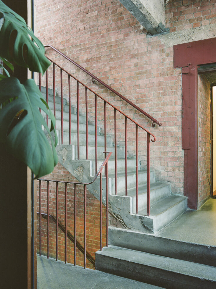
the communal stairwell. 20
Above: The communal stairwell.
the glowing entryway to earthrise studio. 21
Above: The glowing entryway to Earthrise Studio.
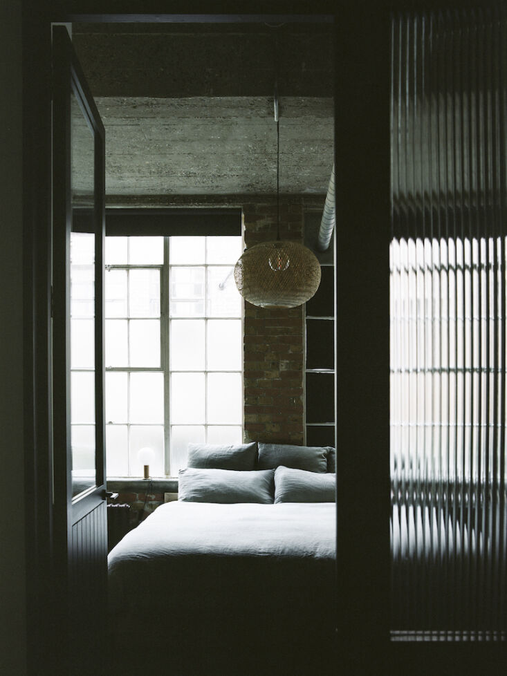
studio mcw began at entrance level by opening up the existing partitioned bedro 22
Above: Studio McW began at entrance level by opening up the existing partitioned bedroom and dressing room to create a large aperture to draw light through the new glazed internal wall to the bathroom and utility space.
heading up, reclaimed timber stairs lead up to an open plan living space. custo 23
Above: Heading up, reclaimed timber stairs lead up to an open plan living space. Custom black mild steel balustrade allows light to travel between levels.
on the upper level, a maze of redundant overhead services were stripped back, w 24
Above: On the upper level, a maze of redundant overhead services were stripped back, which increased the sense of volume above. The original floor plan was constricted by a large, defunct concrete doorway, which Studio McW duly removed. This enabled them to reorganized the layout, shifting the kitchen to the rear of the apartment to create flexible yet distinct zones for work, rest and play.
studio mcw anchored the bright neutral interiors with custom oak and concrete j 25
Above: Studio McW anchored the bright neutral interiors with custom oak and concrete joinery, cast in situ. The vast concrete island doubles as a dining bench.
&#8\2\20;timber, concrete, steel, and clay are the main materials used in t 26
Above: “Timber, concrete, steel, and clay are the main materials used in the build,” explains Alice. “We kept the finishes very much in line with the original warehouse character of the building, which is what drew us to the apartment in the first place.”

“Spanning just over 100 square meters, we designed Earthrise to work very hard to support Jack and Alice’s busy lifestyle, yet offer a serene, peaceful environment.” says Greg Walton, co-founder of Studio McW. “We carefully designed the spatial flow to craft spaces and built in furniture that offer multiple uses, while feeling clean and clutter free.”

there&#8\2\17;s space for concealed clutter and considered curation in the  27
Above: There’s space for concealed clutter and considered curation in the bespoke oak kitchen.
a long concrete sideboard with oak cabinetry and shelving runs the full length  28
Above: A long concrete sideboard with oak cabinetry and shelving runs the full length of the southern elevation; a multi-use feature offering seating, storage, and display for Jack and Alice’s collection of art, photography and cameras.
exposed brickwork denotes the transition from dining/work space into living spa 29
Above: Exposed brickwork denotes the transition from dining/work space into living space.
the slubby linen corner sofa and beni ourain rug create a tactile, relaxed livi 30
Above: The slubby linen corner sofa and Beni Ourain rug create a tactile, relaxed living space. The walls are finished with matte clay walls which unify the two stories.
“we paid special attention to the play of light and material junctions a 31
Above: “We paid special attention to the play of light and material junctions at Earthrise,” explains David McGahon, co-founder of Studio McW. “This is a small but powerful way to respect the raw character of the original building while rejuvenating the space.”

“The apartment now seamlessly facilitates many aspects of our lives,” explains Jack. “During the day the space operates as a studio allowing us to host our team whether it’s for meetings or filming interviews and podcasts, whilst in the evening everything disappears into cupboards and it becomes the perfect entertaining space for friends and family.”

N.B.: This story originally ran on August 10, 2022 and has been updated.
(Visited 8,183 times, 2 visits today)
You need to login or register to view and manage your bookmarks.

Have a Question or Comment About This Post?

Join the conversation

v5.0