When Peggy Wang—the first employee at Buzzfeed (she’s now the editorial director of Buzzfeed Life)—was mid-apartment-search in New York City, she found herself at a crossroads familiar to many New Yorkers: Go for the trendy condo in Williamsburg, or head to the new Brooklyn—Queens—for more space. Queens quickly won: “Once I started exploring the rowhouse options, I couldn’t get past the value proposition of getting rental income, a basement, and a huge backyard,” Wang says. In a landmarked neighborhood in Ridgewood, Wang found a two-story 1900s rowhouse, but it was weighed down with fusty floral wallpaper, peeling linoleum, and wall-to-wall carpet.
Wang enlisted a friend, Keren Richter of White Arrow Interior Design, to gut it and bring it into this century while retaining some of its vintage charm—all on a budget, from high-end appliances sourced from Craigslist to vintage details from salvage shops. “We were living in the home while the remodeling was happening,” Wang says. “It was legitimately hell for three months. But I have to say, it’s incredibly worth it.” Here’s a look inside (plus their tricks for getting a high-end look for less).
Photography courtesy of White Arrow.

Richter and Wang (who is also a sometime musician, formerly in an indie pop band called the Pains of Being Pure at Heart) collaborated closely on the renovation. Their goal? Brighten and update the space while restoring period details, all with cost in mind. (“It was an exercise in resourcefulness and shared creativity,” Richter says.) To modernize and maximize light, they removed interior walls, tore up the flooring and bleached the existing subfloors (a cost-saving measure), replaced the interior doors with salvaged French and frosted glass doors, and painted the walls in Benjamin Moore’s Cloud White. Then, to restore “the home’s missing ‘history'” (most of which had been done away with in previous renovations), Richter’s team crafted period-appropriate millwork and sourced inexpensive antique details, including “doors, knobs, and lighting,” from architectural salvage.
In the high/low living room, two 1970s Italian leather armchairs by Italian designer Gae Aulenti, a vintage black pendant light, Indian Dhurri rug, and even the fireplace were all sourced on eBay. (“Finding a mantel complete with the summer screen was a challenge,” Richter says.) A vintage round mirror, painted to match the coffee table, adds height.

Perhaps the biggest money-saver of the project: bleaching the existing subfloors. “Ripping up the carpet was easy,” Wang says. “But then we spent weeks tearing up the linoleum and subfloor with a heat gun, a scraper, and a crowbar. At some point we gave up because it was so difficult and had the floor guy finish the job.” The team sanded and bleached the floors twice over the course of three days, then finished it with a water-based finish by Bona. Richter and Wang also sourced interior doors and doorknobs from eBay and salvage shops (including a famous Brooklyn stop, Eddie Hibbert’s salvage), then painted the doors in Benjamin Moore’s satin paint in Onyx Paint. “It gives the home a real sense of history and visual weight,” Richter says.
In the dining room, a set of vintage Tapiovaara chairs, found a little worse for wear via an online Swedish auction, were given new life via a coat of Fine Paints of Europe’s traditional oil paint. The pendant is from Park Studio LA.


Indigo pillows on the Meritalia canvas couch (an AptDeco find) connect living room to kitchen. Not pictured: a TV credenza, designed by White Arrow, has a grid of circles cut into the cabinet fronts to allow the TV to be turned on and off when it’s closed.

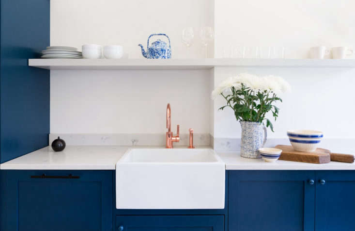
In the Shaker-style kitchen, the cabinets and island are Ikea, refaced with Scherr’s custom fronts and painted in Farrow & Ball’s Hague Blue; the matching larder is also from Scherr’s. (For similar options, see Ikea Kitchen Upgrade: 7 Cabinet Fronts for the Ultimate Kitchen Hack.) Thanks to clever sourcing, “We found the top-notch appliances (a Bertazzoni oven, panel-ready Bosch dishwasher, and Subzero fridge) on Craigslist,” Richter says.
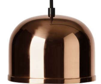
A copper deck-mount faucet from Watermark Designs and Gm 15 Pendant Lamps from Menu add warmth to the blue and white space.

The fridge was previously in front of the kitchen’s single window, so the team relocated it, but needed a smaller refrigerator to fit in the new space. Luckily they sourced a panel-ready 28-inch Subzero fridge on Craigslist. (For more options, see our post 10 Easy Pieces: Best Skinny Refrigerators.) A few sleuthing tips for finding high-end appliances online: “Out-of-state items don’t incur tax if you pay online,” Richter says—she found the unused Bertazzoni oven and hood via a New Jersey showroom. She also recommends using Craigslist’s “Search Tempest” function, which searches across all of Craigslist or by driving distance.


The bedroom is more neutral than the rest of the house: a black-and-white Ikea rug, unfinished Shaker nightstands, and African mud cloth and shibori pillows by White Arrow. The linen bedding is by Matteo, bought on sale at Gilt.


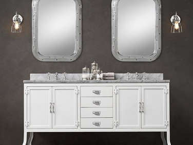
The blue motif continues in the bathroom: “We love the intense pigmentation of Farrow & Ball, so we splurged,” Richter says; the bathroom is painted in Stiffkey Blue. Cement floor tile with a pale blue star pattern from Amethyst Artisan in Manhattan mixes with with inexpensive ceramic wall tile from Daltile. The vintage pharmacy-style vanity and chrome trashcan are both from Restoration Hardware.

Not pictured: the Toto toilet. (For more, see Trend Alert: 8 Techno Toilets.)


An unexpected find from Richter’s and Wang’s salvage hunting: “We visited the basement of an upstate eBay seller and sourced the holophane lights, which he said were from an old asylum,” Richter says. Now they illuminate the revamped entryway.

Unlike Wang’s own kitchen, the rental kitchen features butcher-block countertops and upper cabinets that hide the original chimney.
Before

“The apartment had old floral wallpaper, carpet, dropped ceilings, light brown paint covering the existing trim, linoleum floors, and a lot of added extra rooms and dark spaces,” Richter says.

“There were cheap doors and even cheaper bathrooms and kitchens,” Richter remembers. “Aside from the exterior of the house, no original detail (except for a chair rail and entryway door) was intact.”

Wang’s retrospective advice: “I’m glad I put the time and effort to find the right contractor. I was so anxious to get started, but Keren advised me to vet the contractors and do home visits to see their work up close.” And take time to do renderings before purchasing big-ticket items, “especially things like countertops, tiles, appliances,” she says. “Those things are sometimes not returnable and can hold your renovation up for days if you make bad aesthetic decisions.”
The next project to tackle? A spiral staircase to connect to the large garden—another Ridgewood perk.
Love the look of blue in the kitchen? See our posts:
- Kitchen of the Week: A New-Build Kitchen in Mill Valley, CA, the Six-Month Check-Up
- In California Wine Country, A Modern Farmhouse for a Brit and a Texan
- Steal This Look: A Boldly Blue Kitchen in Philadelphia by Jersey Ice Cream Co.





Have a Question or Comment About This Post?
Join the conversation (15)