The design of Petit Crenn—Michelin-starred chef Dominique Crenn’s latest San Francisco restaurant—started with a conversation between the chef and her longtime friend and first-time collaborator Akemi Tamaribuchi. Says Tamaribuchi of the chef, “She was expressing in a really strong way this feeling of purity. That was the word that kept coming up.”
For Crenn, “purity” signified food from her childhood in coastal Brittany—her grandmother’s recipes and Sunday dinner. For designer Tamaribuchi, it meant clean and white—”the most honest and widely accepted way to relate to this term.”
Tamaribuchi’s SF firm, called Subject to Change, dug in to make it happen. Principal Tamaribuchi and interior design director Gary Wiss filled us in on the details.
Photography by John Merkl for Remodelista.

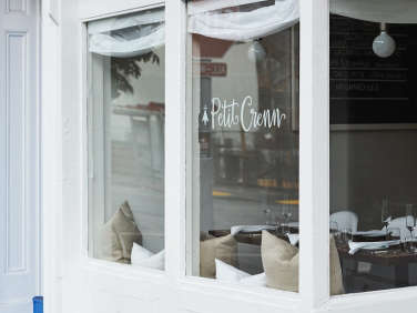
Above: Petit Crenn took over the home of French-American bistro Bar Jules, “a restaurant that was fairly significant to the neighborhood,” said Tamaribuchi. “It was fun for us to reintroduce this space to the neighbors.”
Bar Jules sported chalkboard-paint walls and colorful accents, so the all-white approach transformed the space completely without a single change in buildout. At Petit Crenn, said Tamaribuchi, “the food becomes the color and the decoration.”
Chairs inspired by Verner Panton’s design were included to make the space feel contemporary.

Above: The restaurant’s ceilings are extremely high, notes Tamaribuchi, and the team toyed with the idea of trimming them out to make the room feel more intimate. They settled on a more budget-friendly solution of using pendant lights to visually bring the ceiling closer to the diner.
Subject to Change is an under-the-radar (read: no website) lifestyle and design firm that produces everything from events and wardrobes to commercial and residential interiors. (“All the fun things,” said Tamaribuchi.)

Above: Subject to Change kept the preexisting walnut countertop and concrete floors, but had the latter refinished to a more natural color. They used white hex tile on the bar front, “reminiscent of Brittany, France, where a lot of tile is used,” said Wiss.
Tamaribuchi reports that Crenn, whom she calls “a really passionate, soulful person,” takes an uncommonly collaborative approach to her every project. “She has this amazing way of working with her team and creating this sort of family environment,” she said.

Above: Walls are painted in Benjamin Moore’s Simply White (one of 10 Paint Colors with Cult Followings named by the architects in our Directory).
Crenn’s newest restaurant was meant to be similarly people-first. “She wanted the restaurant to be a really communal experience,” said Tamaribuchi, “just like sitting down to a family dinner.” The chefs themselves serve each course to diners directly, from a set meal each evening. “Dominique was so focused on this shared experience that we wanted to create a setting so simple that all you really see are the people you’re dining with and the food,” said Wiss.

Above: Subject to Change suggested sourcing vintage flatware from flea markets, so Crenn and her team trekked to Bay Area fleas to hand-select utensils for their new restaurant. The walnut tables are holdovers from Bar Jules, as are the banquettes (painted white).

Above: Restoration Hardware pillows lining the banquettes might remind diners of an overstuffed couch at home.
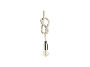
Above: Wanting to add some nautical touches to the space, the team sought a fabricator for custom marine-rope pendants before stumbling upon CB2’s Chord Pendant Light. The simple fixture has caused quite a stir. “I can’t even tell you the response those lights have received,” said Wiss. The team tied the lights for the nautical-knot effect.

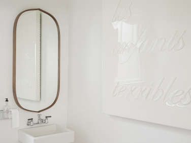
Above: Dominique Crenn worked closely with friend and SF artist Lucky Rapp on the canvas and resin wall art that lines the dining room. Each French phrase was chosen by Crenn herself, “like family slang that has a personal meaning,” said Tamaribuchi. Subject to Change worked with Rapp on the scale, placement, and color for each.

Above: “Brittany’s colors are blue and white,” said Tamaribuchi, embodied in custom aprons from Chef Works.

Above: At the end of the bar and open kitchen sits a La Marzocco espresso machine.

Above: Near the bathroom, a utilitarian display of Dominique Crenn’s own plates and serving pieces, plus classic lion’s head tureens from French porcelain company Pillivuyt and serving pieces by SF artist Tina Frey.
Above: In the bathroom, the team retained almost everything from Bar Jules, including the floor tile and sink. They added a pendant light from Hay—”like a big bell, reminiscent of the seaside,” said Wiss—and a Penarth Walnut Oval Wall Mirror from Crate & Barrel.

Above: A touch of Brittany blue on the exterior: steps painted in Benjamin Moore’s Ol’ Blue Eyes.
Petit Crenn is located at 609 Hayes St. in San Francisco.
See all of Remodelista’s Restaurant Visits, including Anchors Aweigh: Nautical Chic at Maiden Lane in the East Village and Keeping Cool: An Architect-Designed Ice Cream Shop in Vancouver.



Have a Question or Comment About This Post?
Join the conversation (1)