Maybe it’s the result of being cooped up for a year, or the sameness the days tend to take on, but lately I’ve surprised myself by seeking out bright hues and unexpected patterns in lieu of my usual all-neutral M.O. It seems I’m not alone, either: A dose of color just feels apt for this particular moment.
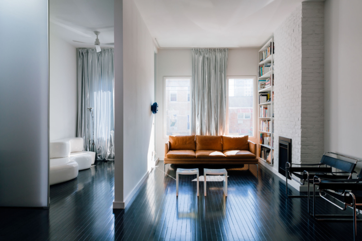
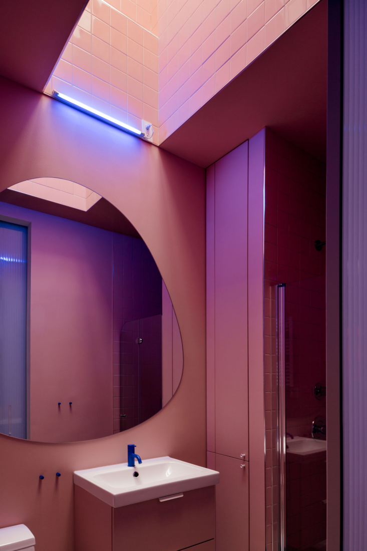
When Julie sent me this Brooklyn project a few weeks ago, in the middle of a rather grey stretch of weather, it felt like a refreshing palette-cleanser for the eyes. The century-old townhouse in Bushwick was redone top to bottom for a pair of artists by Leonidas Trampoukis, Eleni Petaloti, and Isabel Sarasa Mene of New York- and Greece-based LOT Office for Architecture. The exterior is painted boldly, and rather fittingly, in a blue hue reminiscent of Matisse’s Blue Nude or Yves Klein; inside are surprising moments of lavender and even silver—a welcome antidote to the expected and monochrome. Take a look.
Photography by Brian W. Ferry, courtesy of LOT Office for Architecture.


More spaces in bold hues:
- A London Designer’s Apartment Remodel for a Demanding Client (Her Mother)
- Color Therapy: Surprising Shades in an Edinburgh Guesthouse
- My Life in Colour: 8 Lessons from Gillian Lawlee’s Anti-Trendy LA Cottage


Have a Question or Comment About This Post?
Join the conversation