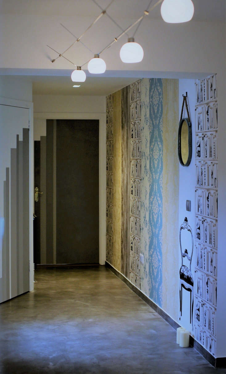
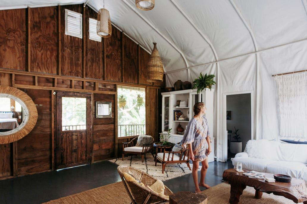
The winner of the 2017 Remodelista Considered Design Awards Best UK Interior is Tanya Vacarda for her Holywood Mid-Terrace House Revamp in Holywood, Northern Ireland.
The project was chosen as the winner by Remodelista editor Julie Carlson, who said: “We’re so impressed by the owners’ ingenuity with this project; we especially like the kitchen, with its crisp black countertops and clever hanging utensil installation.”
N.B. This is the fifth of eight posts spotlighting the winners of the 2017 Remodelista Considered Design Awards. Go to this year’s Considered Design Awards page to see all the entries, finalists, and winners, and have a look at Gardenista’s Considered Design Awards.
Photography by Darren Hercher.

Tanya Vacarda’s Design Statement: “In 2013 we bought our first house, a 1970s mid-terrace: a typical social housing property with small rooms and low ceilings, heavily covered in layers of old wallpaper, plastic tiles, and stained carpets. We had no funds left but enthusiasm and my amateur aspirations.”

A: The house is a two-story mid-terrace built in 1970s with shuttered concrete blocks. It has a small front yard, which looked like an overgrown jungle when we moved in, and a paved backyard with an elevated patio area. It is our first house and home though, so we were as happy as we could be, knowing all of it was ours.
The neighborhood is quiet and friendly, with new families settling in among those who retired years ago. Sometimes I feel like I live in a countryside. I wake up to the sound of birds, and cats climb over the fence to peep into the windows at us. Our street has a stunning view over the Louch Belfast and the other side of the bay. The sunsets are amazing.
Holywood is a charming little town located minutes away from Belfast. It has a beautiful beach, streets lined with churches, cafes, restaurants and ice cream parlors, charity shops, a couple of galleries, and more fashion boutiques. It feels more like a seaside resort with a relaxed pace of life and I love it for that.

Q: What were your practical goals for the project?
A: When we moved in, old electrical wire was hanging from the walls like garlands, kitchen units were rotten from the inside, wallpaper exuded cigarette stench, and the flooring was covered with stained carpets. The bathroom was painted in green and had a huge wheelchair access shower but no bath. We thought we would do minor changes to make it a safe and functional place that we could call home, plus maybe do a few things our own way. It all started with peeling off old wallpaper, so thick with layers of paint that it went down in heavy sheets together with the plaster, of course. From there, the scope and magnitude of our ambitions grew by day with a realization that if we do it, we should do it right. I wanted to do justice to the place, to bring the best out of its awkward yet strangely enticing layout, forms, and drafts.

Q: What solutions did you find to your design problems?
A: Design problems; where do I begin? First, we were thinking along the lines of what one can find in a local DIY supplies store. Then it became clear that if we wanted something different we needed to improvise. For example, I wanted the kitchen units inside to have the same color as their outside finish. I quickly found that white was the order of the day, unless I built my own cabinets from scratch or scarify all our savings for an expensive brand. My solution was to play with Ikea. We customized their cabinets, using additional panels and boards to create the layout and the look I wanted.
Doors were another challenge, as I wanted a kitchen that looks clean and inviting, with an easy ergonomic flow. So the thinking was: “Why do we need doors on each unit? Can we not replace it with one door for all?” After extensive research and trials, the best viable option was to install wall-to-wall folding panels that open to either side, without blocking access to the units. The problem was to find doors and a tracking mechanism suitable to our requirements. A company in England called Doorstuff helped with a suitable gear, and I created folding panes with two centimeter thick spruce boards, polished and finished in decorative plaster matching the wall finish behind.

Q: What are your favorite features of the project?
A: If I have to choose, it will be radiators, bathroom mirror storage, and the staircase.
Tube wall-mounted radiators in anthracite replaced old white panels that did not do a good heating job. I love the look and the fact that I can sit on them. In colder months, they are my favorite place to be when I come home.
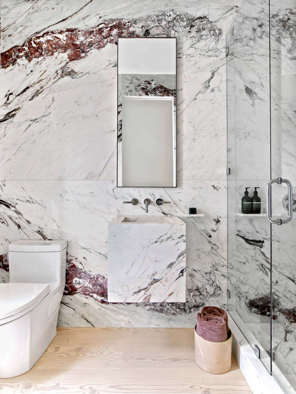
A bathroom wall behind the sanitary units is finished in blue and rustic slate stone. Hanging anything on top of it would ruin the looks, so the mirror storage unit was built into the wall. It does a double job: Keeps the clutter away and reflects the stone work. I love the clean look and how my guests react when they find out it is not just a mirror.
The staircase took me several days to finish the plaster work. The final look is worth the effort though. You just can’t miss the reflection in the polished surface when you come in. It is also a good reminder to myself that one can achieve a lot if one dares to try.
Besides giving a view over the other side and having LED lights, the openings in the staircase found a surprise use by collecting notes, reminders, books, and cups that are lifted on the way back and forth. I spend lots of time sitting on the stairs now peeping into other rooms, reading, or drinking coffee. Functionally and emotionally, it has become more than just a traffic space.

Q: What were the hardest lessons you learned along the way?
A: Things can, and most likely will, go wrong no matter how prepared you think you are. For your own sanity’s sake, you need to stay open-minded and flexible. It is easy to get worked up over small things when you spend so much effort and money on putting a house of your dreams together. So it is important to remember that at the end of a day it is not the perfect finish and detailing in the house that makes your life beautiful, but the experiences of living and enjoying the place with your loved ones.

Q: Where did you cut corners?
A: Flower pots and wall art. I used kitchen pots, wine glasses, ceramic cups, and bowls as flower planters. To salvage some of the leftover wood and spruce boards, those were turned into wall paintings, like the one I have in the study room.

Q: What is your day job?
A: I am a project manager in an IT company. However, since I contracted an interiors bug, I have also been working on a qualification in interior design. Now I also help friends and random strangers with interiors dilemmas, from wardrobe positioning to a full-house surface redesign.

Q: Where do you get your design inspiration?
A: From Remodelista, of course! I read a lot and on various topics in design and culture. I think a lot that is happening in the creative world is intertwined, and you never know where an inspiration can come from. I hunt for inspiration in the streets and when traveling. I carry a sketchbook with me to capture ideas when on the go. If I like something that I find inspiring, I will take a snap and keep it for development of future ideas. I also come from the postmodern culture that was dominated by verbal means of expression; my first university degree was in literary studies, so it left its footprint on me. A narrative is a very important force behind my conceptualization process. Once I can define a clear story behind a project, it becomes its backbone logic that visual ideas attach to. Then everything starts making sense, functionally, aesthetically, and semantically.

Q: What is your favorite local shop?
A: Yard Gallery in Holywood is a small heaven for posters and local artwork. There is also a coffee shop with mouthwatering pastries in it. It is a time trap—you just don’t want to leave the place.
The Mews Interiors is full of salvaged and new finds for a cottage, vintage, or period look. Two lovely ladies run it and my, they have a taste for pretty things with character.
There is also Oscar & Joy shop, another treasure trove for lovers of Scandi style and minimalist design. There are so many curious, handy, and alien-looking things there. It’s irresistible.


Have a Question or Comment About This Post?
Join the conversation (0)