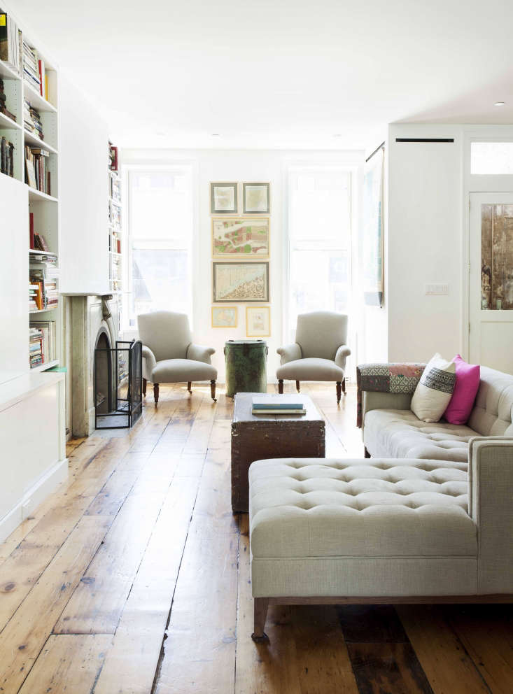
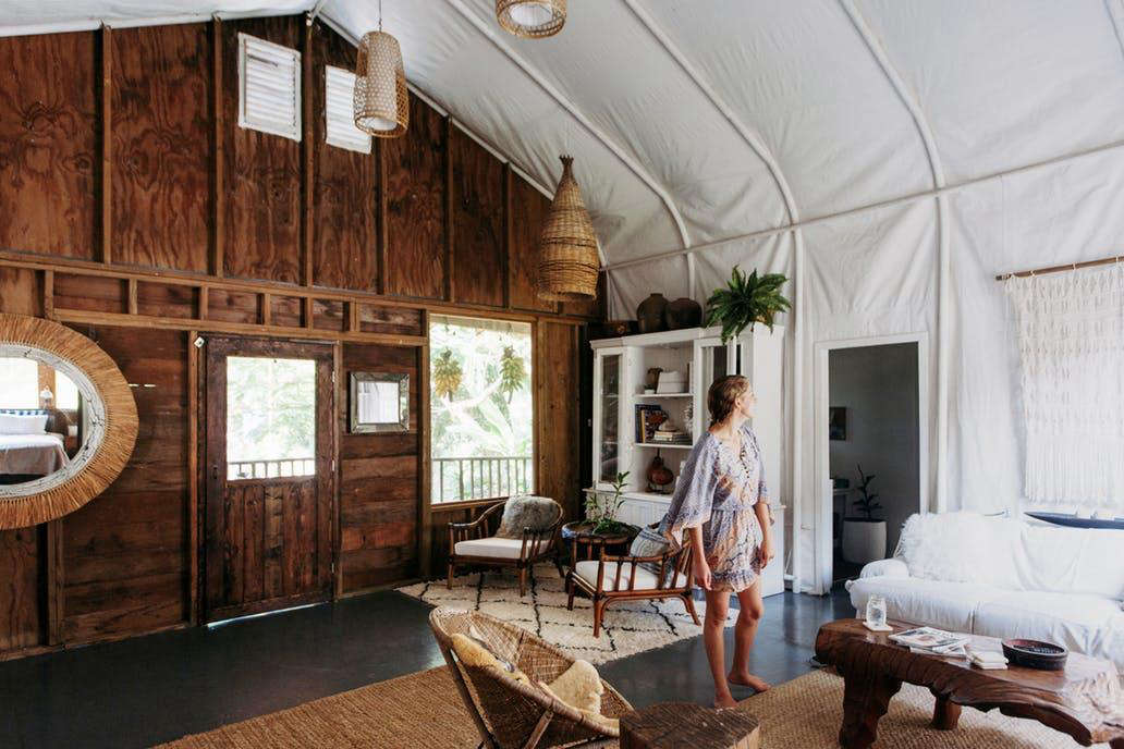
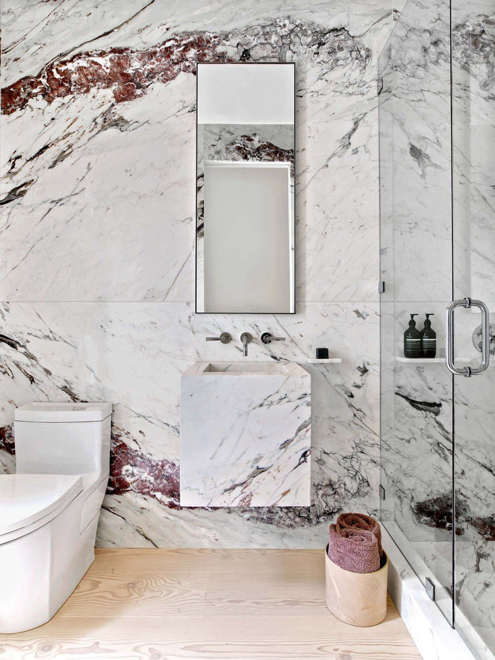
The winner of the 2017 Remodelista Considered Design Awards Best Professional Living/Dining Room is Lorraine Bonaventura Architect in Brooklyn for her Cobble Hill Brownstone Living and Dining.
The project was chosen as a finalist by guest judge Sheila Bridges, who said, “Brownstones can feel dark, but this one is full of light and has a great combination of elements both modern and classic; the neutral shades and personal, eclectic style—like the mismatched dining chairs—really set this apart.”
N.B. This is the fourth of eight posts spotlighting the winners of the 2017 Remodelista Considered Design Awards. Go to this year’s Considered Design Awards page to see all the entries, finalists, and winners, and have a look at Gardenista’s Considered Design Awards.
Photography by Hulya Kolabas.

Lorraine Bonaventura’s Design Statement: “A modern, light-filled home with vintage details was our goal for this brownstone renovation. We created an open parlor level that combines living, dining, and kitchen areas. A set of sliding doors and transom windows open 12 feet wide to a terrace.”

Q: What does your firm specialize in?
A: We specialize in high-end renovation and new construction for residential and commercial projects, focusing on renovating and rehabilitating 18th and 19th century row house buildings in urban historic districts, as well as country properties.
Q: Who worked on the winning project?
A: Architecture and design: Lorraine Bonaventura, principal, Lorraine Bonaventura Architect. Structural engineer: Andrew Goodrich, PE. Mechanical systems engineer: Stanislav Slutsky, PE. General contractor: Excel Builders.
A: What were your practical goals for the project?
Q: The clients had a clear design vision. Although the house had been divided into four apartments with small rooms, they hoped the living level could be open and modern, adding vintage elements and fixtures. The clients have four children, many visitors, and entertain often, so low-maintenance surfaces and materials were selected. They were open to new design ideas and a lot of fun to work with. Given the home’s east and west exposures, we wanted to maximize natural light. To turn the four-story building into a three-floor, five bedroom residence, with a garden-level rental, our team gutted the structure down to its brick shell and stabilized the building with new steel beams and wood joists. The brick addition was demolished and completely rebuilt with a 12-foot glass opening in the back wall. Layer upon layer of linoleum was pulled back to expose wide-board pine subfloors, which were taken up and placed in storage to be reinstalled. The staircase was disassembled and rebuilt using new treads and the original handrails, newel posts, and balusters.

Q: What solutions did you find to your design problems?
A: The house had been broken up into four apartments and there were very few original period details to retain. Completely opening the 52-foot-long main parlor floor level required introducing a new steel structure from the cellar level up through the parlor floor. We maintained the open layout while still creating maximum storage. We found creative locations for the heating, cooling, and sprinkler systems throughout the four levels while keeping the space as open as possible. We created private spaces and storage on the upper levels while maximizing the natural light throughout. We pared the design down to the essentials on the main level: an entire storage wall of custom cabinets for books, TV, and A/V in the living and dining spaces for the owners’ collection of design and art books, and creating an open-plan kitchen with a connection to the terrace and outdoors. We used simple pendant and recessed lighting throughout all levels. Antique stone mantels were found, restored, and installed in newly lined fireplaces.
Q: What are your favorite features of the project?
A: The wide opening and connection with the outdoor terrace on the main level, the combination of a modern open plan with vintage elements, and the children’s bath on the top floor.
Q: What were the hardest lessons you learned along the way?
A: There was a tremendous amount of regulatory requirements to convert the house from a multifamily building to a two-family home, including a sprinkler system. The structure of the more than 125-year-old house was in worse shape than anyone thought; fortunately the owners had the resources and persistence to tackle the challenges of the project.

Q: Where did you cut corners?
A: We did not cut corners, however, we decided to use off-the-shelf kitchen cabinets from Ikea, and had custom doors fabricated.
Q: What is your dream project, or who is your dream client?
A: I love rehabilitating brownstones; these old buildings present practical and aesthetic design challenges. These clients were terrific, communicated clearly, and were knowledgeable about design, with a good sense of humor. I would love to design a boutique hotel and I would like to design a collection of lighting fixtures and outdoor furniture.
Q: What is your best secret design source?
A: For this project, we combined many vintage and antique objects, accessories, and plumbing fixtures. We sourced the vintage tubs and sinks from several places; many came from Irreplaceable Artifacts on 125th Street.

Q: What advice do you have for someone else undertaking a similar project?
A: Always hire a design professional at the outset, utilize their expertise, and be realistic about your goals and the budget; have a contingency plan. I always mention to clients the rule of threes—time, quality, budget—it’s a balance of all three.
Q: What was your biggest splurge?
A: The Aga range in the kitchen, which is electric and can be turned off, unlike Aga ranges in the past, and the two marble mantels in the living and dining level. The early-19th-century mantels came from an 1840s brick townhouse on Perry Street in Manhattan.
Q: What is your favorite local shop?
A: I have always loved David Weeks’s lighting designs and Schoolhouse Electric in Tribeca. There are so many fantastic lighting designers in Brooklyn now—Rich, Brilliant, Willing, Roll & Hill, Apparatus—and wallpaper designers, including Flat Vernacular and Eskayel. Although they are not only in New York, Farrow & Ball just opened a shop in Brooklyn, Original BTC just opened in SoHo, and Reform in Brooklyn. I also love spending time looking at hardware and I’m always on the lookout for new sources—the Nanz Company, ER Butler, Horton Brasses, Inc. in Connecticut are a few.
Q: Where do you get your design inspiration?
A: Traveling, seeing how other architects are reinventing their living spaces, and how people live in other cultures. Walking through all the neighborhoods of New York, I always find something I previously overlooked. I recharge each summer on an island in Maine. Remodelista(!), Dwell, old houses, new houses, vintage Italian and Scandinavian lighting. I love looking at Plain English and deVol kitchens for inspiration in designing kitchens.
Q: Which architects or designers do you admire?
A: There are so many architects whose work I admire: Fred Stelle of Stelle Lomont Rouhani Architects, Bates Masi Architects, Enrique Norten of Ten Arquitectos, Go Logic in Belfast, Maine. Several of the women architects are Benedetta Tagliabue, Zaha Hadid, Gae Aulenti, Carme Pinos. Closer to home: Annabelle Selldorf, Deborah Berke, Catherine Dean, Elizabeth Roberts, CDR Studio.


Have a Question or Comment About This Post?
Join the conversation (5)