The winner of the 2017 Remodelista Considered Design Awards Best Professional Kitchen is Robertson-Tait, in collaboration with Architecture Durusoy, for their Chelsea Loft kitchen.
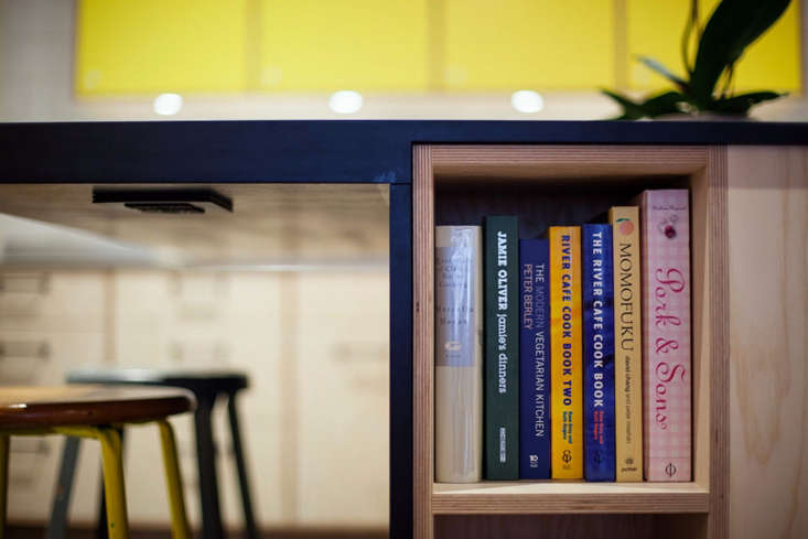
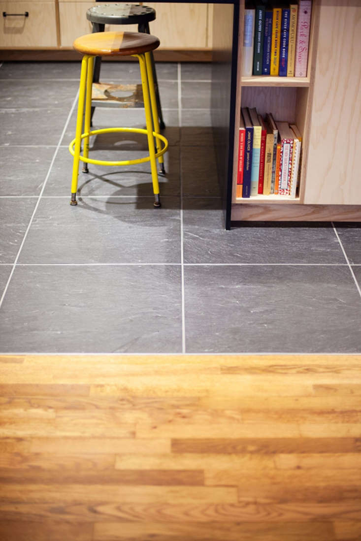
The project was chosen as a finalist by Remodelista editor in chief Julie Carlson, who said: “We like the band of yellow cabinets in this crisp, not-too-serious urban kitchen, which adds a sunny note to the space. The mix of materials is especially appealing; the white subway tile, blond wood cabinetry, and slate flooring work well together to create a balance of dark and light elements.”
N.B. This is the second of eight posts spotlighting the winners of the 2017 Remodelista Considered Design Awards. Go to this year’s Considered Design Awards page to see all the entries, finalists, and winners, and have a look at Gardenista’s Considered Design Awards.

Robertson-Tait’s Design Statement: “Teaming up with the talented Architecture Durusoy, this was one of our most enjoyable projects. Great team, great clients, great space.”

Q: What does your firm specialize in?
Robertson-Tait: We specialize in the thoughtful construction process. The majority of our projects are residential gut renovations. As a design-savvy builder, I find it helpful to assume a consultant role from the inception of a project, working with the architect/designer to manage expectations based on our client’s criteria.

Q: Who worked on the winning project?
Robertson-Tait: Architect Cemre Durusoy of Architecture Durusoy led the design of this project. Our firms have a history of collaboration in various forms, but this project allowed us the opportunity to really dig into it thoroughly. Ivory Build was a key player, as always, bringing extremely high quality craftsmanship and ingenuity to the project. Our clients brought their great taste and many inspired ideas to the table. Great team all around.

Q: What were your practical goals for the project?
Robertson-Tait: As is often the case, the primary goal was to fit the desired scope within the desired budget. Beyond that, transforming what felt like a system of dark rooms and hallways into a bright and comfortable home for two creative people looking to start a family.
Q: What solutions did you find to your design problems?
Robertson-Tait: The space was challenged by one point of entry for the air-conditioning ducts that ran through a matrix of utilitarian soffits all over the place. Cemre’s design utilized intentional thresholds that both defined the various living spaces and provided light and air movement.

Q: What is your dream project, or who is your dream client?
Robertson-Tait: I love a project that doesn’t hold back what’s necessary to achieve the desired result. I love a client who is on board with that.

Q: Where did you cut corners?
Robertson-Tait: We never cut corners. Though we did make some concessions, such as working with the existing wood flooring, and generally sticking to affordable materials.
Q: What advice do you have for someone else undertaking a similar project?
Robertson-Tait: Make sure you have the right team.

Q: What are your favorite features of the project?
Architecture Durusoy: The square island that anchors the kitchen. All four sides of the island are different and designed specifically to suit the functional and aesthetic needs of the side it’s facing. The thickness of the deep blue Richlite counter is increased for the seating area into which an outlet is recessed for laptops or kitchen appliances.

Q: What was your biggest splurge?
Architecture Durusoy: Custom cabinetry makes a world of difference. Fin-ply cabinet boxes create a graphic element in contrast to the ash veneer and painted doors and drawer fronts.


Have a Question or Comment About This Post?
Join the conversation (0)