The winner of the 2017 Remodelista Considered Design Awards Best Amateur Kitchen is Zachary Leung, for his Rustic & Refined kitchen in Toronto, Canada.
The project was chosen as a finalist by guest judge Sam Hamilton, who said: “A lovely renovation—what an extraordinary improvement from the old kitchen space! The hutch is a nice counterpoint to the very modern island.”
N.B. This is the third of eight posts spotlighting the winners of the 2017 Remodelista Considered Design Awards. Go to this year’s Considered Design Awards page to see all the entries, finalists, and winners, and have a look at Gardenista’s Considered Design Awards.

Zachary Leung’s Design Statement: “As a fan of multiple design styles, I opted to mix both modern and traditional elements in this kitchen renovation. Sticking to a classic black and white color scheme allowed for these opposing styles to work harmoniously with each other, resulting in a unique yet timeless look.”

RM: Where do you live?
ZL: I live in Toronto, Ontario, downtown on the West End. It’s a vibrant area of the city, right in the midst of a few great neighborhoods, each with their own unique vibe. My favorite part is the mix of people and their homes. It’s a humble neighborhood that is ethnically diverse, comprised of people both young and old, families and single dwellers, professionals and students, all harmoniously living on the same street. Their homes are equally diverse—century-old workers cottages/bungalows next to ultra-modern town homes, and low-rise condos next to Victorian houses. The mix keeps things both interesting and inclusive—one of the best (and possibly overlooked) aspects about Toronto.

RM: What were your practical goals for the project?
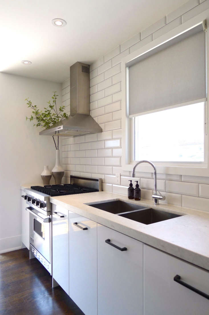
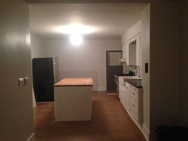
ZL: The original kitchen was dark and narrow, a bit cramped, and seemed a bit haphazard. I wanted to make it more functional and incorporate room for a new closet and laundry area on the main floor, while not taking up valuable kitchen space. For the kitchen itself, I wanted to design a more practical layout, maximize the storage, and add room for an eat-in breakfast area. Finally, I wanted to brighten up the house by increasing the amount of natural light in the space.
RM: What solutions did you find to your design problems?
ZL: I closed up the original solid door in the corner, and centered a new, sliding glass double door to the back. This brought in an abundance of natural light, and also created an opportunity to flank the doors with a new storage closet and laundry closet on either side, which neatly tucks away into the corners.
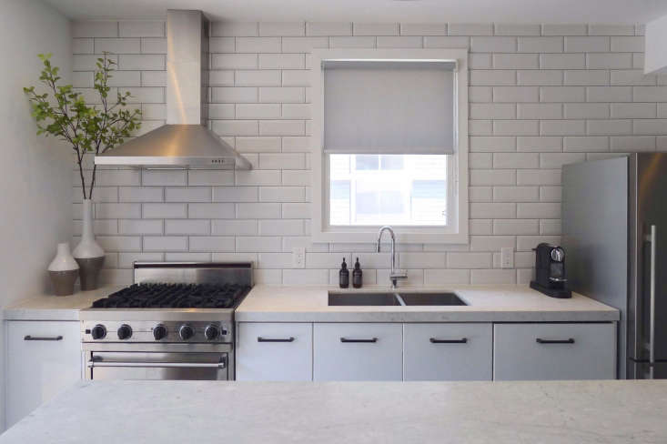
Rearranging the kitchen in a linear format keeps everything within reach while cooking, and balancing it on the opposite side with a rustic hutch not only provides visual interest but also provides practical storage needs for small appliances, cookware, and even a bit of decorative display.
Finally, the new island not only provides more storage but also seating on both sides. This was a small but important detail for me, as it allows for seating for four, face to face, rather than the typical bar style seating that runs along one side, which makes for difficult conversation.
RM: What are your favorite features of the project?
ZL: The mix and contrast of old and new, black and white, casual and refined materials, and traditional and modern design styles. Blending opposites generally gives everyone something they can relate to, regardless of what their personal tastes are. As someone who enjoys multiple different styles, it allowed me to explore them all, resulting in a design that is innovative and interesting, yet still classic enough to hopefully stand the test of time.

RM: What advice do you have for someone undertaking a similar project?
ZL: While it’s great to start with a design in mind, stay open-minded, willing to adapt, and work with the inherent strengths and constraints of the space you are working with. Unexpected items and issues will always come up that affect the original plans, and you have to be open to embracing change. The biggest downfall is ignoring the parameters dictated by the situation, and trying to force a vision—the space itself will tell you what will work, and what won’t.

RM: What was your biggest splurge?
ZL: I’d say the hutch, which I stumbled upon and was serendipitously the perfect size and almost looks custom built for the space. To be honest though, it wasn’t a huge splurge because I actually got it for half price due to the store’s moving sale. However, I’d happily pay full price if I had to do it all over again because I feel it truly makes the space.

RM: Where did you cut corners?
ZL: Although the house is certified to be structurally sound, it’s almost 130 years old, so nothing is perfectly square, level, or plumb anymore. Rather than leveling and rebuilding everything from scratch, I used a few design tricks to hide and distract from any awkward angles and bulkheads, and now they are barely noticeable.

RM: What is your best secret design source?
ZL: In terms of a source for purchasing items, my not-so-secret resource would be Kijiji and Craigslist to find amazing deals. I scored the four counter stools around my island for only $5 each. Best of all, they tie into the hutch perfectly.
As for a design source for inspiration, I like checking out the model suites in new home and condo sales centers. They typically incorporate the latest trends, so it’s great to see how they use design ideas effectively in real spaces.
Before
RM: Where else do you find design inspiration?
ZL: I like to get inspiration from the stylish interiors found in retail stores, restaurants and cafes, and hotels. I try to look beyond just what is local though, to see what is happening in other countries for a fresh new perspective. Currently I’m loving the design scene in Australia, where I’ve discovered some architects and design studios that tend to be a bit edgier. And I don’t think I’ll ever tire of the Scandinavian aesthetic, which never goes out of style.



Have a Question or Comment About This Post?
Join the conversation (2)