The winner of the Remodelista Considered Design Awards Best Amateur-Designed Bath is Zachary Leung of Toronto, Ontario.
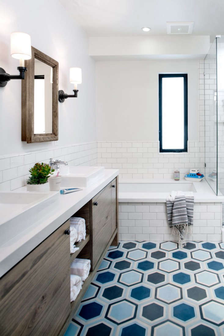
His project was chosen as a finalist by Remodelista editor in chief Julie Carlson, who commented: “The gray and white tub on a tile carpet is such a winning combo. It’s a cleanly linear setup that also has a subtle soft touch.”
N.B.: This is the second of six posts spotlighting the winners of the 2015 Remodelista Considered Design Awards. Go to this year’s 
Zachary Leung’s Design Statement: “For this remodel of a typical Toronto row house bathroom on a budget, we visually opened up the tight space through the use of glass, natural light, mirror, and white walls. A mix of modern and traditional elements updates the bathroom while honoring the history of the home.”

Q: Where do you live?
A: I live in downtown Toronto, Ontario, in a typical-style row house that was built in 1890. It’s a humble space, but conveniently situated right in the middle of a few amazing neighborhoods: Trinity Bellwoods, Little Italy, and Kensington Market. It’s a lively area, filled with a diverse and ever-changing demographic consisting of people from all different backgrounds and walks of life. There’s a great dynamic energy that comes from this eclectic mix, which I believe encourages some of the best restaurants, shops, and cafes to open up on this side of the city.

A: What were your practical goals for the project?
Q: The old bathroom was quite dated, and the tiles were worn and starting to fall off. The shower was small and completely walled in, making it dark and claustrophobic. My goal was to modernize and open up the space while keeping some design references that would relate to the history of the home. Initially, the renovation process was intended to be tackled one room at a time, but as things unfolded, the scope quickly escalated to become a much larger project involving most of the house. Since I was forced to allocate funds elsewhere, I needed to get creative to design a unique bathroom on a limited budget.

Q: What solutions did you find to your design problems?
A: I decided to maintain the existing footprint of the previous bathroom and not move any plumbing to save on costs. The solid walls enclosing the shower were opened up and replaced with frameless glass panels, providing the visual illusion of extra space, as well as taking advantage of the windows and natural light. The existing clawfoot tub was kept and reglazed. By reusing the tub, I kept a historic design element, and also the smaller scale of the tub (compared to a modern one) allowed both a tub and shower to comfortably fit within the confines of the small bathroom.
Another cost-saving measure was limiting the use of tile to basic subway tile in the shower and solid porcelain on the floor, but elevating the overall look with a small portion of imported patterned tile under the tub itself. Finally, due to the settling of the house over the years, the floors needed to be leveled, which resulted in slightly askew angles in the ceiling. Painting the ceiling and walls in the same shade of white took the emphasis away from the awkward angles, and artwork on the walls created a new focal point to detract from the existing bulkheads.

Q: What are your favorite features of the project?
A: I love the natural light that floods the room. I’m lucky that the house is situated at the end of a row, allowing for the possibility of having two large windows in the bathroom, which feels like a small luxury in this space.

Q: What projects would you tackle if you had an unlimited budget?
A: With an unlimited budget, I would love to start a company that builds and designs custom laneway homes. They would be affordable, efficient, functional, and modern, making usable space out of Toronto’s hidden backstreets and turning them into beautiful, livable homes. On a more immediate/practical level, I would love to do a complete renovation of my basement and restore the exterior of my house.
Q: What is your best secret design source?
A: It’s not really a secret source, but I always try to analyze and make mental notes when I experience other well-designed spaces. I’ve been lucky to have traveled a bit, and there are always clever ideas to take away from the hotels and apartments I’ve stayed in, especially from a functional standpoint as they are usually quite efficient at maximizing smaller spaces. The interiors of coffee shops and restaurants are also great from a design perspective as they are usually cozy and comfortable environments with elements that you can easily emulate at home.
Q: What is your favorite local shop?
A: Some of my favorites to (window) shop at include: Mjolk, Klaus, Kiosk, and Avenue Road. Smash is great for unique found objects; Made is full of inspiring local talent; and Muji is amazing for clean and simple household items. Finally, scouring Kijiji and Craigslist, combined with a bit of creativity, can’t be beat.
Q: Which architects or designers do you admire?
A: Architects: Frank Gehry, Daniel Libeskind, Joseph Dirand. Industrial Designers: Naoto Fukasawa, Oki Sato (Nendo), Tom Dixon. Interior Designers: Commute Home, Mazen Studio.
Q: What is your day job?
A: I’m the director of design at iNTERFACEWARE, where I am responsible for the creation of the overall design strategy across multiple departments, including development, marketing, and sales. It’s a unique and fluid role, which involves all aspects of visual identity as well as functional design. I love the broad mix, which keeps things interesting. Beyond my day job, my personal interests include photography, architecture, and interior design.


Have a Question or Comment About This Post?
Join the conversation