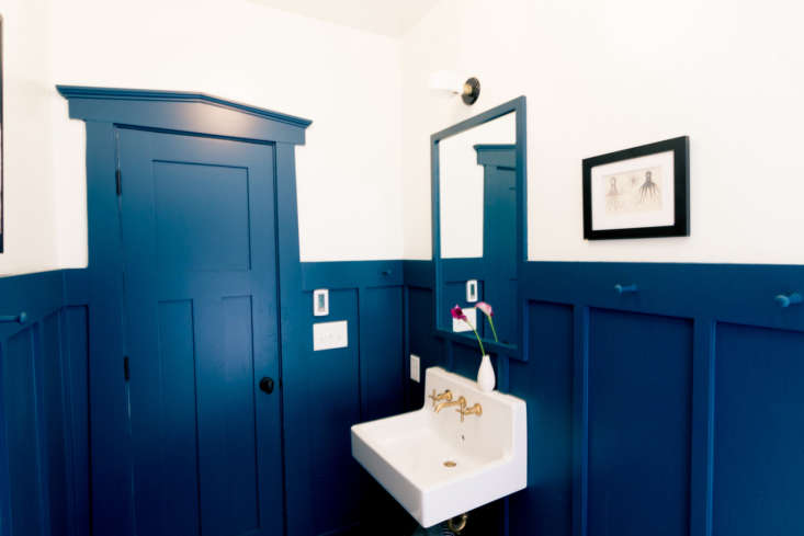
The winner of the 2018 Remodelista Considered Design Awards Best Amateur Bath is Conway Brackett, for her project Craftsman Bungalow Guest Bathroom Remodel in Decatur, Georgia.
The project was chosen as a finalist by editor in chief Julie Carlson, who says: “Bold blue painted paneling and Shaker peg rails make this bathroom both practical and punchy; we also like the use of black and white tiling and brass plumbing fixtures.”
N.B.: This is the fifth of six posts spotlighting the winners of the 2018 Remodelista Considered Design Awards. Go to this year’s Considered Design Awards page to see all the entries, finalists, and winners, and have a look at Gardenista’s Considered Design Awards.
Photography by Eric Brackett.

Conway Brackett’s Design Statement: “When we bought our 1930s bungalow, our guest bathroom had a large vanity, mismatched white tile, and no ventilation. Our goals were to create more space visually, accommodate the different heights of our children, and incorporate Craftsman designs with modern finishes.”

Remodelista: Where do you live?
Conway Brackett: We live in the Oakhurst neighborhood of Decatur, Georgia, which is a city of four square miles inside the Atlanta metro area. It is a walkable, urban neighborhood and restaurants, parks, public transit, and a community garden are all just a few blocks away. We can quickly get to downtown Decatur Square, and the new Atlanta Beltline is just a 10-minute drive to the west. As the name of our neighborhood implies, we do have big oak trees, a few hills, and lush yards. There are a variety of housing styles: Craftsman bungalows, post–World War II cottages, and an increasing number of new builds in the style of modern farmhouses or contemporary Craftsman homes.
We live in a painted-brick Craftsman bungalow built in 1936 with a large front porch and porte cochere. It originally was a two-bedroom, one-bath home with a back sunroom that was later converted to a master bathroom. We built an addition off the back of the house 12 years ago that includes a new kitchen, family room, master bedroom, and large screened-in porch.

RM: What were your practical goals for the project?
CB: Our guest bathroom had a large, oddly shaped 1990s vanity, mismatched white tile, and no ventilation when we moved in 20 years ago. Our goals were to create more space visually, accommodate the different heights of our children, and incorporate Craftsman designs with modern finishes.
RM: What solutions did you find to your design problems?
CB: A wall sink really helped make the bathroom seem roomier, and the vertical battens help give the space the illusion of higher ceilings. The built-in mirror and a higher showerhead accommodate both of my kids’ heights. Although I loved the look of geometric cement tile, the hexagon tiled floor and subway tile in the shower surround are more in line with the Craftsman style. And I love the Shaker pegs because they encourage my kids to hang their towels.

RM: What advice do you have for someone else undertaking a similar project?
CB: I should have designed the placement of the batten trim before deciding the location of the sink so I could get the exact spacing that I wanted between the battens instead of working around the installation of the new sink. My ceiling light (Schoolhouse Electric’s Fuller ceiling light in faceted opal glass) gives such ample light that I don’t really need to use the wall sconce above the mirror. We always leave 20 percent in our budget for unexpected expenses. During the project, we needed to install hardwired smoke detectors and a new electrical panel, and I forgot to budget for the P-trap sink drain in the matching finish. Dark paint shows water marks more than I expected. If you are going to hire contractors, hire ones who are great communicators. Being a working mom and caretaker for my elderly parents, I knew I couldn’t be as hands-on as I had been during our addition project 12 years ago. I had to rely on emails throughout the day and evenings to discuss online orders and decisions. Embrace the mishaps: When your daughter spills blue nail polish on the new floor, appreciate the fact that it complements the wall color!
RM: If your room was a celebrity, who would it be?
CB: My husband and I can’t stop laughing at this Twitter feed of Colin Firth Doing Things and I think this picture truly captures our bathroom!

RM: What is your day job?
CB: I am a high school teacher. I teach Latin, digital media, and instructional design. My students loved it when I would get off-topic and talk for 15 minutes about different toilet designs and the features a person has to consider before purchasing one.
RM: Where do you get your design inspiration?
CB: Remodelista, of course!

RM: Which architects or designers do you admire?
CB: I love following the designs of Jersey Ice Cream Co., Antonio Martins, Cortney Bishop Design, and Amber Interiors. And I do want to give shout-outs to my husband and kids, who gave me free rein to design this bathroom, and to my wonderful contractors, Greenehead Construction in Atlanta!
More winning projects from this year’s Considered Design Awards:
- Best Amateur Kitchen: Hunt Sunday House by Kate Zimmerman Turpin
- Best Professional Living/Dining Space: Spanish Bungalow Redux by Herringbone Design
- Best Professional Bath: Modern Farmhouse Master Bathroom by Megan Bachmann Interiors


Have a Question or Comment About This Post?
Join the conversation (5)