Icon - Arrow LeftAn icon we use to indicate a rightwards action. Icon - Arrow RightAn icon we use to indicate a leftwards action. Icon - External LinkAn icon we use to indicate a button link is external. Icon - MessageThe icon we use to represent an email action. Icon - Down ChevronUsed to indicate a dropdown. Icon - CloseUsed to indicate a close action. Icon - Dropdown ArrowUsed to indicate a dropdown. Icon - Location PinUsed to showcase a location on a map. Icon - Zoom OutUsed to indicate a zoom out action on a map. Icon - Zoom InUsed to indicate a zoom in action on a map. Icon - SearchUsed to indicate a search action. Icon - EmailUsed to indicate an emai action. Icon - FacebookFacebooks brand mark for use in social sharing icons. flipboard Icon - InstagramInstagrams brand mark for use in social sharing icons. Icon - PinterestPinterests brand mark for use in social sharing icons. Icon - TwitterTwitters brand mark for use in social sharing icons. Icon - Check MarkA check mark for checkbox buttons.
You are reading

Kitchen of the Week: A Modern Belgian Minimalist Kitchen

Search

Kitchen of the Week: A Modern Belgian Minimalist Kitchen

December 2, 2021

When a 1960s two-bedroom villa went on the market next door to Sophie and Frank De Jonghe’s house, they decided “in a split second” to turn the place into their own creative project. The couple live in the woodsy Belgian village of Oud-Heverlee 20 minutes outside of Brussels. He works in finance, she in real estate, and they share in their words “a heart beating for minimalist design.”  Their favorite lighting dealer on hearing about the house purchase introduced them to rising interiors architect Andy Kerstens who, says Sophie, “was making his first steps in starting his own office after working for renowned Antwerp firm Dieter Vander Velpen.”

As the De Jonghes began collaborating with Kerstens, the project grew into an interior makeover with a focus on applying tactile natural materials in a refined way. And rather than using the new space for family and friends, as the De Jonghes had originally envisioned, they decided to turn it into a boutique rental and creative hub: a retreat for guests to come work (should you want to record a podcast, for instance, it’s equipped), gather for meetings, offer workshops, stage art shows, or simply vacation in a lovely setting.

The villa is known as the MUD Residence, a reference, explains Sophie, to the fact that the spaces can be “shaped however you like” and also to the choice of flagstones, fumed oak, and other elemental finishes. We’re especially drawn to the kitchen and its island of cantilevered limestone blocks. Take a look and see what you think.

Photography by Piet-Albert Goethals, courtesy of MUD.

an indoor outdoor flagstone pathway leads into the kitchen. &#8\2\20;we exp 17
Above: An indoor-outdoor flagstone pathway leads into the kitchen. “We explored style characteristics of the sixties villa and interpreted them in a new way,” says Sophie. The walls were painted with a roller followed by a brush in two shades of white to create subtly nuanced surfaces.
the chunky counter of grigio alpi limestone is inset with a bora induction cook 18
Above: The chunky counter of Grigio Alpi limestone is inset with a Bora induction cooktop. The cabinet fronts and ceiling panels are fumed oak in “rustic, full-width planks.”

Guests receive a “survival basket” stocked with eggs and veggies from the property’s own chicken and greenhouse, pasta, tomato sauce, and Champagne.

the sink is incorporated into the sculptural limestone island with a finely etc 19
Above: The sink is incorporated into the sculptural limestone island with a finely etched base: see our Trend Alert: Fluting in the Kitchen. “MUD,” says Sophie, “is intended to be a source of inspiration for its residents.” Note the black-and-white photograph by the Douglas Brothers inset in a niche.
the island doubles as a breakfast counter with two tractor stools by craig bass 20
Above: The island doubles as a breakfast counter with two Tractor Stools by Craig Bassam. The blackened brass Cylinder Downlights are by Apparatus Studio of New York.
the sink has a base and drainboard of untreated bronze, and the tall vola fauce 21
Above: The sink has a base and drainboard of untreated bronze, and the tall Vola faucet is in a special-ordered dark finish.
the fridge, stove, and coffee equipment are tucked behind the cabinets to the l 22
Above: The fridge, stove, and coffee equipment are tucked behind the cabinets to the left of the kitchen counter. The door pulls and cabinet detailing are untreated bronze.
the kitchen opens to a dining area with vintage charlotte perriand méribel 23
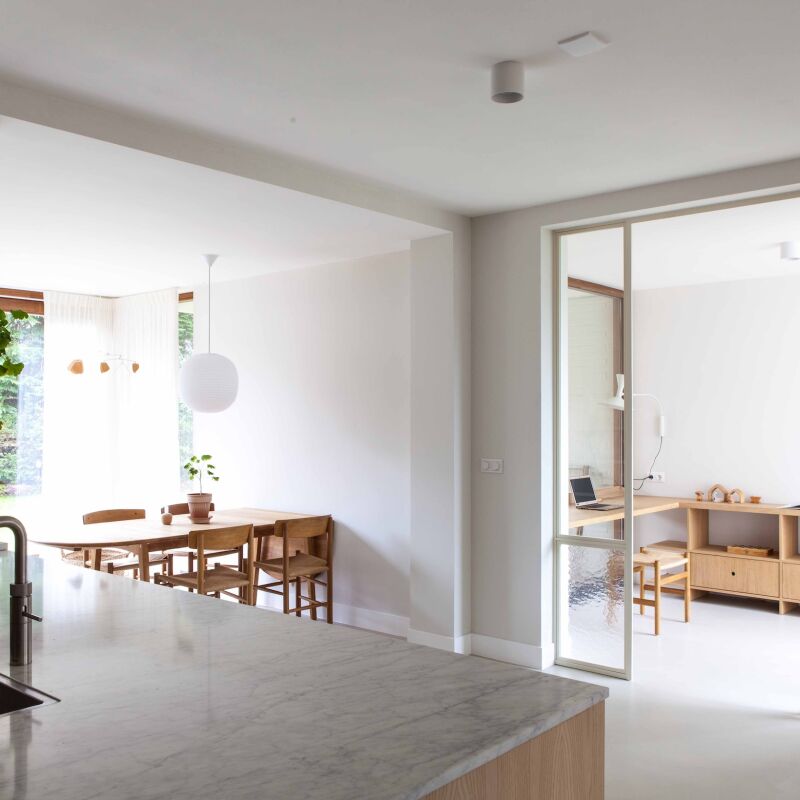
Above: The kitchen opens to a dining area with vintage Charlotte Perriand Méribel chairs.
the oak table is the kei design by marlieke van rossum, inspired by charlotte p 24
Above: The oak table is the Kei design by Marlieke van Rossum, inspired by Charlotte Perriand’s “tables en forme libre,” and the Conference Chairs are Pierre Jeanneret’s Chandigarh classics by Dimo. Out back, there’s a terrace with a barbecue, plus a bio sauna (a cross between a sauna and a steam bath) and a Dutch hot tub. A separate creative studio is set up for meetings, photo shoots, recording sessions, and more.

To see the rest of the house, go to MUD Residence (@mud_residence).

Here are three more eye-opening, minimalist kitchens:

(Visited 2,020 times, 2 visits today)
You need to login or register to view and manage your bookmarks.

Have a Question or Comment About This Post?

Join the conversation

v5.0