Icon - Arrow LeftAn icon we use to indicate a rightwards action. Icon - Arrow RightAn icon we use to indicate a leftwards action. Icon - External LinkAn icon we use to indicate a button link is external. Icon - MessageThe icon we use to represent an email action. Icon - Down ChevronUsed to indicate a dropdown. Icon - CloseUsed to indicate a close action. Icon - Dropdown ArrowUsed to indicate a dropdown. Icon - Location PinUsed to showcase a location on a map. Icon - Zoom OutUsed to indicate a zoom out action on a map. Icon - Zoom InUsed to indicate a zoom in action on a map. Icon - SearchUsed to indicate a search action. Icon - EmailUsed to indicate an emai action. Icon - FacebookFacebooks brand mark for use in social sharing icons. flipboard Icon - InstagramInstagrams brand mark for use in social sharing icons. Icon - PinterestPinterests brand mark for use in social sharing icons. Icon - TwitterTwitters brand mark for use in social sharing icons. Icon - Check MarkA check mark for checkbox buttons.
You are reading

Before & After: A Remodelista Editor’s Dated California Kitchen Gets a Refresh

Search
the home depot logo 300x180 7

Before & After: A Remodelista Editor’s Dated California Kitchen Gets a Refresh

September 20, 2018

When Remodelista contributing editor Meredith Swinehart began planning a recent move across the San Francisco Bay into the East Bay condo of her cinematographer boyfriend, the pair agreed to make some aesthetic upgrades so his longtime home would feel more like theirs. They made a plan: First, they would redesign the laundry niche. (Why start there? See Before & After: A Pet-Friendly Overhaul for the Laundry Closet for the reason. Hint: Cats are involved.) And second, they would revamp the space that was most visually irritating to them both: the kitchen.

Their gripes: The cabinets had perforated metal panels that left cabinet contents exposed and served as effective catchments for cooking grease and grime. The glossy seal on the wood cabinet frames had been damaged by splashed water over time, and the charcoal gray tile backsplash looked downright purple in the wrong light. The cabinet pulls were decorative—in a bad way—and the overall look was sorely dated. But because their complaints about the circa 2002 kitchen were largely aesthetic, they sought to make big changes while keeping the same footprint and making relatively minor interventions. The game changer? An upgrade to the cabinet fronts, and, most important, a fresh coat of paint.

Photography by Mahyar Abousaeedi for Remodelista.

After
Before amp After A Remodelista Editors Dated California Kitchen Gets a Refresh portrait 6
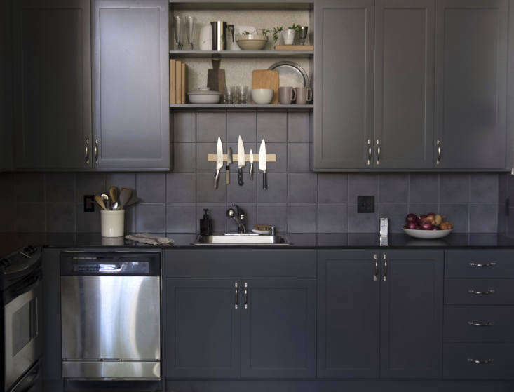
Above: The revamped kitchen has freshly painted cabinets with new doors and pulls, plus two more central display shelves—everything else remained the same. Meredith and her boyfriend retained the charcoal tile backsplash and black granite countertops to keep costs in check, which made “choosing a paint color that minimized the purple tones of the backsplash” the hardest task of all, Meredith explains.
Before amp After A Remodelista Editors Dated California Kitchen Gets a Refresh portrait 6
Above: While exploring all the options in the Behr paint deck, Meredith turned to Seattle interior designer and color expert Katie Hackworth for an opinion. “Black countertops combined with a black backsplash make for a strong masculine statement, whether you like it or not,” says Katie. “One option would be to saturate the wall and cabinets in the same tone. I love gray-blue tones alongside black. It’s a classic pairing that will never get old.”
Before amp After A Remodelista Editors Dated California Kitchen Gets a Refresh portrait 6
Above: Feeling emboldened to go dark, Meredith chose Behr Hematite in a satin finish. It’s a charcoal gray that leans toward green or brown as the light changes. For Meredith, it was the perfect foil to the unlovable backsplash.

On the recommendation of a friend in real estate, Meredith and her boyfriend hired East Bay Custom Cabinet to do the refinishing. Owner Lupe Hernandez suggested replacing the cabinet fronts entirely instead of swapping the perforated metal center panels with wood.

Before amp After A Remodelista Editors Dated California Kitchen Gets a Refresh portrait 6
Above: The new center shelves display useful kitchen objects. A maple knife rack from M.O.C. Woodworks in nearby San Rafael, California, keeps cooking knives at the ready while providing some visual interest against the tile.
Before amp After A Remodelista Editors Dated California Kitchen Gets a Refresh portrait 6
Above: Meredith at work in the “new” kitchen.

Before

old kitchen for remodel paint
Above: The existing kitchen wasn’t beautiful, but it was perfectly functional. Next up? The pantry.

See Meredith’s laundry room overhaul at Before & After: A Pet-Friendly Overhaul for the Laundry Closet.

(Visited 932 times, 1 visits today)
You need to login or register to view and manage your bookmarks.

Frequently asked questions

What was the inspiration behind the kitchen makeover?

The inspiration behind the kitchen makeover was to give the dated kitchen a modern, sleek and darker look.

What color palette was used for the kitchen?

The kitchen was painted in a dark color palette, with the walls painted in Farrow & Ball's Railings and the cabinets in Benjamin Moore's Devonshire Green.

What other changes were made to the kitchen?

Other changes made to the kitchen include replacing the countertops and backsplash, adding new hardware, and installing new appliances.

How long did the kitchen makeover take?

The kitchen makeover took about 4-6 weeks to complete.

What challenges were faced during the kitchen makeover?

One of the main challenges faced during the kitchen makeover was dealing with the old cabinets and figuring out the best way to update them without replacing them entirely.

Who was responsible for the kitchen makeover?

The kitchen makeover was done by designer Nicole Hollis and her team, in collaboration with contractor Jason Langkammerer.

v5.0