In Brooklyn Heights, architect Sarah Zames of firm General Assembly turned a dated 800-square-foot apartment into an “airy, welcoming home” for a pair of peripatetic creatives.
“Our clients wanted to achieve a lot in a pretty small space,” said Zames. She opted to leave the layout largely unchanged while “making some subtle moves that allowed us to maximize the space”—including built-ins everywhere, storage tucked under high ceilings, even a secret cat corridor.
To achieve a modern feel, Zames capitalized on the apartment’s ample natural light and further brightened the space with white walls, white oak millwork, and light gray concrete countertops, anchored by touches of blackened steel, dark blue paint, and a charcoal gray fireplace. The owners—Remodelista readers—were involved in the selection of every detail, from light switches to cushions to cabinet pulls.
Photography by Joe Fletcher, courtesy of General Assembly.

Above: The walls are painted in Benjamin Moore’s White Dove and the original pine wood floors were refinished.

Above: A pair of Trapeze sconces from Apparatus are controlled via a light switch from House of Antique Hardware.

Above: Zames replaced the existing fireplace with a dramatic, trowel-finished concrete unit complete with built-in firewood storage. To maximize every inch of space in the small apartment, the architects tucked a projection screen into the ceiling above the piano.

Above: General Assembly retained the existing Kohler kitchen faucet and farmhouse sink but added new poured concrete countertops. The white tile backsplash is Mutina’s Mews series from Stone Source; a Workstead wall light provides overhead illumination.

Above: The lower cabinets (and refrigerator door) are painted in Farrow & Ball’s Black Blue and outfitted with brass pulls from Liz’s Antique Hardware in LA. The floor tile is Mutina Mews and the range and hood are from Bertazzoni.

Above: Just off the living room is a hallway library that leads to the office. Because of their proximity, the office and living room “are united as one flexible social space,” said Zames.

Above: A library ladder from Putnam Rolling Ladder Co. allows access to a storage platform above the millwork and a bookshelf made of reclaimed wood.
The apartment is entered through a small stairwell bordered by a blackened steel guardrail with a rounded edge.

Above: The storage platforms throughout the apartment double as walkways for the owners’ cats. This hole leads to a platform in the office.
Above: The home office has original brick walls and ceiling beams. The rail is a track for the library ladder, which can be moved from room to room to access the storage platforms (and the cats). General Assembly designed a small table lamp for this project, shown at the end of the desk. The lamp—called Slab—is now in production and is the anchor of the firm’s new homewares collection, Assembly Line.

Above: The office daybed doubles as a guest bed; its cushion is a Japanese futon mattress. The wall is painted in Farrow & Ball’s Black Blue, and the black cabinet pulls are Waterhouse from Rejuvenation.
Above: The owners wanted a clothes dresser in the bedroom but didn’t have the floor space to accommodate one—so General Assembly designed a full-depth dresser recessed into the closet on the other side of the wall.
At left, the segue between the hallway and the bedroom is lined in Commune’s Zuni Zebra tile.
Above: The bathroom is lined in trowel-finshed concrete.
Before

Above: The existing kitchen was visually cluttered. Photograph by Sarah Zames.
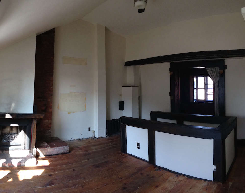
Above: The living room layout was largely unchanged in the redesign. Photograph by Sarah Zames.
See more Before & After profiles, including:
- A Tuxedo Park Carriage House Gets an Update in Black and White
- Kitchen of the Week: A Before & After Culinary Space in Park Slope
- A Former Miss America’s Beverly Hills House, Transformed





Have a Question or Comment About This Post?
Join the conversation (10)