Busy professionals with two young kids, attorney Liz Flynn and sports marketer Craig Howe lived in their 1927 stucco bungalow in LA’s Silver Lake for eight years before “pulling the trigger” on a cost-conscious kitchen overhaul. It helped that they knew exactly who to entrust with the job: Their friends McShane and Cleo Murnane of LA architect/design collaborative Project M+ specialize in miraculous makeovers on a budget. “My husband got offered a job for the summer in Telluride, so that’s when the construction took place,” says Liz. “McShane and Cleo ran with it and got the job done in two months; we barely even saw any sawdust.” And the results are so life-changing (scroll down to see the Befores) that the rest of the house is now a work in progress.
Photography by Mimi Giboin.
Above: In its new guise, the 300-square-foot kitchen has an ageless, cooly confident look, thanks to a gray and white palette and custom Shaker-style cabinetry. (“The space had too many weird corners for us to go with something readymade,” says Liz).
The project began with a mood board (see below) that defined the essential details down to the black arched faucet. To open up the space, McShane widened the entrance from the dining room (the George Nelson Saucer Lamp in the foreground hangs over the dining table) while replicating the house’s Spanish-style archway. One of the design riddles: The couple insisted on keeping the space-hogging back door for the dog–it leads to a fenced-in backyard–so McShane introduced a door with windows and found other spots for storage.

Above: The designers removed the overhead cabinetry and replaced a small, off-center plant bay with double-hung, wood-casement windows (purchased from Taylor Brothers) centered over the sink. They used space freed of cabinets to create an L-shaped island with a ledge that serves as a breakfast counter. The countertops are hardwearing white Caesarstone (read about it in Remodeling 101: Engineered Quartz Countertops). The fridge is situated opposite the sink. The hanging lights are Dante Donegani’s Drink Pendant Lights sourced from Remodelista.

Above: The farmhouse sink is from Kohler and the Pull-Down Faucet is from Newport Brass’s East Linear collection. Of the room’s black accents, Cleo says, “the space needs contrast or it would feel too cold. Black felt perfect–not expensive and easy to maintain.”

Above: The stove wall, situated next to the back door, is tiled with Carrara subway tile. The designers replaced the existing white tiled floor with a Douglas fir floor that matches what’s in the dining room and living room (“but with a less orangey stain,” specifies Cleo. “We used a white oak finish to desaturate the color a bit.”)

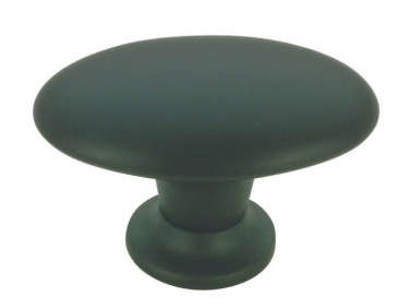
Above: The cabinets are painted Chelsea Gray from Benjamin Moore, and the metal knobs and pulls are from Lowe’s. The stove is a KitchenAid and the hood is from Broan.

Above: McShane created a clever under-the-counter spot for the microwave. (For more ideas, see 10 Strategies for Hiding the Microwave.)

Above: “The Carrara tile adds so much warmth and texture to the space,” says Cleo. “Slab marble is always our first choice, but it’s so much more expensive than tile. And you have to pick out the slabs yourself and pair them.” They went with subtly patterned white Afyon three-by-six-inch tiles with a honed finish from their favorite local source, United Team Tile.
Above: To make up for lost storage space, the breakfast nook is now fitted with deep drawers and a pantry that covered up a window. (“We had been very reluctant, but there’s now so much more light in the space that that window wasn’t a loss,” says Liz.) The room also has a cafe table, not shown here. Liz found the hanging light, the Eldridge Pendant, at Ballard Design. (“The mandate was it had to be black,” says Cleo.)
Before

Above: “It was one of those super-cramped old California kitchens with a layout that made no sense,” says Cleo. “We couldn’t find a modern fridge to fit the space, so it was surrounded by black holes,” adds Liz.

Above: The sink is still in its original spot and the two-year-old dishwasher was kept (but relocated to the right of the new sink).

Above: The stove had been jammed next to the breakfast nook entry. And the red? “What can I say, it was a bad decision that I made many years ago,” says Liz.
Mood Board

Above: Cleo, who is a graphic designer, put together a mood board at the start of the remodel. Liz had loved a Project M+ kitchen with gray Shaker cabinets, so they became the springboard. Getting the couple to agree to black accents was a challenge that the designers won, but the herringbone pattern for the marble tile was nixed as too daring.
See McShane and Cleo’s own house in An LA Cliffhanger: Go High or Stay Low? and Steal This Look: A Low-Key Luxe Bathroom with Blue Cement Floor Tiles. And go to Project M+ for more.








Have a Question or Comment About This Post?
Join the conversation (17)